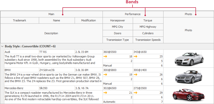
TcxGridBandedTableView Class
A View that groups columns into bands.
Declaration
TcxGridBandedTableView = class(
    TcxGridTableView
)
Remarks
This View displays data in a banded table. Bands allow users to group columns that contain information related to a specific category.

TcxGridBandedTableView is based on the TcxGridTableView and inherits its base features to manage data.
A Banded View works in unbound mode. You can use the following Views to display data in bound or server modes:
Each column in the View should be associated with a band since the View cannot display columns that do not have a parent band. All columns initially belong to a band with an empty caption. You can name this band and leave columns under it or add more bands, and associate columns with them.
You can also specify a parent band for a band to group multiple related bands.
Refer to the following guidance for information on how to configure bands and columns: Banded Table View Tutorial.
Main API Members
You can use this class’s members to manage the View’s layout, appearance, and behavior as follows:
Add a column to the View’s column collection (CreateColumn).
Access grouped and visible columns (GroupedColumns and VisibleColumns).
Respond to a change of a band position or visibility (OnBandPosChanged).
Respond to a band width change (OnBandSizeChanged).
Configure the View controller settings (Controller).
Customize user interaction options (OptionsBehavior and OptionsCustomize).
Customize the View’s appearance (OptionsView).
Specify appearance settings of the View elements (Styles).
Paint a band header in a custom manner (OnCustomDrawBandHeader).
Specify background bitmaps for the View Elements (BackgroundBitmaps).
Configure the column names order in the “Quick Column Customization” dropdown (OnQuickCustomizationColumnCompare).