Multiple Row and Cell Selection
- 13 minutes to read
The DevExpress Grid control supports the following selection options:
- Multiple Row/Card Selection – A user can select several rows/cards.
- Multiple Cell Selection – A user can select multiple cells within different rows.
- Single Row/Card Selection – A user can select only one row or card at the same time. The ‘selected’ row/card is called the focused row/card.
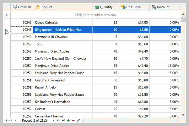
Multiple Row/Card Selection Mode
In multiple row/card selection mode, a user can select multiple rows/cards:
Multiple row/card selection is supported by the following Views:
Enable Multiple Row Selection
To enable multiple row/card selection, set the View’s OptionsSelection.MultiSelect property to true:
Select Rows in Code
//Enable multiple row selection.
gridView1.OptionsSelection.MultiSelect = true;
//Select the second, third, and fourth rows.
gridView1.SelectRows(1, 3);
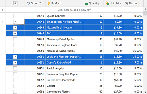
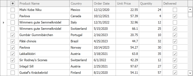
Web Style Row Selection in GridView
The GridView supports Web style row selection. In this mode, the GridView displays a column with check boxes:
Set the GridView’s OptionsSelection.MultiSelectMode property to GridMultiSelectMode.CheckBoxRowSelect to enable Web style row selection:
using DevExpress.XtraGrid.Views.Grid;

//...
gridView1.OptionsSelection.MultiSelect = true;
gridView1.OptionsSelection.MultiSelectMode = GridMultiSelectMode.CheckBoxRowSelect;
Tip
You can bind selected state of rows to a data source field.
Read the following topic for additional information and examples: Web Style Row Selection and Selection Binding.
Related APIs
API Member | Description |
|---|---|
Selects the specified row/card. | |
Selects specified rows/cards. | |
Deselects the specified row/card. | |
Clears the selection. | |
Gets the number of selected rows. | |
Returns an integer array that contains handles of selected rows. | |
Occurs after selection has been changed. | |
These methods prevent excessive updates when doing several selection-related operations in code. |
Performance Improvements
Each time you select or deselect a row, the View raises the SelectionChanged event. Sequential calling of selection-related APIs may slow down application performance. Enclose sequential selection-related modifications within BeginSelection() and EndSelection() method calls:
using System.ComponentModel;
using DevExpress.Data;
using DevExpress.XtraEditors;
using DevExpress.XtraGrid.Views.Grid;
namespace DXApplication {
public partial class Form1 : XtraForm {
public Form1() {
InitializeComponent();
BindGridControl();
//Enable multiple row selection.
gridView1.OptionsSelection.MultiSelect = true;
gridView1.SelectionChanged += GridView1_SelectionChanged;
simpleButton1.Click += SimpleButton1_Click;
}
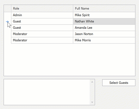
void SimpleButton1_Click(object sender, System.EventArgs e) {
//Select rows based on a condition.
SelectRoles("Guest", gridView1);
}
void GridView1_SelectionChanged(object sender, SelectionChangedEventArgs e) {
memoEdit1.AppendText("The GridView's SelectionChanged event raised.\r\n");
}
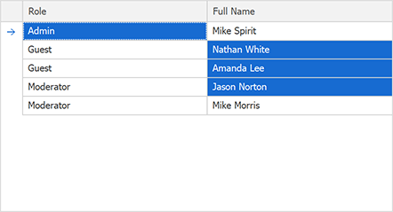
void SelectRoles(string role, GridView gridView) {
int rowHandle;
gridView.BeginSelection();
for(int i = 0; i < gridView1.RowCount; i++) {
rowHandle = gridView.GetVisibleRowHandle(i);
if (gridView.GetRowCellValue(gridView.GetVisibleRowHandle(i), "Role").ToString() == role)
gridView.SelectRow(rowHandle);
}
gridView.EndSelection();
}
void BindGridControl(){
gridControl1.DataSource = new BindingList<DataItem>() {
new DataItem(){ Role = "Admin", FullName = "Mike Spirit" },
new DataItem(){ Role = "Guest", FullName = "Nathan White" },
new DataItem(){ Role = "Guest", FullName = "Amanda Lee" },
new DataItem(){ Role = "Moderator", FullName = "Jason Norton" },
new DataItem(){ Role = "Moderator", FullName = "Mike Morris" },
};
}
}
public class DataItem {
public string Role { get; set; }
public string FullName { get; set; }
}
}
Read the following topic for additional information: Batch Modifications.
Multiple Cell Selection Mode
In multiple cell selection mode, users can select multiple cells within different rows:
Multiple cell selection is supported by the following views:
Enable Multiple Cell Selection
To enable multiple cell selection mode, set the View’s OptionsSelection.MultiSelect property to true and the OptionsSelection.MultiSelectMode property to GridMultiSelectMode.CellSelect:
using DevExpress.XtraGrid.Views.Grid;

//...
gridView1.OptionsSelection.MultiSelect = true;
gridView1.OptionsSelection.MultiSelectMode = GridMultiSelectMode.CellSelect;
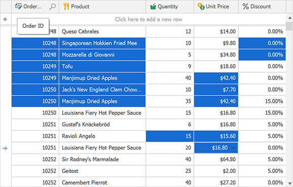
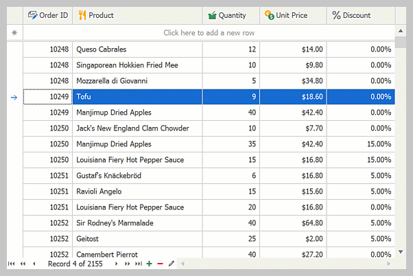
Select Multiple Cells in Code
using DevExpress.XtraGrid.Views.Base;
using DevExpress.XtraGrid.Views.Grid;

//...
gridView1.OptionsSelection.MultiSelect = true;
gridView1.OptionsSelection.MultiSelectMode = GridMultiSelectMode.CellSelect;
gridView1.SelectCell(0, gridView1.Columns["Role"]);
gridView1.SelectCells(new GridCell(1, gridView1.Columns["FullName"]), new GridCell(3, gridView1.Columns["FullName"]));
The image below shows the result:
Related APIs
The following table lists related APIs:
| API Member | Description |
|---|---|
| SelectCell | Selects the specified cell. |
| SelectCells | Selects a range of cells. |
| SelectAll() | Selects all cells within the View. |
| UnselectCell | Deselects the specified cell. |
| UnSelectCells | Deselects a range of cells. |
| ClearSelection() | Clears selection. |
| GetSelectedCells | Returns selected cells. |
| GetSelectedRows() | Returns handles of rows that contain selected cells. |
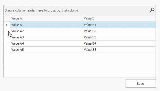
Single Row/Card Selection (Focused Row)
Multiple row/cell selection is disabled by default. A user can select (focus) only one row/card at the same time.
Difference Between Focused and Selected Rows
The focused row (or a card in the CardView) is the row that accepts input from a user. There can only be one focused row in a View, regardless of the selection mode.
Multiple row selection is a visual feature that highlights specific rows.
Note
When multiple row selection is enabled and the user focuses a new row, the row is selected (highlighted). When you focus a row in code, the row is not automatically selected (highlighted).
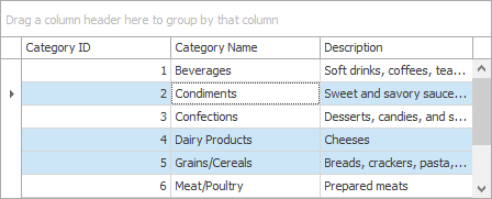
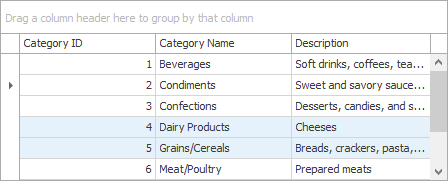
The following images demonstrate selected and deselected states of the focused row:
Focused Row is selected
| The ColumnView.GetSelectedRows method returns three row handles, including the focused row handle. |
Focused Row is deselected
| The ColumnView.GetSelectedRows method returns two handles that correspond to selected rows. The focused row handle will not be included in the method’s resulting array. |
Related APIs
The table below lists related APIs:
API Member | Description |
|---|---|
Gets or sets the focused (selected) row/card. | |
This event occurs after the focused row has been changed. | |
In single row/card selection mode, the | |
In single row/card selection mode, the |
Read the following topics for additional information:
APIs to Work with Selection and Rows
API Member | Description |
|---|---|
Copies the focused or selected record(s) to the Clipboard as text. | |
Deletes a specific row/card. | |
Deletes the focused or selected rows. | |
Returns an object that contains a specified row. | |
Returns a DataRow object that contains a specified row. | |
Gets the value in a row’s field. | |
Gets the text representation of a row’s value. | |
Assigns a value to a row’s cell. |
End-User Capabilities
A user can select rows/cards and cells with a mouse and keyboard. Please refer to the following topic for more information: End-User Capabilities: Selecting Rows/Cards.
Prevent Users from Selecting Specific Rows/Cells Based on a Condition
Handle the SelectionChanging event to control whether a user can select or deselect specific rows/cards/cells based on a condition.
The following code sample does not allow users to select the first 5 rows:
gridView1.SelectionChanging += (s, e) => {
    e.Cancel = e.Action == CollectionChangeAction.Add && e.ControllerRow <= 4;
};
Customize Appearance of Selected and Focused Rows/Cells
Selected and focused rows are painted with the same appearance settings. Use appearance-related properties of the View’s Appearance object (GridView.Appearance, CardView.Appearance, etc.).
Related APIs
| API Member | Description |
|---|---|
| GridViewAppearances.FocusedRow | Contains appearance settings used to paint the focused row. |
| GridViewAppearances.SelectedRow | Contains appearance settings used to paint selected rows. |
| GridViewAppearances.HideSelectionRow | Contains appearance settings used to paint selected rows when the Grid Control is not focused. |
| CardViewAppearances.FocusedCardCaption | Contains appearance settings used to paint the caption of the focused card. |
| CardViewAppearances.SelectedCardCaption | Contains appearance settings used to paint captions of selected cards. |
| CardViewAppearances.HideSelectionCardCaption | Contains appearance settings used to paint captions of selected cards when the Grid Control is not focused. |
Appearance Priority
Row appearance settings take priority over column appearance settings (GridColumn.AppearanceCell). To prioritize column appearance settings, enable the GridColumn.AppearanceCell.Options.HighPriority option:
Read the following topic for additional information: Priority of Appearance Objects.
Customize Appearance of Specific Selected Rows/Cells
Handle the following events to customize appearance settings of cells within selected rows:
Disable Focused Row/Cell Appearance
To prevent the focused row from being highlighted, set the View’s OptionsSelection.EnableAppearanceFocusedRow property to false. The View’s OptionsSelection.EnableAppearanceFocusedCell property allows you to disable coloring of a focused cell.
The following example disables focused cell appearance settings and keeps the focused row’s appearance when the Grid Control loses focus:
void Form1_Load(object sender, EventArgs e) {
    gridView1.OptionsSelection.EnableAppearanceHideSelection = false;
    gridView1.OptionsSelection.EnableAppearanceFocusedCell = false;
}
Tip
To prevent selected/focused rows from being highlighted when the grid control is not focused, use the View’s OptionsSelection.EnableAppearanceHideSelection property.
Disable Selected Row/Cell Appearance
You can use the following techniques to display selected rows and cells without highlight effects:
Assign regular row appearance to the GridViewAppearances.SelectedRow property:
Handle the GridView.RowStyle, GridView.RowCellStyle, or GridView.CustomDrawCell event and modify selected row appearance:
Example - Obtain Selected Rows
This example obtains selected rows and modifies their values in the “Discounted” column.
If data is sorted or filtered, changes made to one grid row can make other rows change their order and, as a result, their row handles. For this reason, you cannot access selected rows by their handles and process these rows right away. Instead, pass row handles retrieved by the ColumnView.GetSelectedRows method to the ColumnView.GetDataRow method. This allows you to access underlying data source objects (in this example, DataRows), save them to an array, and safely change their values afterwards.
Each row modification forces the Grid View to update itself. The example encloses the code within BaseView.BeginUpdate and BaseView.EndUpdate method calls to avoid excessive updates.
ArrayList rows = new ArrayList();

// Add the selected rows to the list.
Int32[] selectedRowHandles = gridView1.GetSelectedRows();
for (int i = 0; i < selectedRowHandles.Length; i++) {
    int selectedRowHandle = selectedRowHandles[i];
    if (selectedRowHandle >= 0)
        rows.Add(gridView1.GetDataRow(selectedRowHandle));
}
try {
    gridView1.BeginUpdate();
    for (int i = 0; i < rows.Count; i++) {
        DataRow row = rows[i] as DataRow;
        // Change the field value.
        row["Discontinued"] = true;
    }
}
finally {
    gridView1.EndUpdate();
}
Example - Select a Column
The following example emulates the behavior introduced in Microsoft Excel (when a user left-clicks a column header, all cells displayed within this column are highlighted):
using DevExpress.XtraGrid.Views.Grid;
using DevExpress.XtraGrid.Views.Grid.ViewInfo;
using System.Collections;
using System.ComponentModel;
using System.Windows.Forms;
using System.Drawing;
using DevExpress.Data;
using DevExpress.XtraGrid.Columns;
using DevExpress.Utils;

namespace DXApplication16 {
    public partial class Form1 : FluentDesignForm {
        // The list of selected columns:
        ArrayList selectedColumns;

        public Form1() {
            InitializeComponent();
            gridView1.MouseDown += GridView1_MouseDown;
            this.Load += Form1_Load;
        }

        private void Form1_Load(object sender, System.EventArgs e) {
            selectedColumns = new ArrayList();
        }

        private void GridView1_MouseDown(object sender, MouseEventArgs e) {
            GridView view = sender as GridView;
            GridHitInfo info = view.CalcHitInfo(new Point(e.X, e.Y));

            if (info.InColumn & e.Button == MouseButtons.Left) {
                // Disable sort operations when a user left-clicks a header.
                info.Column.OptionsColumn.AllowSort = DefaultBoolean.False;
                // Check whether the clicked column is already in the list.
                if (!selectedColumns.Contains(info.Column.FieldName)) {
                    // If not, custom draw its cells and add it to the list.
                    info.Column.AppearanceCell.Assign(view.PaintAppearance.SelectedRow);
                    selectedColumns.Add(info.Column.Name);
                }
                else {
                    // Otherwise, remove this column from the selected columns list
                    // and reset its cell appearances.
                    selectedColumns.Remove(info.Column.Name);
                    info.Column.AppearanceCell.Reset();
                }
            }
            else {
                // If anything but a column header is clicked,
                // reset all column cell appearances and clear the list.
                if (selectedColumns.Count != 0) {
                    foreach (string name in selectedColumns)
                        view.Columns.ColumnByName(name).AppearanceCell.BackColor =
                            Color.Transparent;
                    selectedColumns.Clear();
                }
            }

            // Users can still right-click a header and choose sort options.
            if (info.InColumn & e.Button == MouseButtons.Right) {
                info.Column.OptionsColumn.AllowSort = DefaultBoolean.Default;
            }
        }
    }
}
Notes
Data Grid cells can embed interactive editors (for instance, check boxes or ButtonEdit buttons). When multiple row/cell selection is enabled, clicking such UI elements activates the cell but its editor does not raise events (for example, Click or CheckedChanged) because the editor does not yet exist. To trigger these events, a user must click the element the second time.
To change this behavior, set the ColumnViewOptionsBehavior.EditorShowMode property to EditorShowMode.MouseDown.