GridView.RowCellStyle Event
Fires for every visible Grid cell before this cell is shown. Allows you to modify Appearance settings for this cell.
Namespace: DevExpress.XtraGrid.Views.Grid
Assembly: DevExpress.XtraGrid.v25.2.dll
NuGet Packages: DevExpress.Win.Grid, DevExpress.Win.Navigation
Declaration
Event Data
The RowCellStyle event's data class is RowCellStyleEventArgs. The following properties provide information specific to this event:
| Property | Description |
|---|---|
| Appearance | Gets the appearance settings used to paint the data cell currently being processed. |
| CellValue | Returns the currently processed cell value. Inherited from CustomRowCellEventArgs. |
| Column | Gets the column to which the currently processed cell corresponds. Inherited from CustomRowCellEventArgs. |
| RowHandle | Gets the handle of the row that contains the processed cell. Inherited from CustomRowCellEventArgs. |
The event data class exposes the following methods:
| Method | Description |
|---|---|
| CombineAppearance(AppearanceObject) | Copies the activated settings of the appearance object passed as the parameter. |
Remarks
Use the event’s e.RowHandle and e.Column parameters to identify the currently processed cell, then use the e.Appearance parameter to customize appearance settings.
Use the RefreshRowCell method to forcibly raise the RowCellStyle event when needed.
Note
The grid control fires the RowCellStyle event too frequently. We recommend that you do not implement complex logic in this event handler to avoid performance issues.
    gridView.RowCellStyle += (sender, e) => {
        GridView view = sender as GridView;
        bool _mark = (bool)view.GetRowCellValue(e.RowHandle, "Mark");
        if(e.Column.FieldName == "Name") {
            e.Appearance.BackColor = _mark ? Color.LightGreen : Color.LightSalmon;
            e.Appearance.TextOptions.HAlignment = _mark ? HorzAlignment.Far : HorzAlignment.Near;
        }
        if(e.Column.FieldName == "Length") {
            double _length = (double)e.CellValue;
            if(_length > 25)
                e.Appearance.ForeColor = Color.Red;
        }
    };
To specify appearance settings of entire rows instead of individual cells, handle the GridView.RowStyle event.
Tip
Data Grid does not display cell images assigned to the Appearance.Image properties in the RowCellStyle and GridView.RowStyle events. See the “Cell Icons” section of the Cells topic to learn how to display icons within Grid cells.
Important
Do not change cell values, modify the control’s layout, or change the control’s object model in the events used for custom control painting. Actions that update the layout can cause the control to malfunction.
Please refer to the Appearance and Conditional Formatting topic for additional information.
Online Video
WinForms Grid: Custom Drawing.
Example
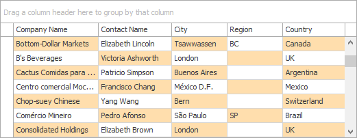
The following code demonstrates how to customize the appearance of individual grid cells using the GridView.RowCellStyle event handler. The grid cells in this example are colored in a staggered manner.
The following image demonstrates the result:

using DevExpress.XtraGrid.Views.Grid;

private void gridView1_RowCellStyle(object sender, RowCellStyleEventArgs e) {
   GridView view = sender as GridView;
   if(view == null) return;
   if(e.RowHandle != view.FocusedRowHandle &&
      ((e.RowHandle % 2 == 0 && e.Column.VisibleIndex % 2 == 1) ||
      (e.Column.VisibleIndex % 2 == 0 && e.RowHandle % 2 == 1)))
      e.Appearance.BackColor = Color.NavajoWhite;
}
Related GitHub Examples
The following code snippets (auto-collected from DevExpress Examples) contain references to the RowCellStyle event.
Note
The algorithm used to collect these code examples remains a work in progress. Accordingly, the links and snippets below may produce inaccurate results. If you encounter an issue with code examples below, please use the feedback form on this page to report the issue.