Using Navigators
- 3 minutes to read
This topic provides information about using navigator controls that allow end-users to browse and edit the data displayed by a grid control. It describes the navigators provided by DevExpress, since these controls have a number of advantages compared to standard navigator controls when used in combination with XtraGrid.
Using Data Navigators with the Grid Control
Data navigator controls provided by DevExpress are represented by a set of buttons that enable end-users to:
- move focus between rows;
- append and delete rows;
- start, finish and cancel editing;
Additionally, by default, navigators can display a text label that displays the current record number together with the total record count.
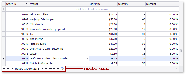
The grid control supports use of two navigator types - embedded and external. Both controls are actually represented by the ControlNavigator class and the only difference is that the grid control automatically positions the embedded navigator within its client area while the external navigator is a separate control that can be placed to any location.
The main point about ControlNavigator is that it is not bound to a data View or data table. It is directly bound to a control that implements the INavigatableControl interface. This enables the navigator to provide more navigation flexibility. The grid control, for instance, implements that interface so that end-users can use the ControlNavigator control to browse master-detail data. Thus, pressing the Next button while an expanded master row is focused, moves the focus to the detail View’s first row. If using a standard navigator control, the focus would move to the next master row within the same View. One more thing that is worth a mention is that standard navigators only allow the focus to move between data rows . By using the ControlNavigator control, end-users are able to navigate group rows also.
To activate the embedded navigator, set the grid’s GridControl.UseEmbeddedNavigator property to true. If enabled, the navigator is displayed at the control’s bottom-left corner.

You can access the ControlNavigator class that represents the embedded navigator using the grid’s GridControl.EmbeddedNavigator property. By changing settings available via this property, you can customize the navigator’s look and feel, buttons’ visibility, style and hint texts, etc.
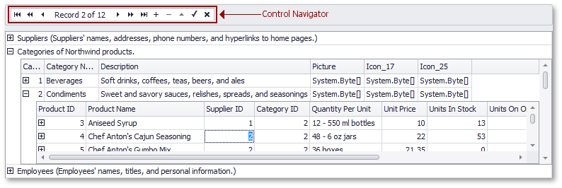
If displaying the navigator within the grid control doesn’t suit your needs, place a ControlNavigator control at the desired location. To bind a navigator control to the grid, use the navigator’s ControlNavigator.NavigatableControl property.
The following image displays a separate navigator control positioned above a grid control.

For more information on using and customizing the control navigator see the ControlNavigator topic.