Appearance and Conditional Formatting
- 15 minutes to read
Tip
Each Appearance object has its own priority. Please see the following help topic for information on how to change the default priority of appearance settings: Application Appearance and Skin Colors.
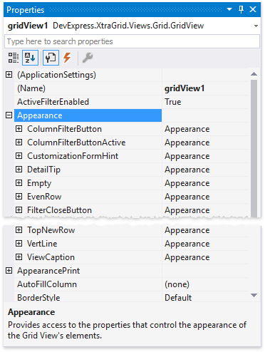
Global Appearance Settings
The GridView.Appearance property gives access to property sections with appearance settings for Grid UI elements (even and odd rows, focused cells, column headers, buttons, grid lines, etc.).
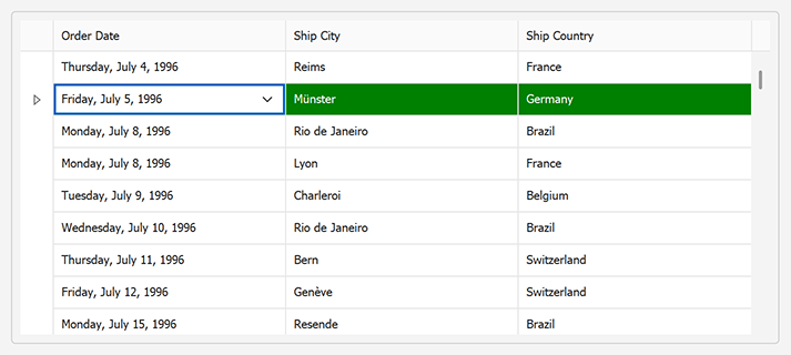
Focused Cell Appearance
Use the View’s Appearance.FocusedCell property to customize the focused cell’s appearance settings:
gridView1.Appearance.FocusedCell.BackColor = DXSkinColors.FillColors.Warning;
gridView1.Appearance.FocusedCell.ForeColor = DXSkinColors.ForeColors.WindowText;
The following image shows the result:
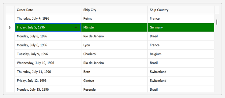
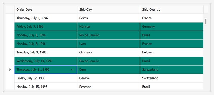
Focused Row Appearance
Use the View’s Appearance.FocusedRow property to customize appearance settings of cells displayed in the focused row:
gridView1.Appearance.FocusedRow.BackColor = System.Drawing.Color.Green;
gridView1.Appearance.FocusedRow.ForeColor = System.Drawing.Color.White;
Set the View’s OptionsSelection.EnableAppearanceFocusedCell property to false to turn off the focused cell’s appearance settings:
Selected Cell/Row Appearance (Multiple Cell/Row Selection)
Use the View’s Appearance.SelectedRow property to customize the appearance of selected rows/cells (when multiple row/cell selection is enabled):
// Activate multiple cell selection.
gridView1.OptionsSelection.MultiSelect = true;
gridView1.OptionsSelection.MultiSelectMode = GridMultiSelectMode.CellSelect;
// Customize background and foreground colors of selected rows.
gridView1.Appearance.SelectedRow.BackColor = DXSkinColors.FillColors.Success;
gridView1.Appearance.SelectedRow.ForeColor = DXSkinColors.ForeColors.WindowText;
Highlight Cells that Belong to a Specific Column
A grid column’s GridColumn.AppearanceCell property specifies appearance and text format settings for cells that belong to this column. These settings override global appearance settings.
The following example centers values in cells of the Name column:
using DevExpress.Utils;

gridView1.Columns["Name"].AppearanceCell.TextOptions.HAlignment = HorzAlignment.Center;
gridView1.Columns["Name"].AppearanceCell.Options.UseTextOptions = true;
Highlight an Active Editor
To highlight the currently active editor, handle the ColumnView.ShownEditor event and use the BaseView.ActiveEditor property to access the focused cell’s editor.
gridView.ShownEditor += (s, e) => {
        GridView view = s as GridView;
        gridView.ActiveEditor.BackColor = Color.DodgerBlue;
    };
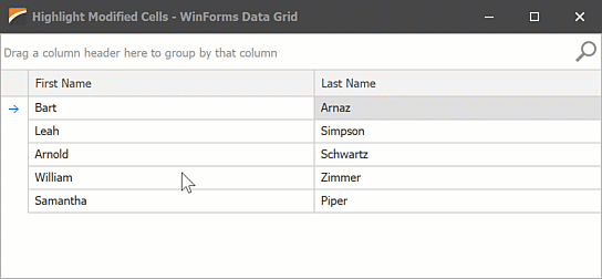
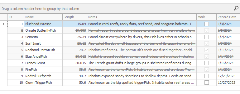
Highlight Modified Cells (Edited by a User)
The following example highlights cells if a user changed/edited their values. The example handles GridView.CellValueChanged and GridView.RowCellStyle events.
using System;
using System.Collections.Generic;
using System.ComponentModel.DataAnnotations;
using DevExpress.LookAndFeel;
using DevExpress.XtraEditors;
using DevExpress.XtraGrid.Views.Grid;

namespace DXApplication14 {
    public partial class Form1 : XtraForm {
        Dictionary<string, ModifiedCellInfo> modifiedRows;
        public Form1() {
            InitializeComponent();
            modifiedRows = new Dictionary<string, ModifiedCellInfo>();
            gridControl1.DataSource = DataItem.GetSampleData();
            gridView1.CellValueChanged += GridView1_CellValueChanged;
            gridView1.RowCellStyle += GridView1_RowCellStyle;
        }
        void GridView1_RowCellStyle(object sender, RowCellStyleEventArgs e) {
            GridView view = sender as GridView;
            string rowId = GetCellIdentifier(view, e.RowHandle, e.Column.FieldName);
            if (modifiedRows.ContainsKey(rowId) && modifiedRows[rowId].FieldName == e.Column.FieldName)
                e.Appearance.BackColor = DXSkinColors.FillColors.Warning;
        }
        void GridView1_CellValueChanged(object sender, DevExpress.XtraGrid.Views.Base.CellValueChangedEventArgs e) {
            GridView view = sender as GridView;
            string rowId = GetCellIdentifier(view, e.RowHandle, e.Column.FieldName);
            if (!modifiedRows.ContainsKey(rowId)) {
                modifiedRows.Add(rowId, new ModifiedCellInfo() { FieldName = e.Column.FieldName, InitialCellValue = e.OldValue });
                return;
            }
            if(modifiedRows.ContainsKey(rowId) && modifiedRows[rowId].InitialCellValue.Equals(e.Value))
                modifiedRows.Remove(rowId);
        }
        string GetCellIdentifier(GridView view, int rowHandle, string fieldName) {
            return view.GetRowCellValue(rowHandle, "ID").ToString() + fieldName;
        }
    }
    public class DataItem {
        public DataItem(string firstName, string lastName) {
            ID = Guid.NewGuid();
            FirstName = firstName;
            LastName = lastName;
        }
        public static List<DataItem> GetSampleData() {
            return new List<DataItem>() {
            new DataItem("Bart", "Arnaz"),
            new DataItem("Leah", "Simpson"),
            new DataItem("Arnold", "Schwartz"),
            new DataItem("William", "Zimmer"),
            new DataItem("Samantha", "Piper")
        };
        }
        [Display(Order = -1)]
        public Guid ID { get; private set; }
        public string FirstName { get; set; }
        public string LastName { get; set; }
    }
    class ModifiedCellInfo {
        public string FieldName { get; set; }
        public object InitialCellValue { get; set; }
    }
}
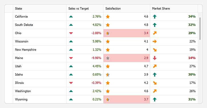
Conditional Formatting
Conditional formatting allows you to customize cell appearance in Grid Views and Banded Grid Views based on cell values.
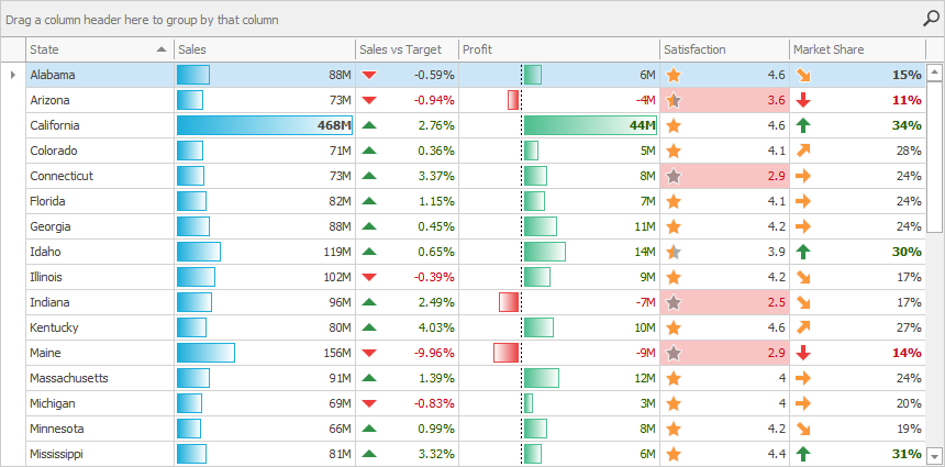
Use Conditional Formatting to do the following:
- Analyze all column cell values and visualize data distribution.
- Highlight specific values and dates.
- Highlight cells with the smallest or largest values.
- Highlight values below or above an average.
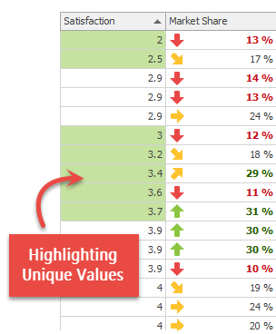
- Highlight unique or duplicate values.
- Use a custom formula to apply a color to specific cells.
- Temporarily highlight cells when their values change, and more.
Show Conditional Formatting in Grid Menu
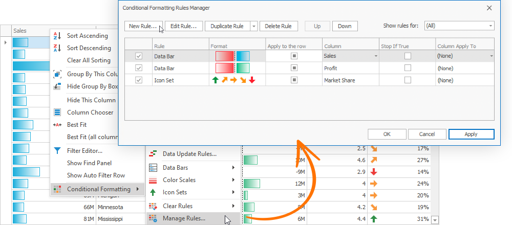
Enable the view’s OptionsMenu.ShowConditionalFormattingItem option to display the Conditional Formatting item in the column menu. A user can right-click a column header and select Conditional Formatting in the menu to add, modify, or clear formatting rules.
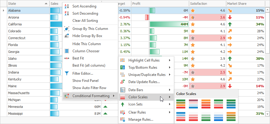
The Manage Rules… menu item allows users to create custom rules. Enable the ColumnViewOptionsFilter.FilterEditorAllowCustomExpressions property to display the Expression Editor button in the New Formatting Rule dialog.
To create a rule, do the following:
Click New Rule….
Select Use a formula to determine which cells to format and edit the rule.
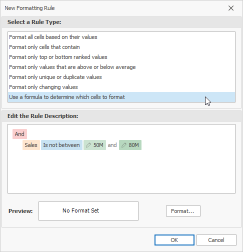
You can also click Expression Editor and use the invoked Expression Editor to edit the rule.
Click the Format button to customize appearance settings that should be applied to cells with matching values. Click OK to close the Format Cells dialog box.
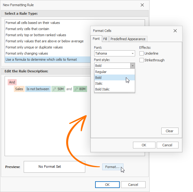
- Click OK to create and apply the rule.
Create a Conditional Formatting Rule at Design Time
- Run the Grid Designer.
- Switch to Format Rules.
- Click “+”.
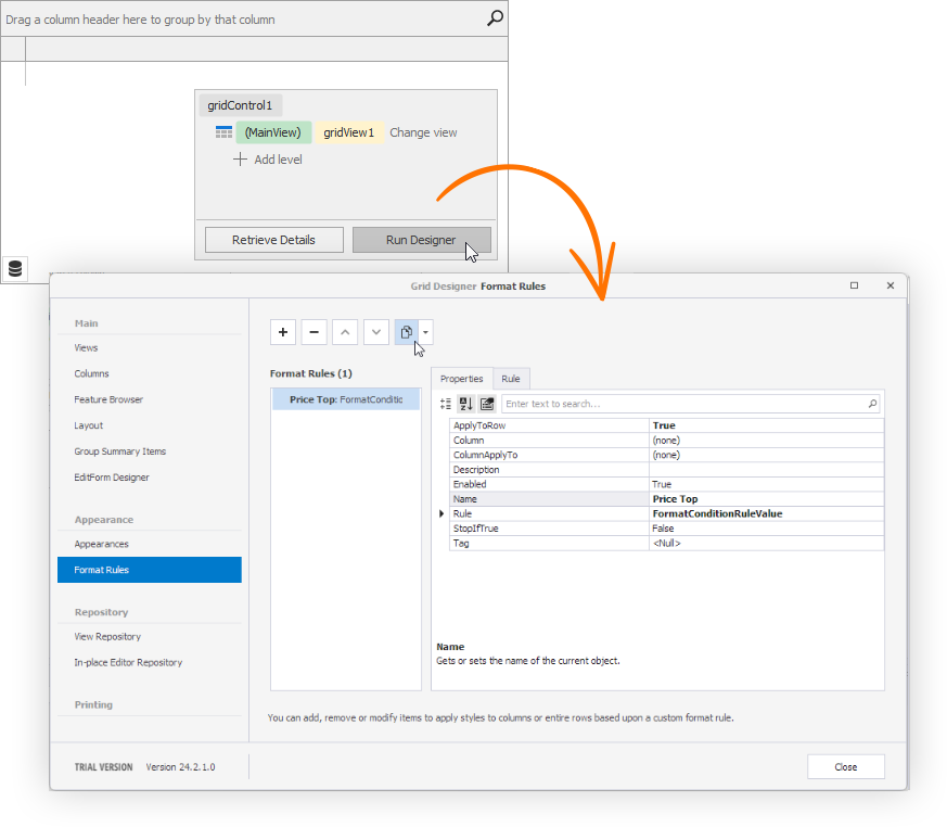
Create a Conditional Formatting Rule in Code
- Create a style format condition (GridFormatRule).
Create a rule (a FormatConditionRuleBase descendant), customize its settings, and assign it to the GridFormatRule.Rule property of the style format condition.
Predefined Rules- FormatConditionRuleIconSet
- FormatConditionRuleMinMaxBase
- FormatConditionRule2ColorScale
- FormatConditionRule3ColorScale
- FormatConditionRuleAboveBelowAverage
- FormatConditionRuleContains
- FormatConditionRuleDataBar
- FormatConditionRuleDataUpdate
- FormatConditionRuleDateOccuring
- FormatConditionRuleExpression
- FormatConditionRuleTopBottom
- FormatConditionRuleUniqueDuplicate
- FormatConditionRuleValue
Add the style format condition to the view’s FormatRules collection.
Tip
Use the style format condition’s GridFormatRule.Enabled property to enable or disable the rule.
You can use the FormatRuleBase.Description property to specify a text description for the created format rule.
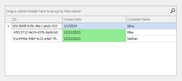
The following code example creates a style format condition that highlights cells in the “CreateDate” column for orders created before the current year:
using System;
using System.Data;
using DevExpress.XtraGrid;
using DevExpress.XtraEditors;

namespace DXApplication9 {
    public partial class Form1 : DevExpress.XtraEditors.XtraForm {
        public Form1() {
            InitializeComponent();
            gridControl1.DataSource = InitDataTable();
            Load += Form1_Load;
        }

        private void Form1_Load(object sender, EventArgs e) {
            // Creates and initializes the style format rule.
            FormatConditionRuleDateOccuring dateRule = new FormatConditionRuleDateOccuring();
            dateRule.Appearance.BackColor = System.Drawing.Color.LightGreen;
            dateRule.DateType = FilterDateType.PriorThisYear;
            // Creates and initializes the style format condition.
            GridFormatRule formatRule = new GridFormatRule();
            formatRule.Rule = dateRule;
            formatRule.Column = gridView1.Columns["CreateDate"];
            formatRule.ColumnApplyTo = gridView1.Columns["CreateDate"];
            // Adds the style format condition to the view's FormatRules collections.
            gridView1.FormatRules.Add(formatRule);

            // This can also be done as follows:
            // GridFormatRule formatRule = gridView1.FormatRules.AddDateOccurringRule(gridView1.Columns["CreateDate"], FilterDateType.PriorThisYear, new DevExpress.Utils.AppearanceDefault(){ BackColor = System.Drawing.Color.LightGreen});
        }

        DataTable InitDataTable() {
            DataTable table = new DataTable("DataRecords");
            table.Columns.AddRange(new DataColumn[] {
                new DataColumn("ID", typeof(Guid)),
                new DataColumn("CreateDate", typeof(DateTime)),
                new DataColumn("CustomerName", typeof(string))
            });
            table.Rows.Add(new object[] { Guid.NewGuid(), new DateTime(2024, 1, 1, 9, 44, 12), "Silva" });
            table.Rows.Add(new object[] { Guid.NewGuid(), new DateTime(2023, 12, 31, 11, 15, 18), "Mike" });
            table.Rows.Add(new object[] { Guid.NewGuid(), new DateTime(2023, 12, 31, 10, 20, 10), "Nathan" });
            return table;
        }
    }
}
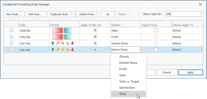
Duplicate Conditional Formatting Rule in Grid Menu
Select a rule to duplicate.
Click the Duplicate Rule dropdown and select the column to which you want to apply the duplicated rule.
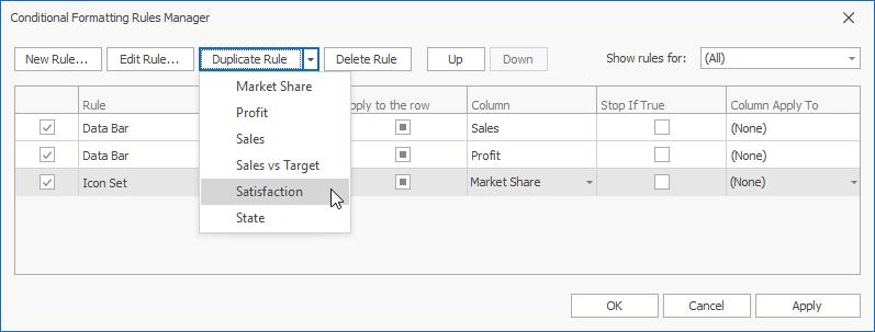
Alternatively, you can click Duplicate Rule to specify settings of the duplicated rule.
Duplicate Conditional Formatting Rule at Design Time
- Run the Grid Designer.
- Switch to Format Rules.
- Click the
 icon.
icon.

Visual Effects and Animation
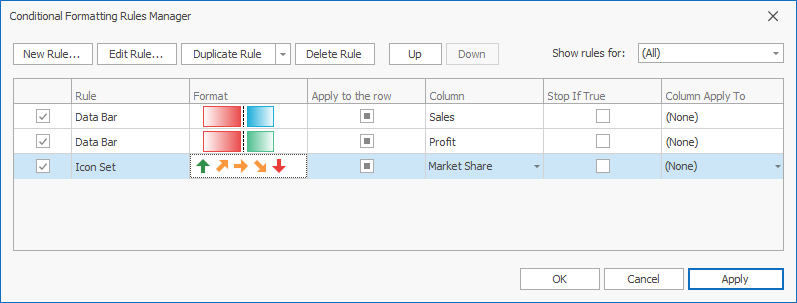
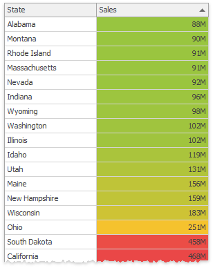
Color Scales
The Data Grid compares cell values and fills these cells with solid colors chosen from a palette. Based on your selection, the palette gradually shifts through two or three threshold colors.
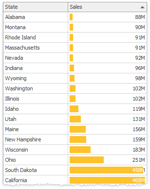
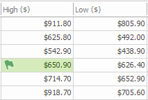
Data Bars
Cells are partially filled with the selected color. The fill percentage depends on how small or large the cell value is compared to other values in this column. You can also draw a vertical axis at the zero value. In this instance, data bars for positive and negative values are displayed in opposite directions and are painted with different colors.
Icons
Icon sets allow you to label each value range with a corresponding icon.
Static Appearance Settings
Selected font settings, and background and foreground colors are applied to cells with values that meet specific criteria (for example, the top 10 column values).
Animation
Some format condition rules support animation effects. The animation effect is played when a cell value changes. Use the FormatConditionRuleBase.AllowAnimation property to enable animation.
The following animation temporarily highlights a cell with an icon or color when a cell value changes:
Examples: Conditional Formatting
- How to: Apply a Data Bar Format to a Column
- How to: Apply an Icon Set Format to a Column
- How to: Apply a Two-Color Scale Format to a Column
- How to: Apply a Three-Color Scale Format to a Column
- How to: Highlight Column Values that Match a Condition
- How to: Highlight the Top 20% Column Values
- How to: Apply a Format Based on an Expression
- How to: Temporarily Highlight Cells When Their Values Change
Tip
To customize row appearances in other Views, handle customization events of these views: CustomCardStyle, ItemCustomize, CustomDrawItem.
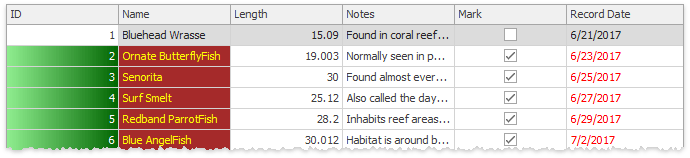
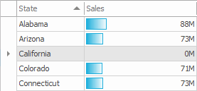
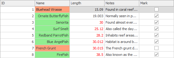
Change Cell and Row Appearances Dynamically
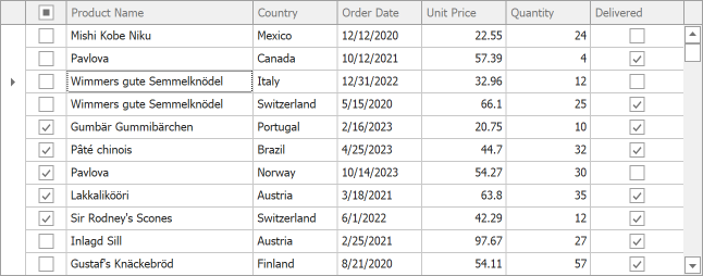
Handle the GridView.RowCellStyle event to change cell appearance dynamically. For example, you can highlight specific cells in response to events. The following code snippet changes the background color and content alignment for the Name column’s cells based on the Boolean value of the Mark column.
gridView.RowCellStyle += (sender, e) => {
        GridView view = sender as GridView;
        bool _mark = (bool)view.GetRowCellValue(e.RowHandle, "Mark");
        if(e.Column.FieldName == "Name") {
            e.Appearance.BackColor = _mark ? Color.LightGreen : Color.LightSalmon;
            e.Appearance.TextOptions.HAlignment = _mark ? HorzAlignment.Far : HorzAlignment.Near;
        }
    };
You can also handle the GridView.RowStyle event to process and paint rows and group rows individually. For example, the following code snippet highlights focused rows.
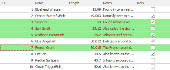
Color foreColor = Color.Brown;
    Color backColor = Color.LightGreen;

    // Change the appearance settings of row cells dynamically.
    gridView.RowStyle += (sender, e) => {
        GridView view = sender as GridView;
        //Change the foreground and background colors of selected rows.
        if(view.IsRowSelected(e.RowHandle)) {
            e.Appearance.ForeColor = foreColor;
            e.Appearance.BackColor = backColor;
            /* This property controls whether settings of the RowStyle event have a higher priority
               than the appearances specified by the GridViewAppearances.EvenRow
               and GridViewAppearances.OddRow properties. */
            e.HighPriority = true;
        }
    };
The GridView.GroupLevelStyle event allows you to paint group rows dynamically and apply unique appearance settings for each group level. In the following example, different group row levels have different appearance settings.
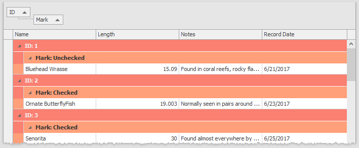
gridView.GroupLevelStyle += (s, e) => {
        if(e.Level == 0) {
            e.LevelAppearance.ForeColor = Color.WhiteSmoke;
            e.LevelAppearance.BackColor = Color.Salmon;
        } else {
            e.LevelAppearance.ForeColor = Color.FromArgb(50, 50, 50);
            e.LevelAppearance.BackColor = Color.LightSalmon;
        }
    };
Tip
Use the RefreshRow method to force the view to redraw the specified row. The RefreshData() method redraws all rows.
Tip
You can also handle ~CustomDraw events to customize row and cell appearances dynamically: CustomDrawCell, CustomDrawGroupRow, CustomDrawGroupRowCell, CustomDrawFooterCell, etc. The following demo shows these events in action: Custom Painting Demos.
Example: Customize Cell Appearance
This example creates a helper class that handles the RowCellStyle event and makes it easy to specify a cell color.

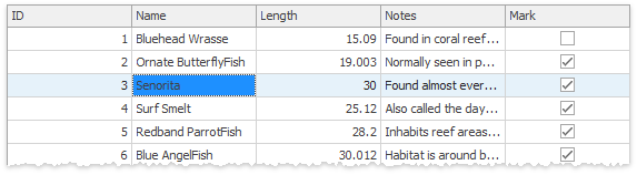
Override Custom Appearances for Selected Cells
Appearance settings of individual cells have lower priority than custom Column.AppearanceCell settings. If you allow a user to select individual cells (OptionsSelection.MultiSelectMode = CellSelect) with custom appearances, all cells (selected and unselected) look the same. To highlight selected cells, handle the GridView.RowCellStyle event.
private void GridView1_RowCellStyle(object sender, RowCellStyleEventArgs e) {
    GridView view = sender as GridView;
    if(view.IsCellSelected(e.RowHandle, e.Column)) {
        e.Appearance.BackColor = view.PaintAppearance.SelectedRow.BackColor;
        e.Appearance.ForeColor = view.PaintAppearance.SelectedRow.ForeColor;
    }
}
The GridView.PaintAppearance property allows you to obtain appearance settings used for GridView (for example, the background color of selected rows).
Disable Focused Row/Cell Appearance
To prevent the focused row from being highlighted in the GridView or its descendant, disable the GridOptionsSelection.EnableAppearanceFocusedRow option. The GridOptionsSelection.EnableAppearanceFocusedCell property allows you to disable the focused cell’s highlight color.
The following example disables focused cell appearance settings and keeps the focused row appearance when the grid control loses focus:
private void Form1_Load(object sender, EventArgs e) {
    gridView1.OptionsSelection.EnableAppearanceHideSelection = false;
    gridView1.OptionsSelection.EnableAppearanceFocusedCell = false;
}
Prevent Selected Rows from Graying Out when the Grid is Not in Focus
Disable the GridOptionsSelection.EnableAppearanceHideSelection option to prevent selected/focused rows from being highlighted in a specific manner when the grid control is not focused.
Disable Selected Row/Cell Appearance
You can use the following techniques to display selected rows and cells without highlight effects:
Assign regular row appearance to the GridViewAppearances.SelectedRow property:
Handle the GridView.RowStyle, GridView.RowCellStyle, or GridView.CustomDrawCell event and modify selected row appearance:
Disable Cells Based on a Condition
You can disable cells in rows that meet a specific condition. Disabled cells are grayed out according to skin settings. Users cannot edit disabled cells.
Refer to the following topic for detailed information and examples: Disabled Cell Behavior.
Word-Wrap Column Captions
Use the HeaderPanel property to access global settings that specify the appearance and text formatting of all column captions. To wrap column caption text, do the following:
- Set the
HeaderPanel.TextOptions.WordWrapproperty toWordWrap.Wrap. - Set the
HeaderPanel.Options.UseTextOptionsproperty totrue. - Enable the ColumnHeaderAutoHeight option to automatically fit column captions or use the ColumnPanelRowHeight property to specify the height of column headers manually.
To override global appearance settings for an individual column, use the column’s AppearanceHeader property.
The following example wraps the Name column’s caption text. Play the animation to see the result.
using DevExpress.Utils;

gridView1.Columns["Name"].AppearanceCell.TextOptions.WordWrap = WordWrap.Wrap;
gridView1.Columns["Name"].AppearanceCell.Options.UseTextOptions = true;
gridView1.OptionsView.ColumnHeaderAutoHeight = DefaultBoolean.True;