LayoutView.CustomCardStyle Event
Allows you to customize the appearance of a card’s caption and border.
Namespace: DevExpress.XtraGrid.Views.Layout
Assembly: DevExpress.XtraGrid.v25.2.dll
NuGet Packages: DevExpress.Win.Grid, DevExpress.Win.Navigation
Declaration
Event Data
The CustomCardStyle event's data class is DevExpress.XtraGrid.Views.Layout.Events.LayoutViewCardStyleEventArgs.
Remarks
Handle the CustomCardStyle event to customize the appearance of a card’s caption and border. To change the appearance options, use the event’s Appearance parameter. The State parameter allows you to identify the card’s current state.
Note
Changing a card’s background color is not in effect in skinning paint schemes.
You can handle the CustomCardStyle event to provide different appearances for different cards. The CustomCardStyle event fires when a card is about to be painted on-screen. The currently processed card can be identified via the RowHandle parameter that specifies the card’s visual position. See Rows to learn more.
Important
Do not change cell values, modify the control’s layout, or change the control’s object model in the events used for custom control painting. Actions that update the layout can cause the control to malfunction.
Example
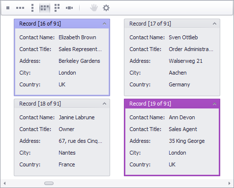
The following example shows how to handle the LayoutView.CustomCardStyle event to change the border color for cards that contain “London” in the City field. The event handler provides different border colors for the focused and non-focused card states.

using DevExpress.XtraGrid.Views.Base;
using DevExpress.XtraGrid.Views.Layout;

private void layoutView1_CustomCardStyle(object sender, DevExpress.XtraGrid.Views.Layout.Events.LayoutViewCardStyleEventArgs e) {
    LayoutView view = sender as LayoutView;
    string city = view.GetRowCellDisplayText(e.RowHandle, colCity);
    if (city != "London") return;
    if ((e.State & GridRowCellState.Focused) != 0)
        e.Appearance.BorderColor = Color.FromArgb(192, 192, 255);
    else
        e.Appearance.BorderColor = Color.MediumOrchid;
}