Focus and Navigation
- 7 minutes to read
This topic explains how to do the following:
- Switch between navigation styles: row, cell, or no input focus.
- Focus rows in code or determine the currently focused row.
- Focus cells in code or determine the cell focused by a user.
- Focus and interact with the Filter Panel.

Navigation
Use the DataViewBase.NavigationStyle property to control how users can move focus in the GridControl:
| Property Value | Description |
|---|---|
| GridViewNavigationStyle.Row | A View allows you to focus and navigate through rows only. |
| GridViewNavigationStyle.Cell (Default) | A View displays the focused row and allows you to focus, navigate and edit cells. |
| GridViewNavigationStyle.None | A View does not allow you to focus rows and cells. |
Note
Use the following techniques to implement full keyboard navigation support when you use a custom CellTemplate:
- If the template contains a BaseEdit class descendant, use the solution from the following topic: Custom In-Place Cell Editors.
- If the template does not include a BaseEdit class descendant, you should Process User Actions manually.
Refer to the following topic for information on end-user navigation: Navigate Through Rows and Cells.
Focus Rows, Nodes, and Cards
Availability
Users can focus rows, nodes, and cards if the DataViewBase.NavigationStyle property is not set to GridViewNavigationStyle.None.
You can handle the DataViewBase.FocusedRowHandleChanging event to prevent users from focusing rows based on a specific condition.
In Code
To identify a focused row, node, or card, use DataControlBase.CurrentItem / DataViewBase.FocusedRowHandle properties. You can also use the TreeListView.FocusedNode property to get or set the focused node.
The following code sample focuses a row that contains the specified cell value:

void Button_Click(object sender, RoutedEventArgs e) {
    FocusRowInGrid();
}

public void FocusRowInGrid() {
    view.FocusedRowHandle = 2;
}
The GridControl provides access to the following methods designed to move focus between cards/rows:
| Method | Description |
|---|---|
| DataViewBase.MoveFirstRow | Moves focus to the first visible row or card within a View. |
| DataViewBase.MovePrevPage | Moves focus backward by the number of rows or cards displayed on screen within a View. |
| DataViewBase.MovePrevRow | Moves focus to the row or card that precedes the currently focused row/card. |
| DataViewBase.MoveNextRow | Moves focus to the row or card that follows the currently focused row/card. |
| DataViewBase.MoveNextPage | Moves focus forward by the number of rows or cards displayed on screen within a View. |
| DataViewBase.MoveLastRow | Moves focus to the last visible row or card within a View. |
| DataViewBase.MoveFocusedRow | Moves focus to the specified row. |
| GridViewBase.MoveParentGroupRow | Moves focus to the group row that owns the currently focused row. |
You cannot use methods mentioned above to focus hidden rows or rows within collapsed groups/detail Views. The DataControlBase.VisibleRowCount property returns the number of visible rows.
The following table lists events that GridControl raises when a focused row is changed:
| Event | Description |
|---|---|
| DataControlBase.CurrentItemChanged | Occurs after each focus movement between cards/rows. The event returns information on both the previous and current focused data items. |
| DataViewBase.FocusedRowHandleChanged | Occurs after the handle of the focused row/card changes. The event returns information on the previous and current focused row handles. |
Related API
When the GridControl is loaded, the first row/card accepts focus. To load the GridControl without input focus, set the DataControlBase.AllowInitiallyFocusedRow property to true.
The GridControl scrolls the active View to display the focused row/card. To disable this behavior, set the DataViewBase.AllowScrollToFocusedRow property to true.
Focus Cells
Availability
To allow users to focus cells, ensure that the DataViewBase.NavigationStyle property is set to GridViewNavigationStyle.Cell (default).
In Code
To identify the focused cell, use DataControlBase.CurrentItem / DataViewBase.FocusedRowHandle and DataControlBase.CurrentColumn properties.
The following code example focuses a cell with the specified value:

void Button_Click(object sender, RoutedEventArgs e) {
    FocusCellInGrid();
}

public void FocusCellInGrid() {
    grid.CurrentColumn = view.VisibleColumns[2];
    view.FocusedRowHandle = 0;
}
Use the following methods to move focus between cells within a row:
| Method | Description |
|---|---|
| DataViewBase.MoveNextCell | Focuses the next cell after the focused cell. |
| DataViewBase.MovePrevCell | Focuses the previous cell before the focused cell. |
Related API
Set the column’s ColumnBase.AllowFocus property to true to prohibit users from focusing this column.
Users can press the Tab key to move focus to the next cell. To exclude a column from the tab order, set the column’s TabStop property to true.
Column Keyboard Actions
Use the keyboard to focus the Data Grid’s column headers and trigger actions related to the focused column. To enable keyboard header navigation, set the TableView.AllowHeaderNavigation property to true. You can navigate to the header panel using Tab and Shift + Tab keys, or arrow keys. In addition, you can press the Ctrl + Shift + Tab shortcut to focus the current cell header. To return to the data row, press Ctrl + Tab. Once a header is focused, you can execute the following commands:
| Action | Keyboard Hotkey |
|---|---|
| Sort the column | Enter |
| Add the column to multi-column sorting | Shift + Enter |
| Exclude the column from multi-column sorting | Ctrl + Enter |
| Open the drop-down filter popup | Alt + ↓ or F4 |
| Reorder the column | Ctrl + ← and Ctrl + → |
| Display the context menu | Shift + F10 or Context Menu ≣ |
| Resize the column | Shift + ← and Shift + → |
Filter Panel Keyboard Actions
Set the DataViewBase.AllowFilterPanelNavigation property
to true to enable keyboard navigation between Filter Panel elements.
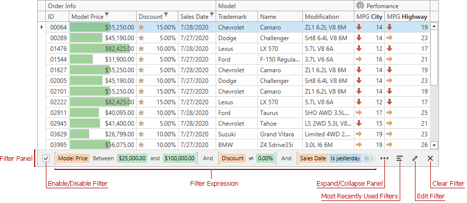
If the DataViewBase.AllowLeaveFocusOnTab property is set to true, you can press Tab, Shift + Tab, or Ctrl + Shift + Tab shortcuts to navigate between data area, column headers, and the Filter Panel. Press the ↑ key to return focus to the data area.
Use the following shortcuts to navigate through Filter Panel elements:
| Focused Element | Action | Keyboard Hotkey |
|---|---|---|
| Enable/Disable Filter check box | Toggle filtering | Space |
| Clear Expression button | Remove the expression | Space or Enter |
| Clear Expression button | Navigate between clear expression buttons | ← and → |
| Most Recently Used Filters button | Open the filter list | Space or Enter |
| Most Recently Used Filters item | Navigate between items | ↑ and ↓ |
| Most Recently Used Filters item | Apply the selected filter | Enter |
| Expand/Collapse button | Expand or collapse the Filter Panel | Space or Enter |
| Edit Filter button | Open the Filter Editor | Space or Enter |
| Clear Filter button | Clear all filter expressions | Space or Enter |
| Anywhere in the grid | Move focus directly to the Filter Panel | Ctrl + Shift + F |
Customize Appearance
The following table lists properties that allow you to customize the appearance of focused rows and cells:
| Property | Description |
|---|---|
| DataViewBase.ShowFocusedRectangle | Gets or sets whether a focus rectangle is painted around the focused cell or row. This is a dependency property. |
| DataViewBase.FocusedCellBorderTemplate | Gets or sets the template that defines the presentation of a focused cell’s border. This is a dependency property. |
| TableView.FocusedRowBorderTemplate / TreeListView.FocusedRowBorderTemplate | Gets or sets the template that defines the presentation of a focused row’s border. This is a dependency property. |
| GridViewBase.FocusedGroupRowBorderTemplate | Gets or sets a template that defines the presentation of the focused group row’s border. This is a dependency property. |
| CardView.FocusedCardBorderTemplate | Gets or sets the template that defines the presentation of a focused card’s border. This is a dependency property. |
| CardView.FocusedCellBorderCardViewTemplate | Gets or sets the template that defines the presentation of a focused cell’s border in a Card View. This is a dependency property. |
| CardView.VerticalFocusedGroupRowBorderTemplate | Gets or sets the border template of the focused group row. This is a dependency property. |
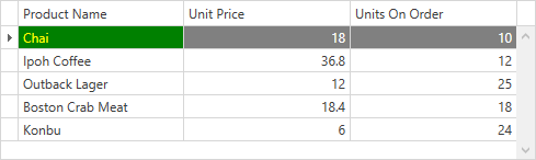
Example
This example uses the View’s RowStyle and CellStyle properties to apply custom styles to focused row and cell. To identify whether the row and cell are focused, use attached IsFocusedRow and IsFocusedCell properties.
<Window ...
        xmlns:dxg="http://schemas.devexpress.com/winfx/2008/xaml/grid">
    <Window.Resources>
        <Style x:Key="FocusedCellStyle" TargetType="dxg:LightweightCellEditor">
            <Style.Triggers>
                <Trigger Property="dxg:DataViewBase.IsFocusedCell" Value="True">
                    <Setter Property="Background" Value="Green"/>
                    <Setter Property="Foreground" Value="Yellow"/>
                </Trigger>
            </Style.Triggers>
        </Style>
        <Style x:Key="FocusedRowStyle" TargetType="dxg:RowControl">
            <Style.Triggers>
                <Trigger Property="dxg:DataViewBase.IsFocusedRow" Value="True">
                    <Setter Property="Background" Value="Gray"/>
                    <Setter Property="Foreground" Value="White"/>
                </Trigger>
            </Style.Triggers>
        </Style>
    </Window.Resources>
    <Grid>
        <dxg:GridControl x:Name="grid" AutoGenerateColumns="AddNew">
            <dxg:GridControl.View>
                <dxg:TableView AutoWidth="True"
                               CellStyle="{StaticResource FocusedCellStyle}"
                               RowStyle="{StaticResource FocusedRowStyle}"/>
            </dxg:GridControl.View>
        </dxg:GridControl>
    </Grid>
</Window>