DataViewBase.IsFocusedCell Attached Property
Gets a value that indicates whether the cell is focused.
Namespace: DevExpress.Xpf.Grid
Assembly: DevExpress.Xpf.Grid.v26.1.Core.dll
Declaration
Returns
| Type | Description |
|---|---|
| Boolean |
|
Example
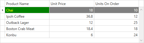
This example uses the View’s RowStyle and CellStyle properties to apply custom styles to focused row and cell. To identify whether the row and cell are focused, use attached IsFocusedRow and IsFocusedCell properties.
<Window ...
        xmlns:dxg="http://schemas.devexpress.com/winfx/2008/xaml/grid">
    <Window.Resources>
        <Style x:Key="FocusedCellStyle" TargetType="dxg:LightweightCellEditor">
            <Style.Triggers>
                <Trigger Property="dxg:DataViewBase.IsFocusedCell" Value="True">
                    <Setter Property="Background" Value="Green"/>
                    <Setter Property="Foreground" Value="Yellow"/>
                </Trigger>
            </Style.Triggers>
        </Style>
        <Style x:Key="FocusedRowStyle" TargetType="dxg:RowControl">
            <Style.Triggers>
                <Trigger Property="dxg:DataViewBase.IsFocusedRow" Value="True">
                    <Setter Property="Background" Value="Gray"/>
                    <Setter Property="Foreground" Value="White"/>
                </Trigger>
            </Style.Triggers>
        </Style>
    </Window.Resources>
    <Grid>
        <dxg:GridControl x:Name="grid" AutoGenerateColumns="AddNew">
            <dxg:GridControl.View>
                <dxg:TableView AutoWidth="True"
                               CellStyle="{StaticResource FocusedCellStyle}"
                               RowStyle="{StaticResource FocusedRowStyle}"/>
            </dxg:GridControl.View>
        </dxg:GridControl>
    </Grid>
</Window>
See Also