DxFormLayoutGroup.HeaderTemplate Property
Specifies the template used to display the group header.
Namespace: DevExpress.Blazor
Assembly: DevExpress.Blazor.v22.1.dll
NuGet Package: DevExpress.Blazor
Declaration
[Parameter]
public RenderFragment HeaderTemplate { get; set; }
Property Value
| Type | Description |
|---|---|
| RenderFragment | A render fragment that declares a group header. |
Remarks
Use the HeaderTemplate property to customize a Form Layout group header. If you use this property, place layout items (group content) in the Items component.
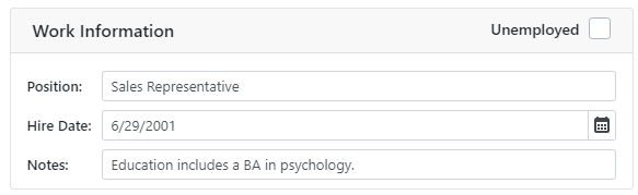
The following code snippet adds a CheckBox to the Form Layout group’s header:
<DxFormLayout>
    <DxFormLayoutGroup ColSpanMd="6">
        <HeaderTemplate>
            <div class="float-left">
                Work Information
            </div>
            <div class="float-right">
                <DxCheckBox CheckedChanged="@((bool t) => UnemployedChanged(t))" LabelPosition="LabelPosition.Left" Checked="@Unemployed">Unemployed</DxCheckBox>
            </div>
        </HeaderTemplate>
        <Items>
            <DxFormLayoutItem Caption="Position:" ColSpanMd="12">
                <DxTextBox @bind-Text="@Position" Enabled="!Unemployed" />
            </DxFormLayoutItem>
            @* ... *@
        </Items>
    </DxFormLayoutGroup>
</DxFormLayout>

@code {
  bool Unemployed { get; set; }
  string? Position { get; set; } = "Sales Representative";
  // ...
  void UnemployedChanged(bool value)
  {
      // ...
      Position = value ? null : Position;
      Unemployed = value;
  }
}
HeaderTemplate has higher priority than the Caption and CaptionCssClass properties. To apply custom CSS classes to the header, use the HeaderCssClass property.
See Also