TFormattedApplicationInfo.DisplayMask Property
Specifies a custom message string with placeholder fields that display corresponding application properties loaded from app resources.
Declaration
property DisplayMask: string read; write;Property Value
| Type | Description |
|---|---|
| string | The message string with placeholder fields that display corresponding application properties. |
Remarks
Use the DisplayMask property to specify label content. To define a multi-line message, use a carriage return/line feed sequence ('#13#10' in Delphi or '\n' in C++Builder).

Design-Time Content Customization
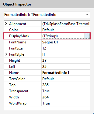
To edit widget content, select a Formatted Info widget in the Splash Form Designer dialog’s Design Pane and click the DisplayMask property’s ellipsis button in the Object Inspector to display the property editor dialog.
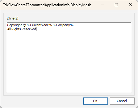
Use the multi-line editor to modify the widget message and click OK to apply pending changes and close the editor.
Placeholder Field Syntax
A string assigned to the DisplayMask property can contain multiple supported placeholder field names enclosed between % characters:
Supported Placeholders/Application Property Keys
| Placeholder Field (Key) | Application Property | Description |
|---|---|---|
%CurrentYear% |
— | Displays the current year using the 'YYYY' mask (2026, for example). |
%Description% |
TProperty.FileDescription | An optional description for the application’s executable file. |
%Product% |
TProperty.ProductName | The product (application) name (Mail Client Demo, for example). |
%Version% |
TProperty.ProductVersion | The current application version number (26.1, for example). |
%Company% |
TProperty.CompanyName | The application developer/publisher name (Developer Express Inc., for example). |
%Copyright% |
TProperty.LegalCopyright | Copyright information. |
%Trademarks% |
TProperty.LegalTrademarks | Information on company trademarks. |
%Comments% |
TProperty.Comments | Optional build-related comments. |
Content Position/Alignment
To position content horizontally and vertically within label widget boundaries, use the Alignment property.
Text Appearance-Related Settings
To change font size, typeface, color and apply supported font attributes to label text, use the following properties:
- FontName
- Specifies the font typeface used to display label text.
- FontSize
- Specifies font size.
- FontStyle
- TextColor
- Specifies label text color (with support for transparency).
Content-Related Properties in Other Label Widgets
- TdxSplashFormBase.TApplicationProperty.Property
- Specifies the source application property for the label widget.
- TdxSplashFormBase.TText.Text
- Specifies label widget content.
Default Value
The DisplayMask property’s default value is DefaultDisplayMask.