Customization in Blazor Charts
- 14 minutes to read
DevExpress Charts for Blazor allow you to customize the appearance of nested/inner components and chart elements. This topic lists available options.
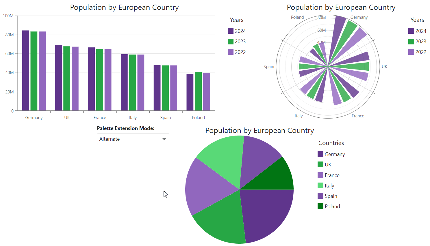
Palette
Blazor Chart components allow you to create a custom palette to colorize chart series or pie sectors. To apply a palette, assign it to the component’s Palette property.
The Palette property accepts the following formats:
- Longhand and shorthand hexadecimal color values:
#ffff00,#ff0. - RGB and RGBA color codes:
rgb(255, 0, 0),rgba(0, 230, 0, 0.3). - HTML color name (case-insensitive):
red,DarkGreen.
When the number of series (for DxChart or DxPolarChart) or series points (for DxPieChart) exceeds the number of palette colors, you can use the component’s PaletteExtensionMode property to extend the palette. Alternate, Blend, and Extrapolate options are available.
The following code snippet applies a two-color palette to chart components and uses the drop-down menu to change the palette extension mode:
<DxChart Data="@DataSource"
         Palette="@Palette"
         PaletteExtensionMode="@ExtensionMode">
    <DxChartBarSeries ArgumentField="@((StatisticPoint v) => v.Country)"
                      ValueField="@((StatisticPoint v) => v.Population24)"
                      Name="2024" />
    <DxChartBarSeries ArgumentField="@((StatisticPoint v) => v.Country)"
                      ValueField="@((StatisticPoint v) => v.Population23)"
                      Name="2023" />
    <DxChartBarSeries ArgumentField="@((StatisticPoint v) => v.Country)"
                      ValueField="@((StatisticPoint v) => v.Population22)"
                      Name="2022" />
    <DxChartTitle Text="Population by European Country" />
    <DxChartLegend Position="RelativePosition.Outside"
                   Orientation="Orientation.Vertical"
                   HorizontalAlignment="HorizontalAlignment.Right">
        <DxChartTitle Text="Years" />
    </DxChartLegend>
</DxChart>

@code {
    IEnumerable<StatisticPoint> DataSource = Enumerable.Empty<StatisticPoint>();
    protected override void OnInitialized() {
        DataSource = GenerateData();
    }
}
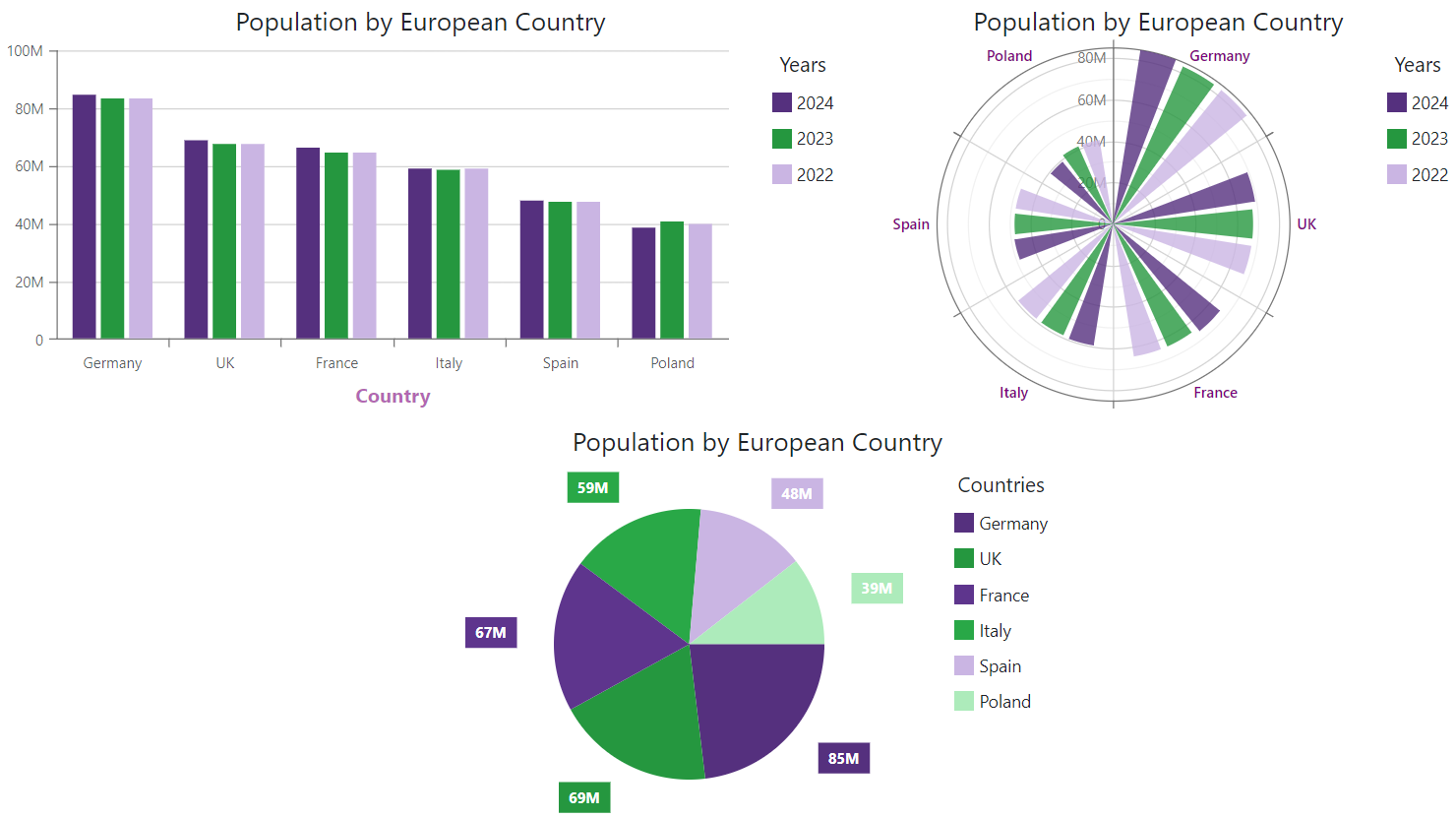
Font Customization
Blazor Charts allow you to customize font setting of multiple chart elements. The table below lists these elements and their corresponding objects.
| Chart Element | DxChart Object | DxPolarChart Object | DxPieChart Object |
|---|---|---|---|
| Axis title | DxChartAxisTitle | N/A | N/A |
| Axis label | DxChartAxisLabel | DxPolarChartAxisLabel | N/A |
| Axis strip label | DxChartAxisStripLabel | N/A | N/A |
| Constant line label | DxChartConstantLineLabel | DxChartConstantLineLabel | N/A |
| Series label | DxChartSeriesLabel | DxChartSeriesLabel | DxChartSeriesLabel |
| Annotation | DxChartAnnotation | N/A | DxPieChartAnnotation |
Add a DxChartFont object to the target component’s markup to access and configure the element’s font settings. The following properties are available:
- Color | Opacity
- Specify the text color and its opacity.
- Family | Weight
- Specify font style settings.
- Size
- Specifies font size.
The following code snippet applies font customizations to several chart elements:
<DxChart>- argument axis title<DxPolarChart>- argument axis labels<DxPieChart>- series labels
<DxChart Data="@DataSource">
    <DxChartBarSeries ArgumentField="@((StatisticPoint v) => v.Country)"
                      ValueField="@((StatisticPoint v) => v.Population24)"
                      Name="2024" />
    <DxChartBarSeries ArgumentField="@((StatisticPoint v) => v.Country)"
                      ValueField="@((StatisticPoint v) => v.Population23)"
                      Name="2023" />
    <DxChartBarSeries ArgumentField="@((StatisticPoint v) => v.Country)"
                      ValueField="@((StatisticPoint v) => v.Population22)"
                      Name="2022" />
    <DxChartArgumentAxis>
        <DxChartAxisTitle Text="Country">
            <DxChartFont Color="purple" Weight="700" Opacity="0.6"/>
        </DxChartAxisTitle>
    </DxChartArgumentAxis>
    <DxChartTitle Text="Population by European Country" />
    <DxChartLegend Position="RelativePosition.Outside"
                   Orientation="Orientation.Vertical"
                   HorizontalAlignment="HorizontalAlignment.Right">
        <DxChartTitle Text="Years" />
    </DxChartLegend>
</DxChart>
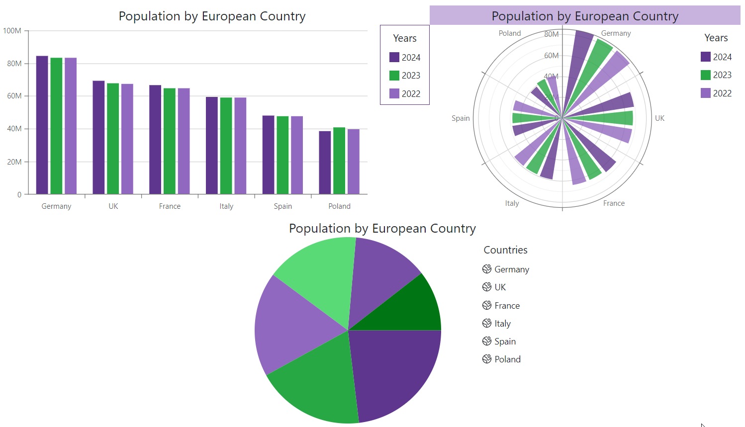
CSS Customization
You can change the appearance of certain chart elements by applying custom CSS classes to them. The table below lists all customizable chart elements and the API properties used for their customization.
| Customizable Element | Property |
|---|---|
| Chart component | DxChartBase.CssClass |
| Legend | DxChartLegend.CssClass |
| Legend item icon | DxChartSeriesLegendItem.IconCssClass |
| Chart title | DxChartTitle.CssClass |
| Chart subtitle | DxChartSubtitle.CssClass |
| Axis title | DxChartAxisTitle.CssClass |
The following code snippet uses CSS classes to customize chart elements:
<DxChart>- legend<DxPolarChart>- chart title<DxPieChart>- legend item icons
<DxChart Data="@DataSource">
    <DxChartBarSeries ArgumentField="@((StatisticPoint v) => v.Country)"
                      ValueField="@((StatisticPoint v) => v.Population24)"
                      Name="2024" />
    <DxChartBarSeries ArgumentField="@((StatisticPoint v) => v.Country)"
                      ValueField="@((StatisticPoint v) => v.Population23)"
                      Name="2023" />
    <DxChartBarSeries ArgumentField="@((StatisticPoint v) => v.Country)"
                      ValueField="@((StatisticPoint v) => v.Population22)"
                      Name="2022" />
    <DxChartTitle Text="Population by European Country" />
    <DxChartLegend Position="RelativePosition.Outside"
                   Orientation="Orientation.Vertical"
                   HorizontalAlignment="HorizontalAlignment.Right"
                   CssClass="chart-legend" >
        <DxChartTitle Text="Years" />
    </DxChartLegend>
</DxChart>
Customize Individual Series Points and Point Labels
Handle the CustomizeSeriesPoint event to customize individual series points or point labels. This event fires for each series point or pie sector in all chart series.
Use the event’s Point argument property to obtain information about the current series point. The following properties are available:
- Point.Argument | Point.Value
- Return the point’s argument and value.
- Point.SeriesName
- Returns the name of the point’s series.
- Point.DataItems
- Returns the point’s data source object.
void OnCustomizeSeriesPoint(ChartSeriesPointCustomizationSettings args) {
    var countryName = args.Point.Argument.ToString();
    var population = string.Format("{0:#,0,, M}", args.Point.Value);
    var seriesName = args.Point.SeriesName;
    var dataItems = args.Point.DataItems;
}
In a CustomizeSeriesPoint event handler, you can also use the following argument properties:
- PointAppearance to access the point’s appearance settings.
- PointLabel to access the point’s label settings.
Refer to the sections below for additional information and examples.
Customize Point Appearance
Handle the CustomizeSeriesPoint event and use its PointAppearance argument property to access and modify appearance settings of individual series points. The following properties are available:
- Color
- Specifies the point’s color.
- Symbol | Size
- Specify the shape and size of the point’s marker.
- Image
- Allows you to access and modify the point’s image settings.
- Visible
- Specifies the point’s visibility.
Note
The PointAppearance.Color argument property affects chart series of all types. Other argument properties do not affect bar-based and pie series.
PointAppearance settings override common point settings defined for all points in a series at the DxChartSeriesPoint component level (for DxChart and DxPolarChart).
The following code snippet changes appearance for points that match the specified condition:
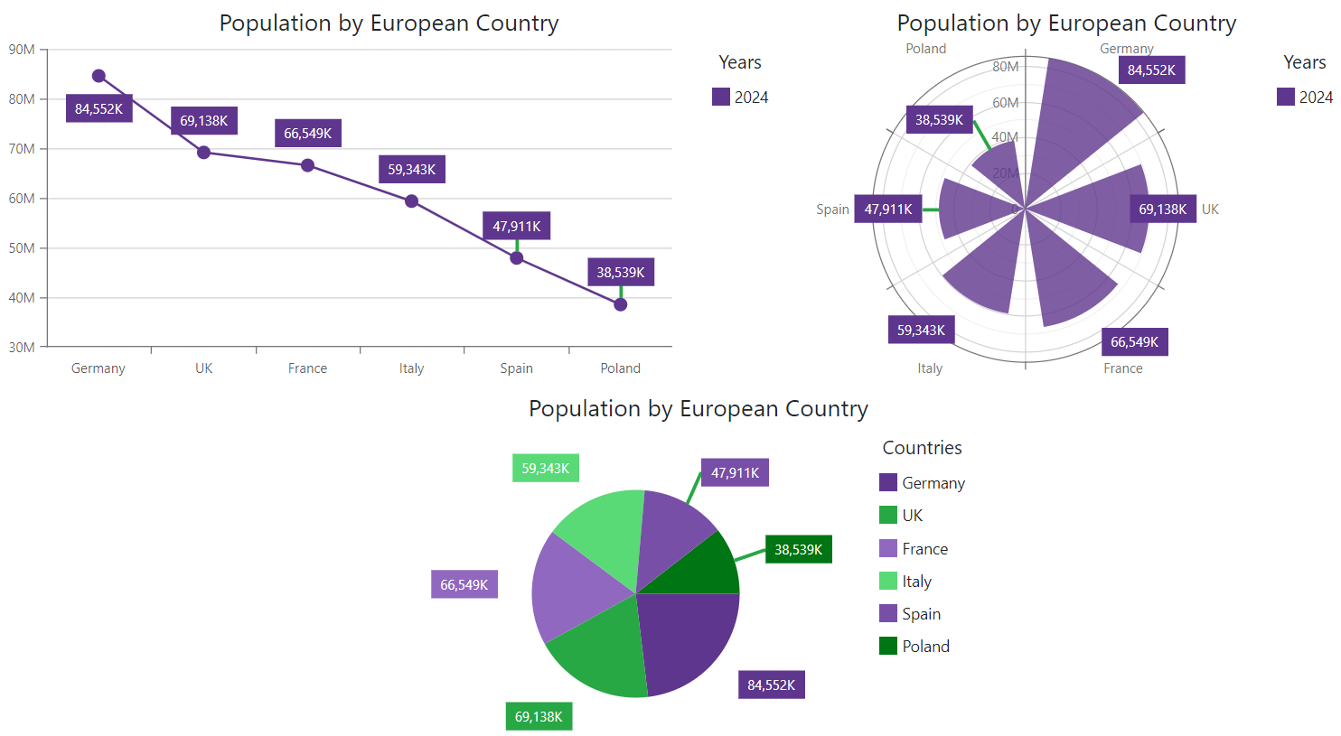
<DxChart>- point marker shape and color<DxPolarChart>,<DxPieChart>- pie sector or bar color
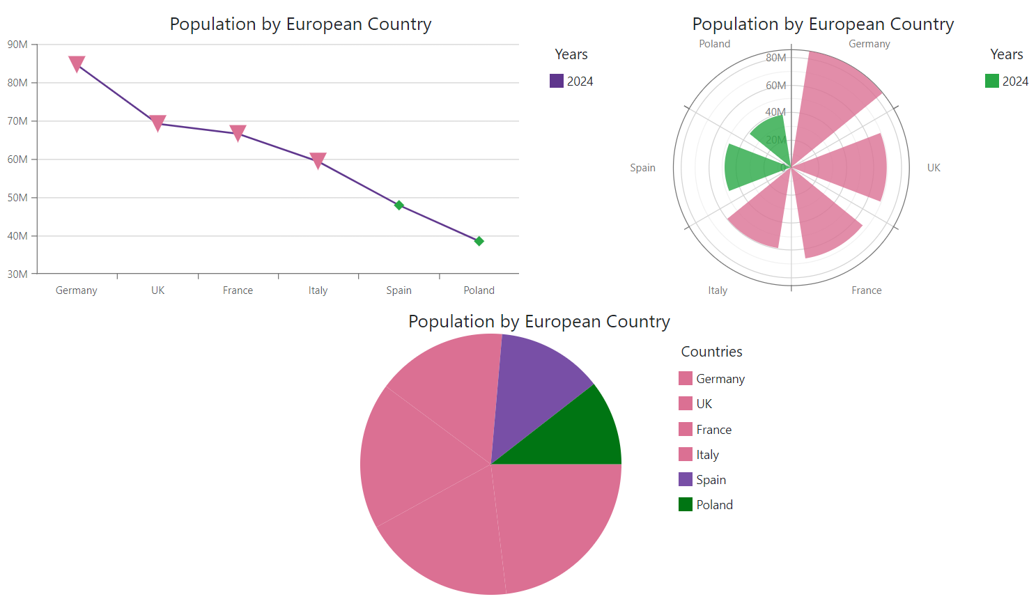
<DxChart Data="@DataSource"
         CustomizeSeriesPoint="@OnCustomizeSeriesPoint">
    <DxChartLineSeries ArgumentField="@((StatisticPoint v) => v.Country)"
                       ValueField="@((StatisticPoint v) => v.Population24)"
                       Name="2024">
        <DxChartSeriesPoint Symbol="ChartPointSymbol.Polygon"
                            Color="@System.Drawing.Color.FromArgb(255, 40, 167, 69)" />
    </DxChartLineSeries>
    <DxChartTitle Text="Population by European Country" />
    <DxChartLegend Position="RelativePosition.Outside"
                   Orientation="Orientation.Vertical"
                   HorizontalAlignment="HorizontalAlignment.Right">
        <DxChartTitle Text="Years" />
    </DxChartLegend>
</DxChart>
Customize Point Images
DxChartSeriesPointImage class configures image settings for all points in a series. Use the PointAppearance.Image argument property in a CustomizeSeriesPoint event handler to access and modify image settings for individual series points. You can change image url, height, and width.
The following code snippet assigns images to series points based on point arguments. Images with the corresponding names are stored in the project’s wwwroot/images folder.
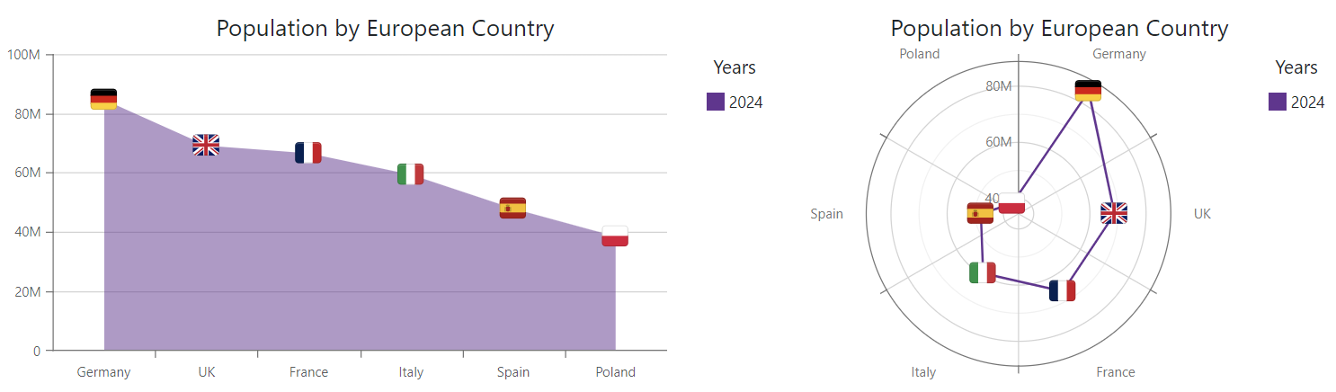
<DxChart Data="@DataSource"
         CustomizeSeriesPoint="@OnCustomizeSeriesPoint">
    <DxChartAreaSeries ArgumentField="@((StatisticPoint v) => v.Country)"
                       ValueField="@((StatisticPoint v) => v.Population24)"
                       Name="2024">
        <DxChartSeriesPoint Visible="true">
            <DxChartSeriesPointImage Height="25" Width="25" />
        </DxChartSeriesPoint>
    </DxChartAreaSeries>
    <DxChartTitle Text="Population by European Country" />
    <DxChartLegend Position="RelativePosition.Outside"
                   Orientation="Orientation.Vertical"
                   HorizontalAlignment="HorizontalAlignment.Right">
        <DxChartTitle Text="Years" />
    </DxChartLegend>
</DxChart>
Customize Point Labels
DxChartSeriesLabel class configures settings of all labels in a series. Use the PointLabel argument property in a CustomizeSeriesPoint event handler to access and modify settings of individual point labels.
Note
Individual label settings have priority over common label settings.
You can modify the following label settings:
- Visible
- Specifies whether series labels are visible.
- ShowForZeroValues
- Specifies whether to show labels for series points with zero values (for bar-based series only).
- BackgroundColor
- Specifies the label’s background color.
- Alignment | Position | HorizontalOffset | VerticalOffset
- Specify series label location.
- RotationAngle
- Specifies the rotation angle of series labels.
- Texts | FormatPattern
- Specify label text and its format.
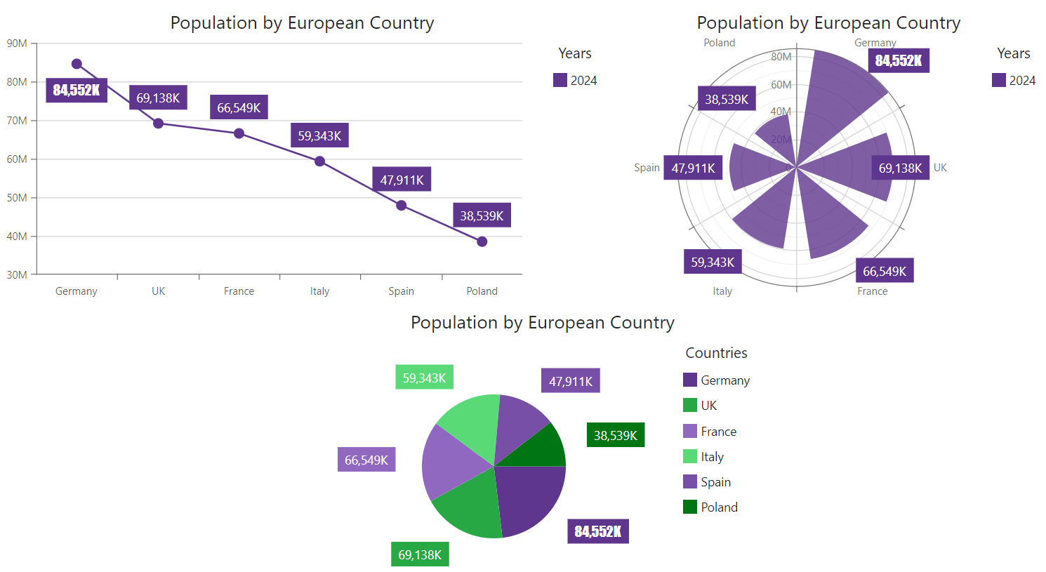
The following code snippet customizes labels for series points that match the specified criterion and hides the remaining point labels:
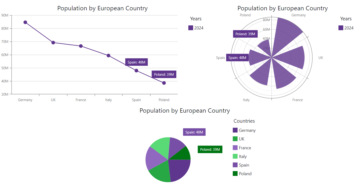
<DxChart Data="@DataSource"
         CustomizeSeriesPoint="@OnCustomizeSeriesPoint">
    <DxChartLineSeries ArgumentField="@((StatisticPoint v) => v.Country)"
                       ValueField="@((StatisticPoint v) => v.Population24)"
                       Name="2024">
        <DxChartSeriesLabel Visible="true" />
    </DxChartLineSeries>
    <DxChartTitle Text="Population by European Country" />
    <DxChartLegend Position="RelativePosition.Outside"
                   Orientation="Orientation.Vertical"
                   HorizontalAlignment="HorizontalAlignment.Right">
        <DxChartTitle Text="Years" />
    </DxChartLegend>
</DxChart>
You can also use PointLabel.Border, PointLabel.Connector, and PointLabel.Font argument properties to access and modify border, connector, and font settings of individual series labels.
Customize Label Borders
DxChartSeriesLabelBorder class configures borders for all labels in a series. Use the PointLabel.Border argument property in a CustomizeSeriesPoint event handler to access and modify border settings of individual labels. You can change the border color, width, line style, and visibility.
The following code snippet adds borders to series labels and customizes the border style for points that match the specified condition:
<DxChart Data="@DataSource"
         CustomizeSeriesPoint="@OnCustomizeSeriesPoint">
    <DxChartLineSeries ArgumentField="@((StatisticPoint v) => v.Country)"
                       ValueField="@((StatisticPoint v) => v.Population24)"
                       Name="2024">
        <DxChartSeriesLabel Visible="true"
                            ValueFormat="ChartElementFormat.Thousands()">
            <DxChartSeriesLabelBorder Visible="true" />
        </DxChartSeriesLabel>
    </DxChartLineSeries>
    <DxChartTitle Text="Population by European Country" />
    <DxChartLegend Position="RelativePosition.Outside"
                   Orientation="Orientation.Vertical"
                   HorizontalAlignment="HorizontalAlignment.Right">
        <DxChartTitle Text="Years" />
    </DxChartLegend>
</DxChart>
Customize Label Connectors
DxChartSeriesLabelConnector class configures connectors for all labels in a series. Use the PointLabel.Connector argument property in a CustomizeSeriesPoint event handler to access and modify connector settings of individual labels. You can change connector color, width, and visibility.
The following code snippet adds connectors to series labels and customizes the connector style based on a condition:
<DxChart Data="@DataSource"
         CustomizeSeriesPoint="@OnCustomizeSeriesPoint">
    <DxChartLineSeries ArgumentField="@((StatisticPoint v) => v.Country)"
                       ValueField="@((StatisticPoint v) => v.Population24)"
                       Name="2024">
        <DxChartSeriesLabel Visible="true"
                            ValueFormat="ChartElementFormat.Thousands()">
            <DxChartSeriesLabelConnector Visible="true" />
        </DxChartSeriesLabel>
    </DxChartLineSeries>
    <DxChartTitle Text="Population by European Country" />
    <DxChartLegend Position="RelativePosition.Outside"
                   Orientation="Orientation.Vertical"
                   HorizontalAlignment="HorizontalAlignment.Right">
        <DxChartTitle Text="Years" />
    </DxChartLegend>
</DxChart>
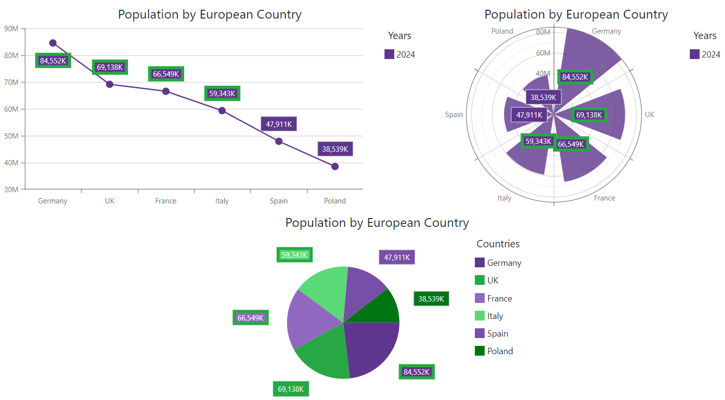
Customize Label Font Settings
DxChartFont class configures font settings for all labels in a series. Use the PointLabel.Font argument property in a CustomizeSeriesPoint event handler to access and modify font settings of individual labels. The following properties are available:
- Color | Opacity
- Specify the text color and its opacity.
- Family | Weight
- Specify font style settings.
- Size
- Specifies font size.
The following code snippet configures label font settings at the DxChartFont component level and customizes label text for points that match the specified criterion:
<DxChart Data="@DataSource"
         CustomizeSeriesPoint="@OnCustomizeSeriesPoint">
    <DxChartLineSeries ArgumentField="@((StatisticPoint v) => v.Country)"
                       ValueField="@((StatisticPoint v) => v.Population24)"
                       Name="2024">
        <DxChartSeriesLabel Visible="true"
                            ValueFormat="ChartElementFormat.Thousands()">
            <DxChartFont Size="14" Weight="400" />
        </DxChartSeriesLabel>
    </DxChartLineSeries>
    <DxChartTitle Text="Population by European Country" />
    <DxChartLegend Position="RelativePosition.Outside"
                   Orientation="Orientation.Vertical"
                   HorizontalAlignment="HorizontalAlignment.Right">
        <DxChartTitle Text="Years" />
    </DxChartLegend>
</DxChart>
Task-Based Examples
This section contains code samples that demonstrate customization options.
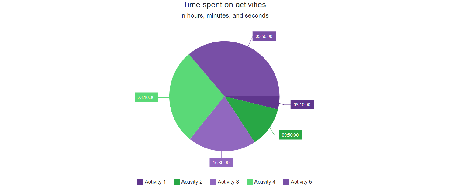
Display TimeSpan Values in Pie Chart Labels
You have a pie chart that renders TimeSpan values in Ticks. The chart automatically displays numbers of ticks in series labels. You want to display series label text in a custom {HH:mm:ss} format.
To complete this task, follow the steps below:
- Handle the CustomizeSeriesPoint event.
- In the handler, use the event’s Point.Value argument property to obtain the point’s value from a data source.
- Cast the point’s value to the DateTime type.
- Assign the new value in the specified format to the PointLabel.Texts argument property.
<DxPieChart T="DataItem"
            CustomizeSeriesPoint="@OnCustomizeSeriesPoint">
    <DxPieChartSeries Data="@Data"
                      ValueField="si => si.TimeSpent.Ticks"
                      ArgumentField="si => si.Activity"
                      SummaryMethod="Enumerable.Sum" >
        <DxChartLegend VerticalAlignment="VerticalEdge.Bottom"
                       Position="RelativePosition.Outside"/>
        <DxChartSeriesLabel Visible="true" >
            <DxChartSeriesLabelConnector Visible="true" />
        </DxChartSeriesLabel>
    </DxPieChartSeries>
</DxPieChart>

@code {
    void OnCustomizeSeriesPoint(ChartSeriesPointCustomizationSettings args) {
        var value = (long)args.Point.Value;
        var dateTime = new DateTime(value);
        args.PointLabel.Texts = new string[] { $"{dateTime.ToString("HH:mm:ss")}" };
    }

    List<DataItem> Data = new List<DataItem>();

    protected override async Task OnInitializedAsync() {
        var list = new List<TimeSpan>();
        var random = new Random();
        for (int i = 1; i < 100; i++) {
            var firstDate = DateTime.Now;
            Data.Add(new DataItem() {
                Activity = "Activity " + ((i / 20) + 1),
                TimeSpent = DateTime.Today.AddMinutes(i) - DateTime.Today
            });
        }
    }

    public class DataItem {
        public string Activity { get; set; }
        public TimeSpan TimeSpent { get; set; }
    }
}