GridControl Class
Displays data from a data source as a table, cards, tiles, or in other formats.
Namespace: DevExpress.XtraGrid
Assembly: DevExpress.XtraGrid.v25.2.dll
NuGet Packages: DevExpress.Win.Grid, DevExpress.Win.Navigation
Declaration
public class GridControl :
    EditorContainer,
    IScrollBarAnnotationsOwner<ScrollAnnotationKind>,
    IScrollBarOwner,
    IPrintableEx,
    IPrintable,
    IBasePrintable,
    IPrintingTarget,
    IPrintHeaderFooter,
    INavigatableControl,
    IToolTipControlClient,
    IDXManagerPopupMenu,
    IViewController,
    IFilteredComponent,
    IFilteredComponentBase,
    IBoundControl,
    ISupportJsonXtraSerializer,
    ISupportXtraSerializer,
    IGestureClient,
    IGuideDescription,
    ISearchControlColumnsClient,
    ISearchControlClient,
    ILogicalOwner,
    ISupportFilterCriteriaDisplayStyle,
IChildAccessibleInfoProviderRemarks
The Data Grid (GridControl) is a container for Views that can display data from a bound list, table, or collection.
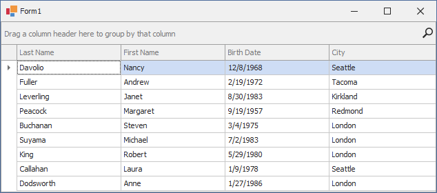
The following help topics give a detailed overview of Data Grid features:
Bind to Data
Use the following API to assign a data source to the GridControl:
API | Description |
|---|---|
Gets or sets the grid control’s data source. | |
Gets or sets a sub-list of the data source whose data is supplied for the grid control’s main View. |
The following code snippet creates a GridControl and binds it to the Employees table of the Northwind database. The GridControl automatically creates columns for data fields.
using System;
using System.Windows.Forms;
using DevExpress.XtraGrid;

namespace DXApplication {
    public partial class Form1 : DevExpress.XtraEditors.XtraForm {
        GridControl gridControl1;
        public Form1() {
            InitializeComponent();
            gridControl1 = new GridControl();
            gridControl1.Dock = DockStyle.Fill;
            this.Controls.Add(gridControl1);
        }

        void Form1_Load(object sender, EventArgs e) {
            employeesTableAdapter.Fill(nwindDataSet.Employees);
            gridControl1.DataSource = employeesBindingSource;
        }
    }
}

Tip
Read the following help topic for a list of supported data sources and step-by-step tutorials: Data Binding.
Read the following step-by-step-tutorials for information on how to bind to specific data types:
- Bind the Grid to ADO.NET Data
- Bind the Grid to Entity Framework Data
- Create and Manage Data in Code and Apply Data Annotation Attributes
- Large Data Sources and Instant Feedback with Server Mode
Assign a View
DevExpress GridControl uses Views to display data from a data source. Views specify the presentation and layout of data records and fields. Views introduce a comprehensive set of edit, display, behavior, and appearance options.
GridControl ships with the following data views:
- Traditional Table (Grid View)
- Banded Grid View
- Advanced Banded Grid View
- Card View
- Carousel (Layout View)
- Windows Explorer View
- Tile View and Kanban Board
- HTML & CSS Templated View (Items View)
GridControl uses a GridView as the default View. Use the MainView property to specify the View. The following code snippet specifies a CardView as the main View:
using System;
using System.Windows.Forms;
using DevExpress.XtraGrid;
using DevExpress.XtraGrid.Views.Card;

namespace DXApplication2 {
    public partial class Form1 : DevExpress.XtraEditors.XtraForm {
        GridControl gridControl1;
        public Form1() {
            InitializeComponent();
            gridControl1 = new GridControl() { Dock = DockStyle.Fill };
            gridControl1.MainView = new CardView();
            this.Controls.Add(gridControl1);
        }

        void Form1_Load(object sender, EventArgs e) {
            employeesTableAdapter.Fill(nwindDataSet.Employees);
            gridControl1.DataSource = employeesBindingSource;
        }
    }
}
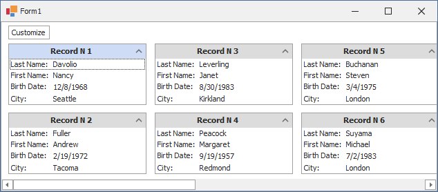
Use the following API to assign and access Views:
API | Description |
|---|---|
Gets or sets the View that displays data at the top hierarchy level. | |
Creates a View of the specified type. | |
Gets the collection of Views currently displayed by the grid control. | |
Provides access to the collection of Views in the grid’s View repository. |
Tip
Read the following help topic for information on how to change the view and customize view settings at design time: Select a View.
Create Columns
The View holds grid columns in the Columns collection. Use the Columns collection to add, remove, and arrange grid columns. The View automatically creates grid columns for all bound data fields if the Columns collection is empty and the AutoPopulateColumns option is enabled.
Read the following help topic for information on how to manage grid columns at design time: Access and Customize Views and Columns at Design Time.
Use the following API to manage grid columns:
API | Description |
|---|---|
Provides access to the collection of columns available for display within the View. | |
Gets or sets whether to create columns automatically for all fields in the underlying data source (when binding the grid and the View does not contain any columns). | |
Clears the |
The following code snippet creates “First Name” and “Last Name” columns:
using System;
using System.Windows.Forms;
using DevExpress.XtraGrid;
using DevExpress.XtraGrid.Columns;
using DevExpress.XtraGrid.Views.Base;

namespace DXApplication {
    public partial class Form1 : DevExpress.XtraEditors.XtraForm {
        GridControl gridControl1;
        public Form1() {
            InitializeComponent();
            gridControl1 = new GridControl() { Dock = DockStyle.Fill };
            // Force the GridControl to initialize its settings.
            gridControl1.ForceInitialize();
            // Add 'FirstName' and 'LastName' columns.
            (gridControl1.MainView as ColumnView).Columns.AddRange(
                new GridColumn[]{
                    new GridColumn() { Name = "colFirstName", FieldName = "FirstName", Visible = true },
                    new GridColumn() { Name = "colLastName", FieldName = "LastName", Visible = true }
                }
            );
            this.Controls.Add(gridControl1);
        }

        void Form1_Load(object sender, EventArgs e) {
            employeesTableAdapter.Fill(nwindDataSet.Employees);
            // Bind the GridControl to data.
            gridControl1.DataSource = employeesBindingSource;

        }
    }
}
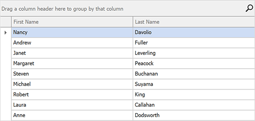
See the following help topic for additional information and examples: Working with Columns in Code.
Tip
GridControl supports unbound columns. Refer to the following help topics for information:
Data Shaping and Aggregation
Grouping
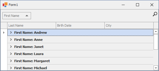
The grouping feature combines data rows with identical column values into groups. This feature is supported in the Grid View and Banded Grid Views.
Refer to the following help topic for more information: Grouping.
This example groups data by three columns. The GroupIndex property value specifies the order in which columns are grouped.
void Form1_Shown(object sender, EventArgs e) {
    gridView1.Columns["FirstName"].GroupIndex = 0;
    gridView1.Columns["BirthDate"].GroupIndex = 1;
    gridView1.Columns["City"].GroupIndex = 2;
}
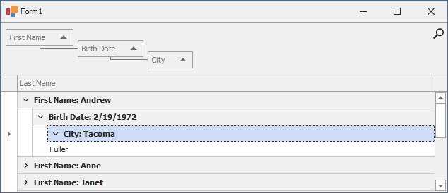
Sorting
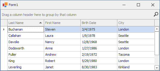
The sorting feature reorders data rows to display values of specific column(s) in ascending, descending, or custom order.
Refer to the following help topic for more information: Sorting.
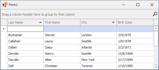
This example sorts data by values in the “Last Name” column. If the “Last Name” column contains identical values, data is sorted further by the “City” column.
using DevExpress.Data;

void Form1_Shown(object sender, EventArgs e) {
    GridColumn colName = gridView1.Columns["LastName"];
    GridColumn colCity = gridView1.Columns["City"];
    colName.SortIndex = 0;
    colName.SortOrder = ColumnSortOrder.Ascending;
    colCity.SortIndex = 1;
    colCity.SortOrder = ColumnSortOrder.Descending;
}
Filtering
The WinForms Grid Control includes a comprehensive set of filter and custom query options. When a filter is applied, the View displays only records that meet the current filter criteria.
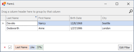
The following code snippet filters the grid to display only data rows in which the “Last Name” column value begins with “D”:
void Form1_Shown(object sender, EventArgs e) {
    gridView1.ActiveFilterString = "[LastName] LIKE 'D%'";
}
Refer to the following help topic for more information: Filter and Search.
Data Aggregation and Summaries
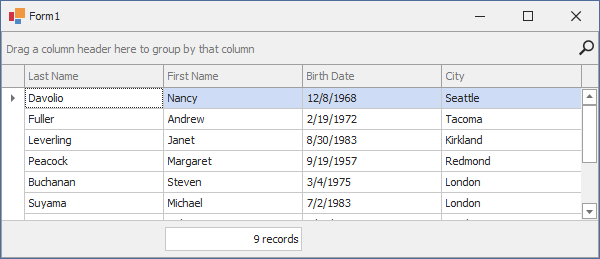
Summaries utilize aggregate functions to display summary information: total record count, minimum values, etc.
The following code snippet creates a total summary item:
// Create a summary item.
GridColumnSummaryItem siTotal = new GridColumnSummaryItem() {
    SummaryType = DevExpress.Data.SummaryItemType.Count,
    DisplayFormat = "{0} records"
};
// Associate the summary item with the 'FirstName' column.
gridView1.Columns["FirstName"].Summary.Add(siTotal);
// Display the GridView's footer.
gridView1.OptionsView.ShowFooter = true;
Refer to the following help topic for more information and examples: Summaries.
Data Editing
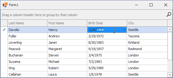
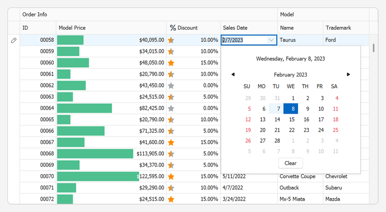
The Grid Control allows you to incorporate various data editors within grid cells. Users can edit cell values in-place or in a separate edit form.
The following table lists common editing-related tasks and corresponding help topics:
Task | Help topic |
|---|---|
Get/set cell values in code | |
Assign cell editors | |
Add/remove rows | |
Edit data in a separate form | |
Error-free user input | |
Post changes to the database | |
Edit an unbound column |
This example creates a ToggleSwitch repository item and assigns it to the “Mark” column.
    // Creates a 'ToggleSwitch' repository item.
    RepositoryItemToggleSwitch edit = new RepositoryItemToggleSwitch();
    // Adds the repository item to the grid's RepositoryItems collection.
    gridControl.RepositoryItems.Add(edit);
    // Assigns the repository item to the 'Mark' column.
    gridView.Columns["Mark"].ColumnEdit = edit;
Refer to the following help topic for more information: Edit Data. Create Cell Editors. Validate User Input.
Master-Detail Presentation
The Grid Control supports master-detail data presentation with any number of nesting levels and any number of details at each level. Detail views can display any type of information.
Design Time
Read the following help topic for information on how to create and manage master-detail relationships at design time: Master-Detail Relationships.
In Code
The following help topic describes how to create and manage master-detail relationships in code: Working with Master-Detail Relationships in Code.
Appearance
Design Time
The following help topics describe how to change the appearance of various Grid elements at design time:
In Code
Read the following help topic for a list of related API and examples: Appearance and Conditional Formatting.
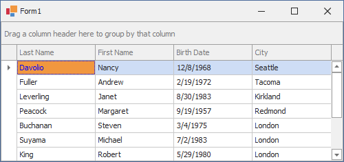
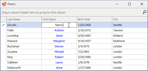
This example changes text alignment and sets a blue text color for cells in the “First Name” column.
using DevExpress.Utils;

void Form1_Shown(object sender, EventArgs e) {
        gridView1.Columns["FirstName"].AppearanceCell.TextOptions.HAlignment = HorzAlignment.Center;
        gridView1.Columns["FirstName"].AppearanceCell.Options.UseTextOptions = true;
        gridView1.Columns["FirstName"].AppearanceCell.ForeColor = Color.Blue;
}
Export and Printing
The following help topics describe different aspects of print and export:
- Printing Overview
- Member Table: Printing
- Export Overview
- Export to XLS and XLSX Formats
- Export Methods and Settings
- Advanced Grid Printing and Exporting
- Document Post-Processing
- Clipboard
Examples
- Data Binding
- Data Editing
- Data Representation
- Export and Printing
- Filtering Records
- Formatting Values
- General Use
- Master-Detail Mode
- Miscellaneous
- Navigation and Selection
- Painting
- Skins and Look and Feel
- Sorting and Grouping Data
- Calculating Summaries
Get More Information
More examples and articles on this product can be found on our website. Access our Support Center to find related articles in our online Knowledge Base.
