Printing Overview
- 5 minutes to read
The Grid Control provides methods for printing displayed data, showing a preview window and invoking a print dialog. This topic demonstrates how to customize the printed version of the Grid Control, and lists ways with which the grid control can be printed. This topic consists of the following subsections.
Note
Custom painting, alpha blending and color gradient features are not supported in the grid control’s printout.
Note
In Large Data Sources: Server and Instant Feedback Modes, a print/export document is not regenerated each time it is sent to the print/export output. This means that if a print/export document has been generated and it’s not empty, subsequent changes to the grid’s layout (changing filter, sort and group settings, modifying cell values, etc.) are not applied when you send the grid’s data to the print/export output the next time. To apply the changes made, call the BaseView.CreateDocument method before sending the grid’s data to the print/export output.
Printing Basics
Although the Grid Control provides direct methods for printing displayed data, these methods delegate the printing functionality to the DevExpress Printing Library. If this library cannot be found, the printing and export functionality is not available. To ensure that Grid Control printing/exporting is permitted, check the GridControl.IsPrintingAvailable property’s value.
To print data from the Grid Control, use the following methods.
| Member | Description |
|---|---|
| GridControl.Print | Prints the grid control’s GridControl.DefaultView (the GridControl.MainView or the currently maximized detail View) without showing a print preview or print dialog. |
| GridControl.PrintDialog | Displays the standard Print dialog to print the data displayed in the Grid Control’s GridControl.DefaultView. |
| GridControl.ShowPrintPreview | Opens the Print Preview window with a Bars UI. |
| GridControl.ShowRibbonPrintPreview | Displays the Print Preview window with a Ribbon UI. |
These methods print and show a print preview of the data displayed by the Grid Control’s Default View (the GridControl.MainView or the currently maximized detail View).
A detail View can be printed as follows:
- along with the Main View, if you expand this detail and enable the GridOptionsPrint.PrintDetails option;
- separately from the Main View, if you zoom to (maximize) this detail. See Master-Detail Relationships to learn more.
The following example shows how to preview grid data.
private void ShowGridPreview(DevExpress.XtraGrid.GridControl grid) {
   // Check whether or not the Grid Control can be printed.
   if(!grid.IsPrintingAvailable) {
      MessageBox.Show("The 'DevExpress.XtraPrinting' Library is not found", "Error");
      return;
   }
   // Opens the Preview window.
   grid.ShowPrintPreview();
}
The image below illustrates the Preview window for a sample grid.
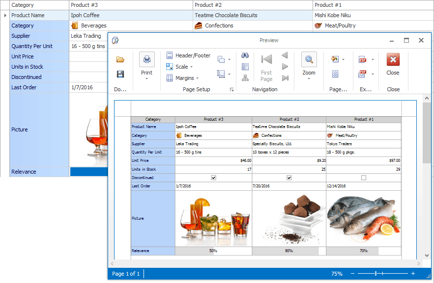
Refer to the XtraPrinting Library documentation for more information on the functionality provided by the print preview window.
To customize general print/export settings (e.g., page orientation and margins), handle the BaseView.PrintInitialize event.
Modifying Print Appearances
By default, a printed grid utilizes the same appearances as when it is displayed onscreen (these appearance settings can be customized for each View using the BaseView.Appearance property).
However, each View provides print appearances used to paint the View’s visual elements (buttons, headers, cells, etc.) in print output.
To use print appearances instead of display appearances when the grid is printed, set the View’s OptionsPrint.UsePrintStyles option to true.
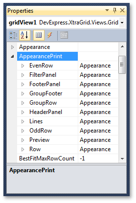
Use the View’s BaseView.AppearancePrint object to adjust print appearances. This object provides multiple properties with which you can specify the appearance settings for various View elements (for Grid Views - data and group rows, even and odd data rows, filter panel, footer panel, etc.; for Card Views - card caption, field value, etc.).
The following image illustrates the print appearances for a Grid View in the Properties window.
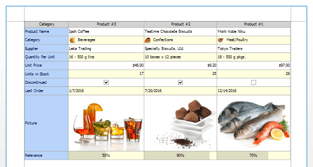
The code below shows how to enable print appearances and customize the background color of even rows.
gridView1.OptionsPrint.UsePrintStyles = true;
// Enable AppearancePrint.EvenRow property settings.
gridView1.OptionsPrint.EnableAppearanceEvenRow = true;
// Set the background color for even rows.
gridView1.AppearancePrint.EvenRow.BackColor = Color.LightYellow;
The result is displayed in the image below.
The printing appearances can also be customized in the Print Appearances Page of the Grid Designer.
Printing Options
Each View provides a set of options that specify the View elements to be printed, as well as the appearance settings to be used to paint these elements when the grid control is printed. These options can be accessed as follows.
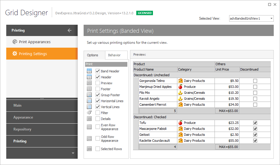
At design time, using the Print Settings Page of the Grid Designer.
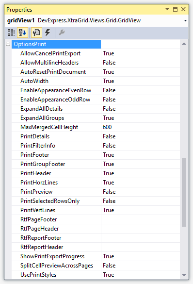
At design time and in code, with the OptionsPrint property (see GridView.OptionsPrint, BandedGridView.OptionsPrint and CardView.OptionsPrint, LayoutView.OptionsPrint and TileView.OptionsPrint).
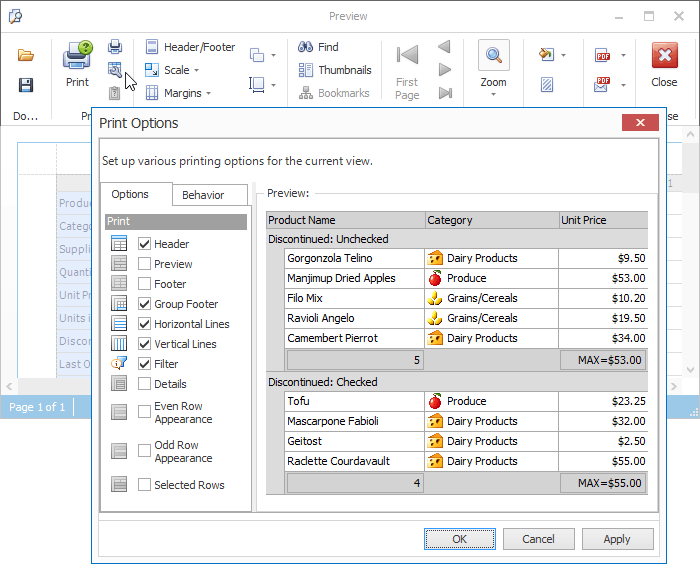
By an end-user at runtime, in the Print Options dialog invoked by clicking the “Options” menu command in the Preview window.
