TcxButtonImageOptions.SVGOptions Property
Provides access to SVG image list settings.
Declaration
property SVGOptions: TcxImageListSVGOptions read; write;Property Value
| Type | Description |
|---|---|
| TcxImageListSVGOptions | Stores SVG image list settings. |
Remarks
You can use the SVGOptions property to define individual glyph dimensions for the button when it displays an SVG image stored in an image list assigned to the Images property. The SVGOptions property can be useful if you use a single image list populated with vector icons for all UI elements in an application.
Note
The SVGOptions property has no effect on:
- Any bitmap images (bitmaps always have fixed dimensions).
- An SVG image loaded using the Glyph property.
Available Options
Use the SVGOptions.LargeSize property to specify required dimensions for the button glyph assigned using Images and ImageIndex properties. To apply new SVG glyph dimensions to the button, set the SVGOptions.UseRegularAsLarge property to True.
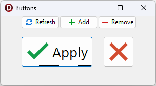
Code Example: Create Buttons with Different-Sized SVG Glyphs
The following code example creates five buttons with different-sized SVG glyphs using a single image list as a glyph source:
uses
  cxButtons,  // Declares the TcxButton class and related types
  cxGraphics;  // Declares the TcxImageList class and related types
// ...

procedure TMyForm.FormCreate(Sender: TObject);
var
  AButton: TcxButton;
  ALargeGlyphSettings: TcxButtonImageOptions;
begin
  AButton := TcxButton.Create(Self);  // Creates the large "Apply" button
  AButton.Parent := Self;  // Associates the created button with the form
  AButton.Caption := 'Apply';
  AButton.Font.Size := 20;
  // Position the button
  AButton.Top := 40;
  AButton.Left := 40;
  AButton.Height := 60;
  AButton.Width := 140;
  // Assign a glyph and configure related settings
  ALargeGlyphSettings := AButton.OptionsImage;
  ALargeGlyphSettings.Images := cxImageList1;
  ALargeGlyphSettings.ImageIndex := 0;
  ALargeGlyphSettings.SVGOptions.UseRegularAsLarge := True;
  ALargeGlyphSettings.SVGOptions.LargeSize.Width := 48;
  ALargeGlyphSettings.SVGOptions.LargeSize.Height := 48;
  AButton := TcxButton.Create(Self);  // Creates the large "Cancel" button
  AButton.Parent := Self; // Associates the created button with the form
  // Position the button
  AButton.Top := 40;
  AButton.Left := 200;
  AButton.Height := 60;
  AButton.Width := 60;
  AButton.PaintStyle := bpsGlyph;
  // Assign a glyph and configure related settings
  AButton.OptionsImage.Assign(ALargeGlyphSettings);  // Copies common settings from the "Apply" button
  AButton.OptionsImage.ImageIndex := 1;  // Assigns a different glyph from the source image list
  AButton := TcxButton.Create(Self);  // Creates the small "Refresh" button
  AButton.Parent := Self;  // Associates the created button with the form
  AButton.Caption := 'Refresh';
  AButton.Left := 40;  // Positions the button
  AButton.OptionsImage.Images := cxImageList1;
  AButton.OptionsImage.ImageIndex := 2;
  AButton := TcxButton.Create(Self);  // Creates the small "Add" button
  AButton.Parent := Self;  // Associates the created button with the form
  AButton.Caption := 'Add';
  AButton.Left := 115;  // Positions the button
  AButton.OptionsImage.Images := cxImageList1;
  AButton.OptionsImage.ImageIndex := 3;
  AButton := TcxButton.Create(Self); // Creates the small "Remove" button
  AButton.Parent := Self;  // Associates the created button with the form
  AButton.Caption := 'Remove';
  AButton.Left := 190;  // Positions the button
  AButton.OptionsImage.Images := cxImageList1;
  AButton.OptionsImage.ImageIndex := 4;
end;