TcxCustomButton Class
The base class for the TcxButton component.
Declaration
TcxCustomButton = class(
    TCustomButton,
    IdxSkinSupport,
    IcxLookAndFeelContainer,
    IdxFadingObject,
    IdxFormattedTextOwner,
    IdxScaleFactor,
    IdxAdornerTargetElement,
    IdxAdornerRootTargetElement,
    IdxAutomationElement,
    IcxHintableObject,
    IcxHintableObject2
)
Remarks
TcxButton is an advanced DevExpress counterpart of the standard TButton component shipped with the VCL library.
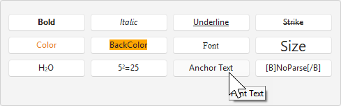
Standard Button Mode
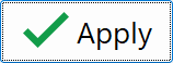
The TcxButton component can display both a caption and a glyph as well as execute an associated command on a click (in Standard and Command Link modes):
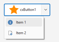
Drop-Down Button Modes
Alternatively, the button can display an associated drop-down menu (in any of the three supported drop-down modes):
Speed Button Mode
In addition, you can use the SpeedButtonOptions.GroupIndex property to define a button as part of a TcxButton group (similar to the standard TSpeedButton component shipped with the VCL library):

Main API Members
The list below outlines key members of the TcxCustomButton class. These members allow you to configure button appearance and behavior.
Appearance-Related APIs
- Caption
- Specifies a caption for the button. Supports BBCode-inspired markup tags.
- Description
- Specifies a description for the button (in Command Link and Office Drop Down modes only). Supports BBCode-inspired markup tags.
- FormattedText
- Provides access to settings and events that allow you to configure the appearance and behavior of button caption and description formatted using BBCode-inspired markup tags.
- LookAndFeel
- Provides access to look & feel settings (at the component level).
- OnCustomDraw
- Allows you to override or complement built-in draw routines for the button.
- OptionsImage
- Provides access to all button glyph-related settings (the button can display a glyph only if the PaintStyle property is set to bpsDefault or bpsGlyph).
- PopupAlignment
- Specifies menu alignment (if the Kind property is set to cxbkDropDown, cxbkDropDownButton, or cxbkOfficeDropDown).
Button Usage Modes
- Kind
- Specifies the selected button type (according to the target purpose).
- PaintStyle
- Specifies the active content display mode.
- SpeedButtonOptions
- Provides access to speed button options. You can use the SpeedButtonOptions.GroupIndex property to use the button as a standard TSpeedButton component (that is, as part of a button group).
User Interaction APIs
- Automation
Provides access to UI Automation and accessibility-related settings.
Tip
Use Automation.Name, Automation.Description, and other API members to specify information visible to third-party assistive tools as UIA node properties.
- DropDownMenu
- Allows you to associate the button with a drop-down menu component. The button can display a drop-down menu only if the Kind property is set to cxbkDropDown, cxbkDropDownButton, or cxbkOfficeDropDown.
- OnClick
- Allows you to respond to a click on the button. You can set the RepeatClick property to
Trueto raise the OnClick event repeatedly while the button is pressed. - OnDropDownMenuPopupEx
- Allows you to customize the associated drop-down menu before it is displayed.
- RepeatClick
- Specifies if the button generates OnClick events repeatedly at regular intervals while pressed.
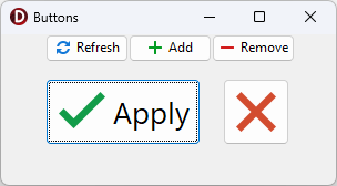
Code Example: Create Buttons with Different-Sized SVG Glyphs
The following code example creates five buttons with different-sized SVG glyphs using a single image list as a glyph source:
uses
  cxButtons,  // Declares the TcxButton class and related types
  cxGraphics;  // Declares the TcxImageList class and related types
// ...

procedure TMyForm.FormCreate(Sender: TObject);
var
  AButton: TcxButton;
  ALargeGlyphSettings: TcxButtonImageOptions;
begin
  AButton := TcxButton.Create(Self);  // Creates the large "Apply" button
  AButton.Parent := Self;  // Associates the created button with the form
  AButton.Caption := 'Apply';
  AButton.Font.Size := 20;
  // Position the button
  AButton.Top := 40;
  AButton.Left := 40;
  AButton.Height := 60;
  AButton.Width := 140;
  // Assign a glyph and configure related settings
  ALargeGlyphSettings := AButton.OptionsImage;
  ALargeGlyphSettings.Images := cxImageList1;
  ALargeGlyphSettings.ImageIndex := 0;
  ALargeGlyphSettings.SVGOptions.UseRegularAsLarge := True;
  ALargeGlyphSettings.SVGOptions.LargeSize.Width := 48;
  ALargeGlyphSettings.SVGOptions.LargeSize.Height := 48;
  AButton := TcxButton.Create(Self);  // Creates the large "Cancel" button
  AButton.Parent := Self; // Associates the created button with the form
  // Position the button
  AButton.Top := 40;
  AButton.Left := 200;
  AButton.Height := 60;
  AButton.Width := 60;
  AButton.PaintStyle := bpsGlyph;
  // Assign a glyph and configure related settings
  AButton.OptionsImage.Assign(ALargeGlyphSettings);  // Copies common settings from the "Apply" button
  AButton.OptionsImage.ImageIndex := 1;  // Assigns a different glyph from the source image list
  AButton := TcxButton.Create(Self);  // Creates the small "Refresh" button
  AButton.Parent := Self;  // Associates the created button with the form
  AButton.Caption := 'Refresh';
  AButton.Left := 40;  // Positions the button
  AButton.OptionsImage.Images := cxImageList1;
  AButton.OptionsImage.ImageIndex := 2;
  AButton := TcxButton.Create(Self);  // Creates the small "Add" button
  AButton.Parent := Self;  // Associates the created button with the form
  AButton.Caption := 'Add';
  AButton.Left := 115;  // Positions the button
  AButton.OptionsImage.Images := cxImageList1;
  AButton.OptionsImage.ImageIndex := 3;
  AButton := TcxButton.Create(Self); // Creates the small "Remove" button
  AButton.Parent := Self;  // Associates the created button with the form
  AButton.Caption := 'Remove';
  AButton.Left := 190;  // Positions the button
  AButton.OptionsImage.Images := cxImageList1;
  AButton.OptionsImage.ImageIndex := 4;
end;
Direct TcxCustomButton Class Descendant
Do not use the TcxCustomButton class directly. Use the TcxButton component instead.