TcxButtonImageOptions Class
Stores image-related button settings.
Declaration
TcxButtonImageOptions = class(
    TcxButtonCustomPersistent
)
Remarks
A TcxButton component can display a glyph in addition to (or instead of) a caption if the component’s PaintStyle property is set to bpsDefault or bpsGlyph.

Main API Members
The list below outlines key members of the TcxButtonImageOptions class. These members allow you to display a glyph within a TcxButton component and configure all image and content layout-related settings.
Image Source Settings
- Glyph
Specifies a glyph for the button. Alternatively, you can use Images and ImageIndex properties to display a glyph within the button.
Note
The Glyph property has priority over Images and ImageIndex properties.
- ImageIndex
- Allows you to display an image within the Images list (as the button glyph).
- Images
- Specifies an image source for the button glyph.
- NumGlyphs
- Specifies the number of glyphs stored within an image loaded using the Glyph property. You can use this property to define different glyphs for the following button states: Normal, Disabled, Clicked, and Down/Pressed.
- SVGOptions
- Provides access to SVG image-related options that affect an image list assigned to the Images property.
Button Layout Settings
- Layout
- Allows you to switch between four predefined button glyph and caption arrangement options.
- Margin
- Specifies the distance between the displayed glyph and the nearest button border.
- Spacing
- Specifies the distance between the displayed glyph and the button caption.
General-Purpose API Members
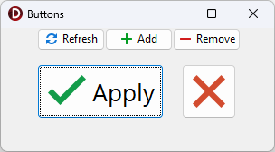
Code Example: Create Buttons with Different-Sized SVG Glyphs
The following code example creates five buttons with different-sized SVG glyphs using a single image list as a glyph source:
uses
  cxButtons,  // Declares the TcxButton class and related types
  cxGraphics;  // Declares the TcxImageList class and related types
// ...

procedure TMyForm.FormCreate(Sender: TObject);
var
  AButton: TcxButton;
  ALargeGlyphSettings: TcxButtonImageOptions;
begin
  AButton := TcxButton.Create(Self);  // Creates the large "Apply" button
  AButton.Parent := Self;  // Associates the created button with the form
  AButton.Caption := 'Apply';
  AButton.Font.Size := 20;
  // Position the button
  AButton.Top := 40;
  AButton.Left := 40;
  AButton.Height := 60;
  AButton.Width := 140;
  // Assign a glyph and configure related settings
  ALargeGlyphSettings := AButton.OptionsImage;
  ALargeGlyphSettings.Images := cxImageList1;
  ALargeGlyphSettings.ImageIndex := 0;
  ALargeGlyphSettings.SVGOptions.UseRegularAsLarge := True;
  ALargeGlyphSettings.SVGOptions.LargeSize.Width := 48;
  ALargeGlyphSettings.SVGOptions.LargeSize.Height := 48;
  AButton := TcxButton.Create(Self);  // Creates the large "Cancel" button
  AButton.Parent := Self; // Associates the created button with the form
  // Position the button
  AButton.Top := 40;
  AButton.Left := 200;
  AButton.Height := 60;
  AButton.Width := 60;
  AButton.PaintStyle := bpsGlyph;
  // Assign a glyph and configure related settings
  AButton.OptionsImage.Assign(ALargeGlyphSettings);  // Copies common settings from the "Apply" button
  AButton.OptionsImage.ImageIndex := 1;  // Assigns a different glyph from the source image list
  AButton := TcxButton.Create(Self);  // Creates the small "Refresh" button
  AButton.Parent := Self;  // Associates the created button with the form
  AButton.Caption := 'Refresh';
  AButton.Left := 40;  // Positions the button
  AButton.OptionsImage.Images := cxImageList1;
  AButton.OptionsImage.ImageIndex := 2;
  AButton := TcxButton.Create(Self);  // Creates the small "Add" button
  AButton.Parent := Self;  // Associates the created button with the form
  AButton.Caption := 'Add';
  AButton.Left := 115;  // Positions the button
  AButton.OptionsImage.Images := cxImageList1;
  AButton.OptionsImage.ImageIndex := 3;
  AButton := TcxButton.Create(Self); // Creates the small "Remove" button
  AButton.Parent := Self;  // Associates the created button with the form
  AButton.Caption := 'Remove';
  AButton.Left := 190;  // Positions the button
  AButton.OptionsImage.Images := cxImageList1;
  AButton.OptionsImage.ImageIndex := 4;
end;
Direct TcxButtonImageOptions Class Reference
The TcxCustomButton.OptionsImage property references a TcxButtonImageOptions object.