AccordionControl.GroupContextButtons Property
Stores context buttons, shared among all AccordionControl groups.
Namespace: DevExpress.XtraBars.Navigation
Assembly: DevExpress.XtraBars.v25.2.dll
NuGet Package: DevExpress.Win.Navigation
Declaration
Property Value
| Type | Description |
|---|---|
| AccordionContextItemCollection | A DevExpress.Utils.ContextItemCollection object that stores context buttons, displayed by any group element within this AccordionControl. |
Remarks
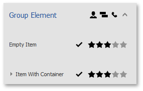
AccordionControl can display context buttons for items and groups. These buttons are stored within the AccordionControl.ItemContextButtons and AccordionControl.GroupContextButtons collections respectively. The figure below illustrates different context button sets for accordion items and groups.

Context buttons can be of four main types:
- AccordionContextButton - simple push button (see ContextButton);
- AccordionCheckContextButton - check buttons, checked or cleared with a click (see CheckContextButton);
- AccordionRatingContextButton - RatingControl-based button that allows your end-users to rate specific content (see RatingContextButton);
- AccordionTrackBarContextButton - TrackBarControl-based button (see TrackBarContextButton).
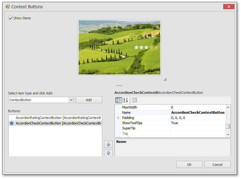
At design-time, modifying context button collections invokes the Context Button Editor that simplifies creating buttons of the required type and modifying their properties (see the figure below).

If you need to hide specific context buttons from individual accordion elements or modify particular buttons in any other manner, handle the AccordionControl.ContextButtonCustomize event. See the event description for an example.
Accordion elements may also display any control within their header area if this control is assigned to the element’s HeaderControl property. This control does not replace context buttons, meaning both of them can be simultaneously displayed.