Ribbon Control
- 5 minutes to read
The RibbonControl is the main part of the Ribbon UI, designed to replace the toolbars and menus with tabbed pages. Each page contains various elements (buttons, sub-menus, in-place editors, galleries, etc.) that are combined into one or multiple groups.
Ribbon Window
The Ribbon Control is usually placed at the top of a window. We recommend that you use the ThemedWindow which supports integration with the Ribbon Control instead of the Window class.

Ribbon Control Elements
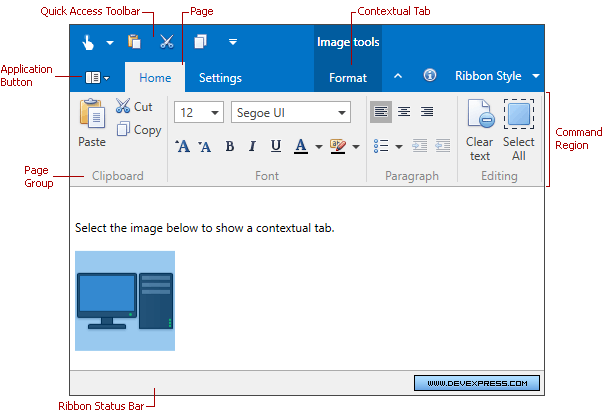
The Ribbon Control consists of the following regions:
- Command Region - Displays various bar items (buttons, sub-menus, in-place editors, galleries, and so on) that are combined into groups and pages.
- Ribbon Header (the area above the Command Region) - Contains the Ribbon Title Bar, page headers, and the Application Button. The RibbonHeaderVisibility property specifies whether to display the Ribbon Header.
- Ribbon Title Bar - Contains the Quick Access Toolbar and category headers. The RibbonTitleBarVisibility property specifies whether to display the Title Bar.
- Quick Access Toolbar - Displays frequently used commands. Users can use context menus to add commands to this bar at runtime.
- Application Button - Invokes a menu for the application.
- Page Header Button - Displays/hides a navigation pane or another top-level UI element.
In addition, you can create a Ribbon Status Bar at the bottom of the window. This bar is painted to concur with the RibbonControl’s look and feel. You can add commands to this status bar, aligning them to the bar’s left and right edges.
Structurally, a RibbonControl consists of page categories, which are containers of ribbon pages. There are two types of page categories:
- Default Page Category - It is designed to display default pages, which are typically always visible during application runtime. Unlike a custom category, the default category does not support a caption. The default page is never visible, only its contents are displayed. In the image above, the Home and Settings pages belong to the default page category.
- Custom Page Category - This category is designed to implement contextual ribbon pages, which can be temporarily made visible according to some logic. Captions are displayed for custom page categories. In addition, custom page categories and category pages’ headers are painted in a different manner than the default page headers. See Ribbon Page Categories and Contextual Pages to learn more.
A page category contains pages as children, which are represented as tabs. An end-user can click a tab to access the commands displayed in it.
Ribbon pages consist of page groups. These visually divide all bar items into logical groups within each tab.
For details on each individual ribbon element, see the corresponding topics.
- Populating Ribbon
- Ribbon Page Group
- Ribbon Page
- Ribbon Page Categories and Contextual Pages
- Ribbon Quick Access Toolbar
Ribbon Layout
The Ribbon Control includes a smart layout that uses the available space to display as much information as possible (items, captions, etc.). For instance, if a page is stretched and has no place to display all available items, it automatically includes a button that displays sub-items in a drop-down panel.
Simplified Mode
The Ribbon Control’s Simplified Mode is an Office 2019-inspired single-line Ribbon mode.
You can use Simplified mode in the Office2007, Office2010, and Office2019 ribbon styles.
Availability
Follow the steps below to enable Simplified mode:
- Set the AllowSimplifiedRibbon property to
true. - Click the Ribbon minimization button or set the IsSimplified property to
true.
The following code snippet enables the Ribbon’s Simplified mode:
<dx:ThemedWindow x:Class="SimplifiedRibbon.MainWindow"
 ...
xmlns:dx="http://schemas.devexpress.com/winfx/2008/xaml/core"
xmlns:dxb="http://schemas.devexpress.com/winfx/2008/xaml/bars"
xmlns:dxr="http://schemas.devexpress.com/winfx/2008/xaml/ribbon">
    <dxr:RibbonControl RibbonStyle="Office2019" AllowSimplifiedRibbon="True" IsSimplified="True">
        ...
    </dxr:RibbonControl>
</dx:ThemedWindow>
Simplified Mode Glyphs
The Simplified Ribbon uses a 20x20 pixel glyph size. You can define it with the BarItem.MediumGlyph property. If you do not have 20x20 size glyphs, you can still use the classic 16x16 pixel size.
Ribbon Items Location
Ribbon Control includes the SimplifiedModeSettings.Location attached property that allows you to specify the Ribbon item’s location.
The following code snippet displays the Open ribbon item in Simplified mode only:
<dx:ThemedWindow x:Class="SimplifiedRibbon.MainWindow"
 ...
xmlns:dx="http://schemas.devexpress.com/winfx/2008/xaml/core"
xmlns:dxb="http://schemas.devexpress.com/winfx/2008/xaml/bars"
xmlns:dxr="http://schemas.devexpress.com/winfx/2008/xaml/ribbon">
    <dxr:RibbonControl RibbonStyle="Office2019">
        <dxr:RibbonDefaultPageCategory>
            <dxr:RibbonPage Caption="Home">
                <dxr:RibbonPageGroup Caption="File">
                    <dxb:BarButtonItem x:Name="biOpen" Content="Open"
                    dxr:SimplifiedModeSettings.Location="Simplified"/>
                </dxr:RibbonPageGroup>
            </dxr:RibbonPage>
        </dxr:RibbonDefaultPageCategory>
    </dxr:RibbonControl>
</dx:ThemedWindow>
Support Side Panels
If you need to integrate the RibbonControl into the window header with side panels in the layout, set the SupportSidePanels property to true.
The following code snippet integrates the RibbonControl into the window header when there are side panels in the layout:
<Grid>
    <Grid.ColumnDefinitions>
        <ColumnDefinition Width="Auto" />
        <ColumnDefinition Width="*" />
        <ColumnDefinition Width="Auto" />
    </Grid.ColumnDefinitions>
    <Grid.RowDefinitions>
        <RowDefinition Height="Auto" />
        <RowDefinition Height="*" />
    </Grid.RowDefinitions>
    <Border Grid.Column="0" Grid.RowSpan="2" Width="50" Background="AliceBlue">
        <TextBlock Text="Left" ... />
    </Border>
    <dxr:RibbonControl Grid.Column="1"
                       SupportSidePanels="True">
    </dxr:RibbonControl>
    <Border Grid.Column="2" Grid.RowSpan="2" Width="50" Background="AliceBlue">
        <TextBlock Text="Right" ... />
    </Border>
</Grid>
Ribbon Style
The Ribbon Control supports different paint styles (for instance, Microsoft Office 2007, Microsoft Office 2010, and Microsoft Office 2019). You can choose a paint style using the RibbonControl.RibbonStyle property.
Examples
- How to create a RibbonControl
- How to define a default ribbon category with commands
- How to define a custom ribbon category
- How to define a RibbonStatusBar
- How to create an Application Menu
- How to create a BarButtonGroup
- How to add items to the Quick Access Toolbar
- How to add commands to the Page Header Region
- How to define an in-ribbon gallery