How to add commands to the Page Header Region
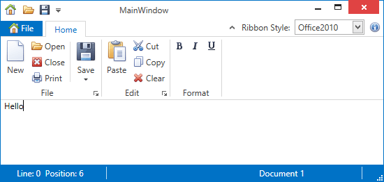
This example shows how to display items on the right edge of the RibbonControl. The items are added via the RibbonControl.PageHeaderItems collection.
The following image shows the result:
<dxr:RibbonControl.PageHeaderItems>
    <dxb:BarEditItem x:Name="eRibbonStyle" Content="Ribbon Style:"
        EditWidth="100"
        ClosePopupOnChangingEditValue="True"
        EditValue="{Binding RibbonStyle, ElementName=RibbonControl}">
        <dxb:BarEditItem.EditSettings>
            <dxe:ComboBoxEditSettings IsTextEditable="False" PopupMaxHeight="250"
                                      ItemsSource="{dxe:EnumItemsSource EnumType={x:Type dxr:RibbonStyle}}"/>
        </dxb:BarEditItem.EditSettings>
    </dxb:BarEditItem>
    <dxb:BarButtonItem Name="bAbout" Content="About"
                   Glyph="{dxc:DXImage Image=Info_16x16.png}"
                   LargeGlyph="{dxc:DXImage Image=Info_32x32.png}"
                   ItemClick="bAbout_ItemClick" />
</dxr:RibbonControl.PageHeaderItems>