ThemedWindow Class
A window that supports DevExpress WPF themes and Ribbon/Tab control integration.
Namespace: DevExpress.Xpf.Core
Assembly: DevExpress.Xpf.Core.v25.2.dll
NuGet Package: DevExpress.Wpf.Core
Declaration
public class ThemedWindow :
    Window,
    IRibbonWindow,
    ISupportAiSmartSearchThemedWindow,
    ISupportAiSmartSearch,
    IHeaderItemsControlHost,
    IBackButtonSupport,
IWindowSurrogateRelated API Members
The following members return ThemedWindow objects:
Remarks
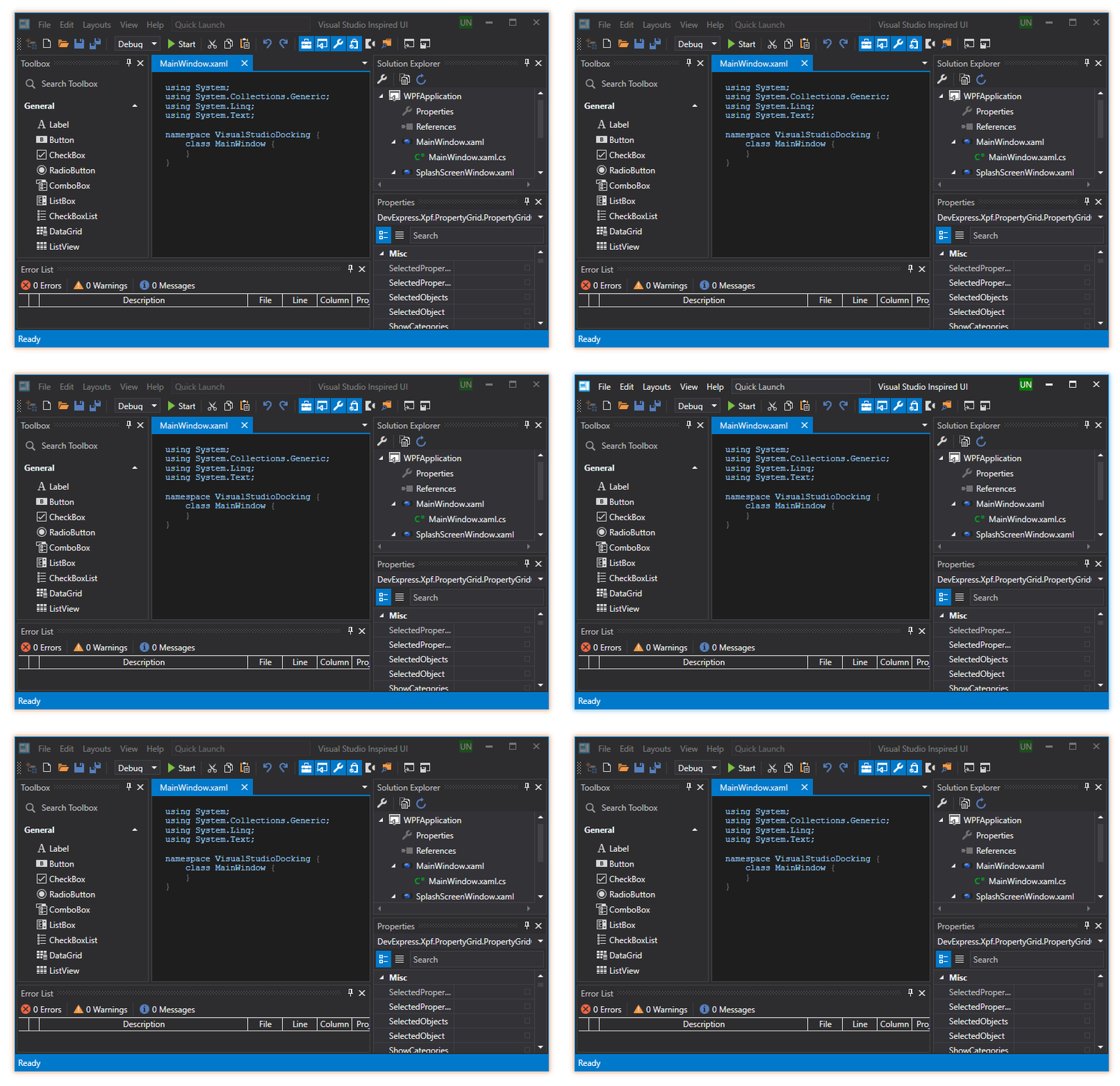
ThemedWindow is a Window class descendant that supports DevExpress WPF themes.

Enable ThemedWindow
In Code
Follow the steps below to replace the standard Window class with the ThemedWindow:
Change the following code snippet…
…to this:
Change the following code snippet…
<Window x:Class="Example.MainWindow"…to this:
<dx:ThemedWindow x:Class="Example.MainWindow"Add the missing reference:
xmlns:dx="http://schemas.devexpress.com/winfx/2008/xaml/core"
With the Smart Tag
Select a window, click its Smart Tag, and click Convert to ThemedWindow. This converts the current Window to ThemedWindow and updates XAML and CS files:

Integrate the Ribbon / Tab Control
Add the RibbonControl or TabControl to your application and specify the ThemedWindow.WindowKind property to integrate the control into the ThemedWindow:
<dx:ThemedWindow
        ...
        xmlns:dx="http://schemas.devexpress.com/winfx/2008/xaml/core"
        xmlns:dxr="http://schemas.devexpress.com/winfx/2008/xaml/ribbon"
        WindowKind="Auto">
    <Grid>
        <dxr:RibbonControl RibbonStyle="Office2010">
            <!-- RibbonControl content -->
        </dxr:RibbonControl>
    </Grid>
</dx:ThemedWindow>
Note
The RibbonControl parent element’s Background property must be set to null.
If a RibbonControl is integrated into ThemedWindow, you can display a search box to look for Ribbon items. For more information, refer to the following help topic: SearchItemDisplayMode:

Tip
You can apply a smart search to the Themed Window with integrated Ribbon Control. Refer to the following help topic for more information: Smart Search AI-powered Extension.
Customize ThemedWindow
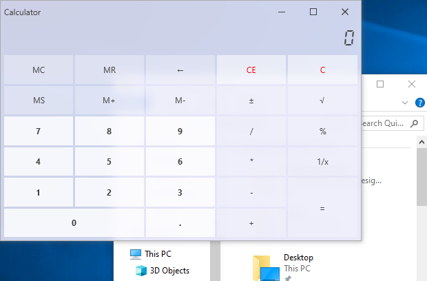
Acrylic Effect
Acrylic makes the ThemedWindow (including title bar) translucent to add a depth effect.
Set the ThemedWindow.EnableAcrylic property to true to enable the Acrylic effect. You can use the ThemedWindow.AcrylicOpacity and ThemedWindow.AcrylicColor properties to customize ThemedWindow opacity and color.

Header / Toolbar Items
ThemedWindow allows you to display items in the window’s header area:

Refer to the ThemedWindow.HeaderItems or ThemedWindow.ToolbarItems property descriptions for a code sample.
Full Height Side Panel
ThemedWindow can display a container at its left side (Side Panel). This panel occupies the entire window height. All header elements (window icon, title, items, and so on) are displayed to the right of the Side Panel. Set the ShowLeftPanel property to true to display the Side Panel.

LeftPanelContent, LeftPanelContentTemplate, and LeftPanelContentTemplateSelector properties allow you to specify panel content.
Refer to the LeftPanelContent property description for a code sample.
Header Colors
You can use the ThemedWindow.HeaderBackground and ThemedWindow.HeaderForeground properties to specify Header Background and Foreground colors when the window is active.

<dx:ThemedWindow
    ...
    HeaderBackground="DodgerBlue"
    HeaderForeground="White">
    ...
</dx:ThemedWindow>
Glow Colors
Set ThemedWindow.UseGlowColors to true to use custom colors for the window’s glow effect. Use the ThemedWindow.ActiveGlowColor and ThemedWindow.InactiveGlowColor properties to specify glow effect colors for active and inactive windows.

Note
The ThemedWindow.UseGlowColors property is in effect only if the ThemedWindow.ShowGlow property is true.
Window Buttons
Use the ThemedWindow.ControlBoxButtonSet property to specify which buttons are displayed in the window’s control box:

<dx:ThemedWindow
  ...
  xmlns:dx="http://schemas.devexpress.com/winfx/2008/xaml/core"
  ControlBoxButtonSet="Close,MaximizeRestore">
  ...
</dx:ThemedWindow>
Round Corners
Set the static RoundCorners property to true to round ThemedWindow corners:
using DevExpress.Xpf.Core;
//...

public partial class App {
    protected override void OnStartup(StartupEventArgs e) {
        base.OnStartup(e);
        ThemedWindow.RoundCorners = true;
    }
}

Note
The Windows version lower then 10 may display rounded corners incorrectly.
The following table describes whether your application’s corners are rounded depending on your Windows version, applied DevExpress Theme, and UseNativeWindow and RoundCorners property values:
Windows Version | Applied DevExpress Theme | ||||
|---|---|---|---|---|---|
|
|
|
| ||
Windows 11 |
|
|
|
| |
non-Win11Light/Win11Dark |
|
|
|
| |
Windows 10 and earlier |
|
|
| ||
non-Win11Light/Win11Dark |
|
|
|
| |
Save and Restore ThemedWindow
You can use the CurrentWindowSerializationBehavior to serialize/deserialize ThemedWindow settings. Refer to the behavior description for more information and examples.
The WindowRestoreLayoutOptions class contains attached properties that allow you to modify the deserialization process.
ThemedWindowDialog
Use the ShowDialog method overloads to display a ThemedWindowDialog.
Related GitHub Examples
The following code snippets (auto-collected from DevExpress Examples) contain references to the ThemedWindow class.
Note
The algorithm used to collect these code examples remains a work in progress. Accordingly, the links and snippets below may produce inaccurate results. If you encounter an issue with code examples below, please use the feedback form on this page to report the issue.

