Ribbon Page
- 2 minutes to read
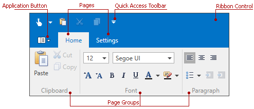
The Ribbon Control consists of page categories, which own ribbon pages. The pages are represented as tabs, and they are structurally and visually split into groups that display various commands, static items, editors and galleries. The following image shows a RibbonControl containing two pages (Home and Gallery Page). The Home page, which is active, consists of two groups (File and Edit):
Each Ribbon page in the RibbonControl belongs to either the default or custom page category. Pages that belong to the default page category are displayed at the left edge of the RibbonControl. Typically, these pages are designed to be always visible during application runtime. If you need to create contextual pages (pages that provide context specific commands), use custom page categories. To learn more, see Ribbon Page Categories and Contextual Pages.
Ribbon Page Settings
Ribbon pages are represented by the RibbonPage class objects. For each page, specify a caption (RibbonPage.Caption) that will be displayed in the corresponding tab.
To add groups to a Ribbon page, add RibbonPageGroup objects to the RibbonPage.Groups collection. In XAML, you can define RibbonPageGroup objects directly between the RibbonPage start and end tags.
<dxr:RibbonControl DockPanel.Dock="Top" RibbonStyle="Office2010">
    <dxr:RibbonDefaultPageCategory>
        <dxr:RibbonPage Caption="Home">
            <dxr:RibbonPageGroup Caption="Clipboard">
                <dxb:BarButtonItem x:Name="btnPaste" Content="Paste" LargeGlyph="{dx:DXImage Image=Paste_32x32.png}" Glyph="{dx:DXImage Image=Paste_16x16.png}"/>
                <dxb:BarButtonItem x:Name="btnCut" Content="Cut" Glyph="{dx:DXImage Image=Cut_16x16.png}" />
                <dxb:BarButtonItem x:Name="btnCopy" Content="Copy" Glyph="{dx:DXImage Image=Copy_16x16.png}"/>
            </dxr:RibbonPageGroup>
            <dxr:RibbonPageGroup Caption="Font">
                <dxr:BarButtonGroup>
                    <dxb:BarButtonItem Content="Bold" Glyph="{dx:DXImage Image=Bold_16x16.png}"/>
                    <dxb:BarButtonItem Content="Italic" Glyph="{dx:DXImage Image=Italic_16x16.png}"/>
                    <dxb:BarButtonItem Content="Underline" Glyph="{dx:DXImage Image=Underline_16x16.png}"/>
                </dxr:BarButtonGroup>

            </dxr:RibbonPageGroup>
        </dxr:RibbonPage>
        <dxr:RibbonPage Caption="Settings">

        </dxr:RibbonPage>
    </dxr:RibbonDefaultPageCategory>
</dxr:RibbonControl>
You can access a category that owns a page via the RibbonPage.PageCategory property. The category’s RibbonPageCategoryBase.IsDefault property indicates whether the category is default or custom.
Navigating Pages and Controlling Page Visibility
The currently active page is specified by the RibbonControl.SelectedPage property. Assigning a page to this property allows you to activate this page. You can also activate a page via the RibbonPage.IsSelected property.
It’s possible to hide a particular page via its RibbonPage.IsVisible property. If a page belongs to a custom category, you can hide all pages in this category by setting the RibbonPageCategoryBase.IsVisible property to false.