Bars
- 5 minutes to read
Bars (also known as Toolbars) implement the hierarchical menu model in applications; this model is the traditional way of organizing application command regions. Use the DevExpress BarManager component to create and customize toolbars in a centralized manner or standalone Bar controls to tweak each bar separately.
Each bar is a horizontally or vertically aligned stripe that contains buttons, editors, radio button groups, etc. There are three toolbar types.
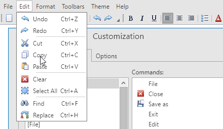
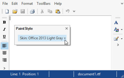
- Main menu bar - the topmost bar that is stretched across the entire form. Contains buttons with no images. Each button is a category (e.g., ‘File’, ‘Edit’, ‘Format’) that displays other buttons and sub-items when clicked.
- Status bar - the bar that is stretched across the bottom edge of the form. Commonly, this bar contains labels that display the current application status and a size grip element that allows end-users to resize the form.
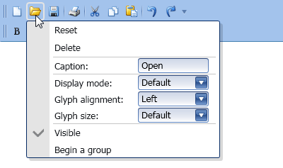
- Regular toolbars - toolbars that contain buttons and editors that represent the most frequently used actions (e.g., creating new documents, font settings or text alignment). Buttons within these bars usually display their icons only. Traditionally these toolbars are arranged below the main menu bar, although you are free to dock them to the left or right side of your form, or make them floating.
Toolbars of all types used within the application form create a toolbar system. The Bar Manager component provides organized access to this entire system. Additionally, you can provide context and pop-up menus for your toolbar system. Follow the links below to learn more about Bars concepts and features.

-
Contains tutorials on the DevExpress Bars Suite.
-
Contains a large variety of task-based examples.
Create Bar Layout
There are two ways to create your bar layout. The traditional approach is to use the Bar Manager component that owns multiple Bar objects. This approach comes with multiple benefits, such as sharing bar items between separate bars, or the centralized control over bar appearances and settings. On the other hand, when you do not need multiple bars within one window, you can follow the simplified approach and use standalone bar controls. Each standalone bar control represents a bar of the specific type (main menu bar, status bar, regular toolbar) that does not require a parent Bar Manager component. Topics in this section provide detailed information on both approaches.
-
A component that provides centralized access over bars and popup menus.
-
Bars contain commands, sub-menus, static text, editors, etc. Each bar is owned by a parent Bar Manager component.
-
This topic enumerates all controls that allow you to create standalone bars that do not require a parent Bar Manager component.
-
Bar Containers are objects that host one or multiple bars (both standalone and owned by a Bar Manager). These containers allow you to dock your bars to the desired sides of an application window or make them floating.

Populate Bars
After your bar layout is ready, you can proceed to populating your bars with different types of elements - regular push buttons, check boxes, buttons with drop-down menus, etc. This can also be achieved using two different approaches. You can either directly declare required elements within a bar, or use links to already existing elements. In the first case, you use bar items, in the latter - bar item links. Refer to the links below to learn more.
-
Provides overall information on bar items and links to these items.
The List of Bar Items and Links
Enumerates all available types of bar items and links.

Actions
Actions are commands that tell a Bar Manager to perform specific operations, such as creating bars, bar items and bar item links, or modifying the existing structure of a Bar Manager. Actions are defined in resources and thus can be shared between multiple windows or even applications.
Tip
Topic: Bar Actions
Appearance Customization
The Appearance Customization topic describes properties and techniques that you can use to customize Bar and Toolbar UI elements.
Runtime Customization
This section illustrates how to grant your end-users access to both hidden & visible bars and bar commands, and allow them to adjust required bar options.
-
Contains a list of tasks that can be performed at runtime using the Customization Window.
-
Describes the Customization Window - a dialog invoked at runtime that allows your end-users to customize bars and bar commands.
-
Categories are assigned to bar items in order to group them in a Customization Window at runtime.

Miscellaneous
-
With the bar merging feature, child menus and bars from child MDI windows are merged into the parent MDI window menus and bars.
-
Learn about implementing the MVVM pattern in your applications using DXBars, DXRibbon and GalleryControl components.
Saving and Restoring a Bar Layout
A bar layout can be saved to a data store (an XML file or a stream), and then restored from this data store, overriding the changes made since the layout was saved. This document provides information on this topic.