Ribbon Menu
- 3 minutes to read
Ribbon is an MS Office-style UI element that gives you access to the application’s functionality. The Application Button invokes the main Ribbon menu.
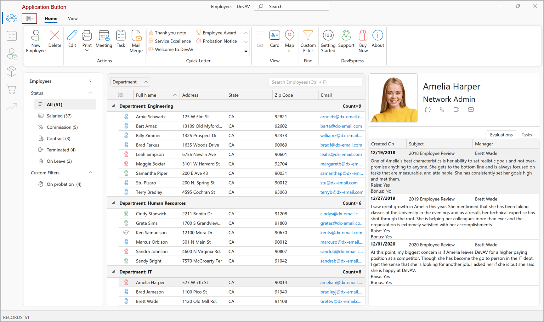
Application Button
The Application Button allows users to access the main menu of your application.
Enable the ShowApplicationButton property to display or hide the Application Button.
When your application uses Ribbon Control, you can add one of the following application menus to your application:
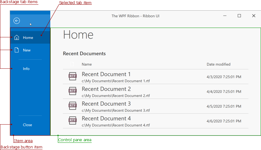
- The Backstage View is the MS Office style full-screen menu.
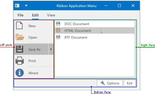
- The Application Menu is the Windows Explorer style popup menu.
Compatibility
The Application Button is available for the following styles:
- Office2007
- Office2010
If both ShowApplicationButton and ShowPageHeaderButton properties are set to true, the RibbonControl displays only the Application Button.
Customize an Application Button
| Property | Description |
|---|---|
| RibbonControl.ApplicationButtonSmallIcon | Specifies the Application Button image in the Office 2010 Ribbon style. |
| RibbonControl.ApplicationButtonLargeIcon | Specifies the Application Button image in the Office 2007 Ribbon style. |
| RibbonControl.ApplicationButtonText | Specifies the Application Button text in the Office 2010 Ribbon style. |
| RibbonControl.ApplicationButton2010Style | Specifies the Application Button custom style in the Office 2010 Ribbon style. |
| RibbonControl.ApplicationButton2007Style | Specifies the Application Button custom style in the Office 2007 Ribbon style. |
Example
The following code example displays the Application Button:
<dx:ThemedWindow
    x:Class="Demo.MainWindow"
    xmlns="http://schemas.microsoft.com/winfx/2006/xaml/presentation"
    xmlns:x="http://schemas.microsoft.com/winfx/2006/xaml"
    xmlns:dx="http://schemas.devexpress.com/winfx/2008/xaml/core"
    xmlns:dxr="http://schemas.devexpress.com/winfx/2008/xaml/ribbon"
    xmlns:sys="clr-namespace:System;assembly=mscorlib"
    Title="MainWindow" Height="800" Width="800">
    <Grid>
        <dxr:RibbonControl
            RibbonStyle="Office2010"
            ShowApplicationButton="True"
            ApplicationButtonSmallIcon="{dxc:DXImage Image=Book_16x16.png}"
            ApplicationButtonLargeIcon="{dxc:DXImage Image=Book_32x32.png}"
            ApplicationButtonText="File"
            PageCategoryAlignment="Right" />
    </Grid>
</dx:ThemedWindow>
Page Header Button
The Page Header Button is displayed at the top left corner of the RibbonControl instead of Application Button. The button typically toggles a navigation pane or another top-level UI element. Enable the ShowPageHeaderButton property to add the Page Header Button to the RibbonControl header.
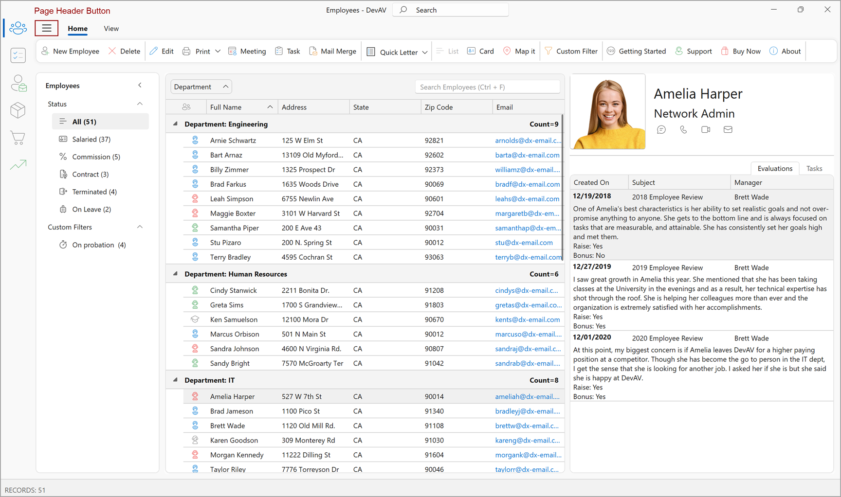
The Page Header Button does not have an action by default. To bind an action to the button, use the PageHeaderButtonCommand.
Compatibility
The Page Header Button is available for the following styles:
- Office2019
- OfficeSlim
- TabletOffice
If both ShowApplicationButton and ShowPageHeaderButton properties are set to true, the RibbonControl displays only the Page Header Button.
Example
The following code example displays the Page Header Button in the header area:
<dx:ThemedWindow
    x:Class="Demo.MainWindow"
    xmlns="http://schemas.microsoft.com/winfx/2006/xaml/presentation"
    xmlns:x="http://schemas.microsoft.com/winfx/2006/xaml"
    xmlns:dx="http://schemas.devexpress.com/winfx/2008/xaml/core"
    xmlns:dxr="http://schemas.devexpress.com/winfx/2008/xaml/ribbon"
    xmlns:sys="clr-namespace:System;assembly=mscorlib"
    Title="MainWindow" Height="800" Width="800">
    <dx:ThemedWindow.Resources>
        <!-- Custom style for Page Header Button -->
        <Style TargetType="dxr:PageHeaderButton">
            <Setter Property="Margin" Value="5,0"/>
            <Setter Property="Padding" Value="8,4"/>
            <Setter Property="CornerRadius" Value="7"/>
            <Setter Property="GlyphWidth" Value="32"/>
            <Setter Property="GlyphHeight" Value="32"/>
            <Style.Triggers>
                <Trigger Property="IsMouseOver" Value="True">
                    <Setter Property="Background" Value="#E3F2FD"/>
                </Trigger>
            </Style.Triggers>
        </Style>
    </dx:ThemedWindow.Resources>
    <Grid>
        <dxr:RibbonControl
            RibbonStyle="Office2019"
            ShowPageHeaderButton="True"
            PageHeaderButtonToolTip="Show or hide navigation"
            PageHeaderButtonGlyph="pack://application:,,,/Icons/Hamburger.svg"
            PageHeaderButtonCommand="{Binding ToggleNavigationPanelCommand}"
            PageHeaderButtonCommandParameter="{x:Boolean True}" />
    </Grid>
</dx:ThemedWindow>
public sealed class MainViewModel {
    public bool IsNavigationVisible { get; set; } = false;

    public ICommand ToggleNavigationPanelCommand => new DevExpress.Mvvm.DelegateCommand<object>(p => {
        if (p is bool force)
            IsNavigationVisible = force;
        else
            IsNavigationVisible = !IsNavigationVisible; // Hides or displays the button if the parameter is null
    });
}
Backstage View
The Backstage View is the MS Office style full-screen menu.
Application Menu
The Application Menu is the Windows Explorer style Ribbon menu.