Ribbon Page Group
- 3 minutes to read
Ribbon Page Group
A Ribbon Page Group is a group of bar items (regular and check buttons, submenus, editors, etc.) within a Ribbon Page. Groups are used to combine commands that have certain features in common.
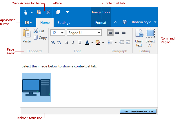
A Ribbon Page Group is represented by the RibbonPageGroup component. To add page groups to a page, add RibbonPageGroup objects to the RibbonPage.Groups collection. In XAML, you can define groups directly between the RibbonPage start and end tags.
<dxr:RibbonControl DockPanel.Dock="Top" RibbonStyle="Office2010">
    <dxr:RibbonDefaultPageCategory>
        <dxr:RibbonPage Caption="Home">
            <dxr:RibbonPageGroup Caption="Clipboard">

            </dxr:RibbonPageGroup>
            <dxr:RibbonPageGroup Caption="Font">

            </dxr:RibbonPageGroup>
        </dxr:RibbonPage>

    </dxr:RibbonDefaultPageCategory>
</dxr:RibbonControl>
A Ribbon page group’s children are bar items and/or bar item links. To add elements to a group, use the RibbonPageGroup.Items collection. In XAML you can define child elements directly between the RibbonPageGroup start and end tags.
<dxr:RibbonPage Caption="Home">
    <dxr:RibbonPageGroup Caption="Clipboard">
        <dxb:BarButtonItem Content="Paste" LargeGlyph="{dx:DXImage Image=Paste_32x32.png}"/>
        <dxb:BarButtonItem Content="Cut" Glyph="{dx:DXImage Image=Cut_16x16.png}" />
        <dxb:BarButtonItem Content="Copy" Glyph="{dx:DXImage Image=Copy_16x16.png}"/>
    </dxr:RibbonPageGroup>
    <dxr:RibbonPageGroup Caption="Font">
        <dxr:BarButtonGroup>
            <dxb:BarButtonItem Content="Bold" Glyph="{dx:DXImage Image=Bold_16x16.png}"/>
            <dxb:BarButtonItem Content="Italic" Glyph="{dx:DXImage Image=Italic_16x16.png}"/>
            <dxb:BarButtonItem Content="Underline" Glyph="{dx:DXImage Image=Underline_16x16.png}"/>
        </dxr:BarButtonGroup>
    </dxr:RibbonPageGroup>
</dxr:RibbonPage>
For each bar item, you can assign large and small icons. Large icons are used by default if there is enough space within a group. However, when the group’s region becomes smaller, large icons are automatically replaced with small icons, and text is hidden if necessary. If the group’s size is reduced so it can no longer display all of its items at one time, the group is collapsed. To prevent a page group from being collapsed, set its RibbonPageGroup.AllowCollapse property to false.
Clicking a collapsed group’s Dropdown button invokes the popup which contains the group’s contents:

Bar Item Arrangement Rules
There are several bar item arrangement principles used by the RibbonControl. You will want to familiarize yourself with these principles, to better arrange bar items in your application:
- For each bar item, which represents a button or sub-menu, you can assign both large and small images. By default, such an item can be displayed using the large image with text, small image with text and small image without text. The BarItem.RibbonStyle property allows you to control which of these options are available.
- If both large and small images are assigned to a bar item, the large image is used by default (if there is enough space to display it). Small images are used when the group’s region is too small to display large images.
- If a bar item is represented by a large image, no other item can be displayed above or below it.
- Only one, two or three bar items with small images can be arranged vertically within a group.