Included Components
- 4 minutes to read
The WPF Data Editors library contains a set of editors and simple controls that can be used in WPF applications. Each editor provides a specific functionality that is required for editing data values of a certain type.
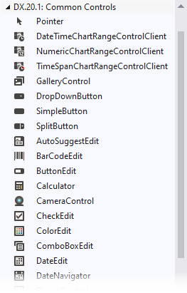
In the Visual Studio IDE, all Data Editors and Simple Controls components are available on the DX.25.1.WPF: Common Controls toolbox tab.
You can use the Data Editors in the following ways.
As a standalone control
The code sample below demonstrates how to use the BarCodeEdit control to display a bar code.
<Window ...
    xmlns:dxe="http://schemas.devexpress.com/winfx/2008/xaml/editors">

<dxe:BarCodeEdit Width="150" Height="60" EditValue="9780470500835">
    <dxe:BarCodeEdit.StyleSettings>
        <dxe:EAN13StyleSettings />
    </dxe:BarCodeEdit.StyleSettings>
</dxe:BarCodeEdit>
The image below demonstrates the result.

As an in-place control
Most of DevExpress WPF data editors can be seamlessly nested in GridControl cells, Bar items, PropertyGrid cells, etc. For more information, see In-Place Mode.
The code sample below demonstrates how to display barcodes within the GridControl using the in-place BarCodeEdit editors.
<Window ...
    xmlns:dxe="http://schemas.devexpress.com/winfx/2008/xaml/editors"
    xmlns:dxg="http://schemas.devexpress.com/winfx/2008/xaml/grid">

<dxg:GridControl Name="grid">
    <dxg:GridControl.View>
        <dxg:TableView />
    </dxg:GridControl.View>
    <dxg:GridControl.Columns>
        <dxg:GridColumn FieldName="ProductName" />
        <dxg:GridColumn FieldName="QuantityPerUnit"/>
        <dxg:GridColumn FieldName="UnitPrice"/>
        <dxg:GridColumn FieldName="EAN13" >
            <dxg:GridColumn.EditSettings>
                <!-- The BarCodeEditSettings objects allows you to -->
                <!-- fully customize the in-place BarCodeEdit settings -->
                <dxe:BarCodeEditSettings ShowText="False">
                    <dxe:BarCodeEditSettings.StyleSettings>
                        <dxe:EAN13StyleSettings />
                    </dxe:BarCodeEditSettings.StyleSettings>
                </dxe:BarCodeEditSettings>
            </dxg:GridColumn.EditSettings>
        </dxg:GridColumn>
    </dxg:GridControl.Columns>
</dxg:GridControl>
The image below demonstrates the result.

Buttons
SimpleButton
Serves as a base for classes that represent button controls.
Class: SimpleButton

DropDownButton
Represents a dropdown button control.
Class: DropDownButton

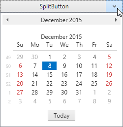
SplitButton
A split button control.
Class: SplitButton
Item Selection
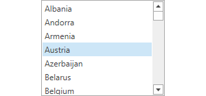
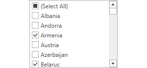
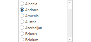
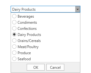
ListBoxEdit
A list box (checked list box, radio list box).
Class: ListBoxEdit
In-place editor: ListBoxEditSettings
ComboboxEdit
A combobox editor.
Class: ComboBoxEdit
In-place editor: ComboBoxEditSettings
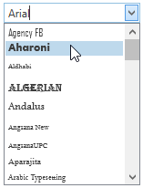
FontEdit
A font editor.
Class: FontEdit
In-place editor: FontEditSettings
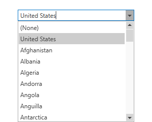
LookupEdit
A lookup editor.
Class: LookUpEdit
In-place editor: LookUpEditSettings
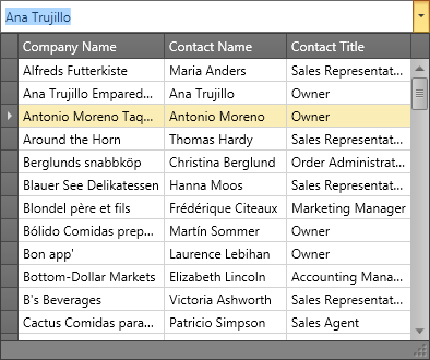
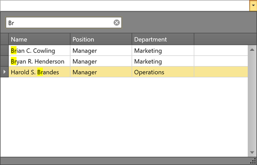
SearchLookUpEdit
A lookup editor with a built-in search functionality.
Class: LookUpEdit with the SearchLookUpEditStyleSettings settings.
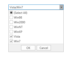
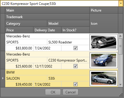
MultiSelectLookUpEdit
A lookup editor with multiple value selection.
Class: LookUpEdit with the MultiSelectLookUpEditStyleSettings settings.
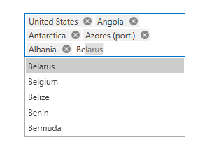
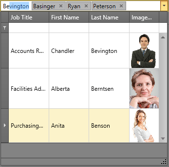
TokenLookUpEdit
A lookup editor with multiple value selection. Selected values are represented by tokens.
Class: LookUpEdit with the TokenLookUpEditStyleSettings settings.
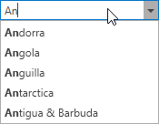
AutoSuggestEdit
An editor that displays a drop-down list of suggestions as a user types in the text box.
Class: AutoSuggestEdit
In-place editor: AutoSuggestEditSettings
Data Input
CheckEdit
A check box editor.
Class: CheckEdit
In-place editor: CheckEditSettings
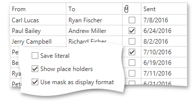
ToggleSwitchEdit
Represents a toggle switch editor.
Class: ToggleSwitchEdit
In-place editor: ToggleSwitchEditSettings

ButtonEdit
A text editor with embedded buttons.
Class: ButtonEdit
In-place editor: ButtonEditSettings

BrowsePathEdit
A text editor that allows users to specify a path to a file/folder.
Class: BrowsePathEdit
In-place editor: BrowsePathEditSettings

TextEdit
A text editor.
Class: TextEdit
In-place editor: TextEditSettings

PasswordBoxEdit
A control allowing you to enter and manage passwords.
Class: PasswordBoxEdit
In-place editor: PasswordBoxEditSettings

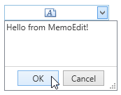
MemoEdit
Represents an editor that displays a multi-line edit box in its popup.
Class: MemoEdit
In-place editor: MemoEditSettings
SpinEdit
An editor with spin buttons used to adjust a numerical value.
Class: SpinEdit
In-place editor: SpinEditSettings

Date and Time
DateEdit
A date editor with a dropdown calendar.
Class: DateEdit
In-place editor: DateEditSettings
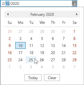
DateNavigator
A date navigator control.
Class: DateNavigator
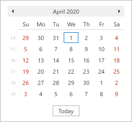
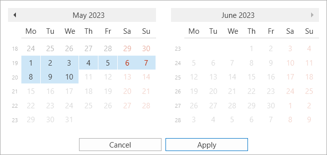
DateRangeControl
A date range control.
Class: DateRangeControl
TimePicker
A time picker control.
Class: TimePicker
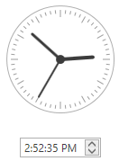
Image and Color
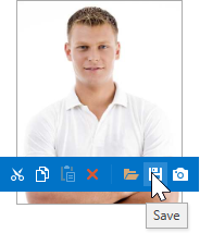
ImageEdit
Represents an image editor.
Class: ImageEdit
In-place editor: ImageEditSettings
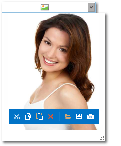
PopupImageEdit
An editor that displays an image within a dropdown window.
Class: PopupImageEdit
In-place editor: PopupImageEditSettings
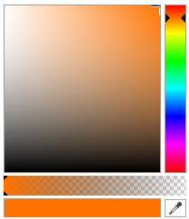
BrushEdit
Represents a brush editor.
Class: BrushEdit
In-place editor: BrushEditSettings
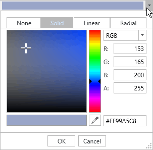
PopupBrushEdit
Represents a brush editor displayed within a dropdown window.
Class: PopupBrushEdit
In-place editor: PopupBrushEditSettings
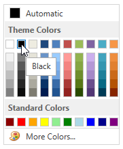
ColorEdit
Represents a color editor.
Class: ColorEdit
In-place editor: ColorEditSettings
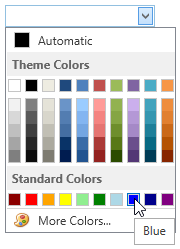
PopupColorEdit
Represents a color editor displayed within a drop-down window.
Class: PopupColorEdit
In-place editor: PopupColorEditSettings
Visualization
ProgressBarEdit
A progress bar.
Class: ProgressBarEdit
In-place editor: ProgressBarEditSettings

SparklineEdit
A sparkline control.
Class: SparklineEdit
In-place editor: SparklineEditSettings

TrackBarEdit
A track bar.
Class: TrackBarEdit
In-place editor: TrackBarEditSettings


RatingEdit
A rating editor.
Class: RatingEdit

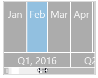
RangeControl
Represents a range control.
Class: RangeControl
Utility
BarCodeEdit
A barcode control.
Class: BarCodeEdit
In-place editor: BarCodeEditSettings

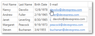
HyperlinkEdit
A hyperlink editor.
Class: HyperlinkEdit
In-place editor: HyperlinkEditSettings
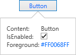
FlyoutControl
Represents a flyout control.
Class: FlyoutControl
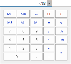
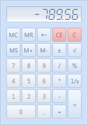
Calculator
Represents a calculator.
Class: Calculator
PopupCalcEdit
Represents a calculator displayed within a dropdown window.
Class: PopupCalcEdit
In-place editor: CalcEditSettings
