DateNavigator Class
A DateNavigator control.
Namespace: DevExpress.Xpf.Editors.DateNavigator
Assembly: DevExpress.Xpf.Core.v26.1.dll
Declaration
Related API Members
The following members return DateNavigator objects:
Remarks
Add the Date Navigator
The DateNavigator is a standalone control. To use it with the Scheduler, add a DateNavigator to your application and use the SchedulerDateNavigatorStyleSettings.Scheduler property to bind the DateNavigator to the SchedulerControl as follows:
    xmlns:dxe="http://schemas.devexpress.com/winfx/2008/xaml/editors"
    xmlns:dxsch="http://schemas.devexpress.com/winfx/2008/xaml/scheduling"
<!---->
 <Grid>
    <Grid.ColumnDefinitions>
        <ColumnDefinition Width="*" />
        <ColumnDefinition Width="Auto" />
    </Grid.ColumnDefinitions>
    <dxsch:SchedulerControl x:Name="scheduler" />
    <dxe:DateNavigator x:Name="datenavigator"
        Grid.Column="1"
        VerticalAlignment="Stretch">
        <dxe:DateNavigator.StyleSettings>
            <dxsch:SchedulerDateNavigatorStyleSettings Scheduler="{Binding ElementName=scheduler}" />
        </dxe:DateNavigator.StyleSettings>
    </dxe:DateNavigator>
</Grid>
Refer to the following topic for a step-by-step tutorial: How to: Create the Scheduler with the DateNavigator.
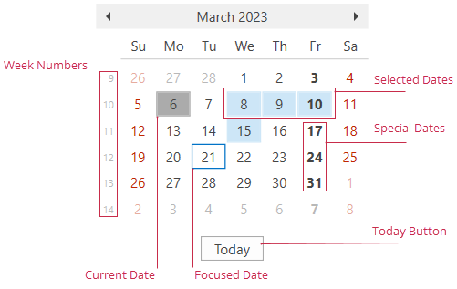
Date Types
The DateNavigator control includes the following date types:
| Type | Property | Description |
|---|---|---|
| Disabled Date | DisabledDates | Gets or sets a collection of dates unavailable for selection. |
| Focused Date | FocusedDate | Gets or sets the focused date in a calendar. |
| Holiday | Holidays | Gets or sets a collection of custom holidays. |
| Selected Date | SelectedDates | Gets or sets a collection of dates selected in the DateNavigator control. |
| Special Date | SpecialDates | Gets or sets a collection of special dates. |
| Workday | Workdays | Gets or sets a collection of workdays in a week. |
Handle the DateNavigator.RequestCellState event to conditionally mark cells as disabled, holiday, or special.
Tip
To specify cell appearance for each state, use the Appearance property.
Customize the Date Navigator
Display Settings
The table below lists all properties that affect DateNavigator appearance.
Characteristics | Properties |
|---|---|
Today button visibility | |
Number of rows and columns | |
First day of the week | |
Holidays | |
Workdays | |
Special dates | |
Week numbers |
Call the RefreshCellAppearances() method to raise the RequestCellAppearance event for each cell and clear cached appearance values.
To display a specific date in the current DateNavigator view, use the ScrollToDate(DateTime) method.
Behavior Settings
The table below lists all properties that affect DateNavigator behavior. Use the DateNavigator.StyleSettings property to specify SchedulerDateNavigatorStyleSettings.
Characteristics | Properties |
|---|---|
Dates users can select | |
Date range selection | |
Multiple date selection | |
Multiple date range selection | DateNavigator.AllowMultipleRanges (the DateNavigator.IsMultiSelect property must be set to |
The maximum number of dates users can select simultaneously | |
Change the scheduler view based on the selection | SchedulerDateNavigatorStyleSettings.AllowChangeSchedulerView |
Update the month part of the selected dates when a user navigates through different months | SchedulerDateNavigatorStyleSettings.AllowUpdateSelectionOnMonthChanged |
The maximum number of consecutively selected weeks | SchedulerDateNavigatorStyleSettings.MaxSelectedConsecutiveWeeks |
The maximum number of individually selected dates | SchedulerDateNavigatorStyleSettings.MaxSelectedNonConsecutiveDates |
Keyboard Navigation
Use the following keys or shortcuts to interact with a DateNavigator control:
Key | Action |
|---|---|
← → ↑ ↓ |
|
Tab | Moves focus one element forward. |
Shift + Tab | Moves focus one element back. |
Enter / Space |
|
Shift + ← / → / ↑ / ↓ | Selects multiple dates when the DateNavigator.IsMultiSelect property is enabled. |
Ctrl + Enter |
|
Ctrl + ← / → / ↑ / ↓ | Moves focus without selecting a different date when the DateNavigator.IsMultiSelect property is enabled. |
Ctrl + Space | Toggles the selection of the focused date without deselecting other dates when the DateNavigator.IsMultiSelect property is enabled. |
Related GitHub Examples
The following code snippets (auto-collected from DevExpress Examples) contain references to the DateNavigator class.
Note
The algorithm used to collect these code examples remains a work in progress. Accordingly, the links and snippets below may produce inaccurate results. If you encounter an issue with code examples below, please use the feedback form on this page to report the issue.