SimpleButton Class
Serves as a base for classes that represent button controls.
Namespace: DevExpress.Xpf.Core
Assembly: DevExpress.Xpf.Core.v26.1.dll
Declaration
Remarks
The SimpleButton control is a standard System.Windows.Controls.Button descendant and supports all the inherited features.
Custom Button Content
Use the Content property to specify the SimpleButton‘s content.
<dx:SimpleButton x:Name="simpleButton"  Height="100" Width="226">
    <dx:SimpleButton.Content>
        <Grid>
            <Ellipse Height="80" Width="150" Fill="#FFAFAFF3"/>
            <TextBlock TextAlignment="Center" VerticalAlignment="Center" FontSize="30">Button</TextBlock>
        </Grid>
    </dx:SimpleButton.Content>
</dx:SimpleButton>
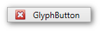
Customizable Glyph
Use the SimpleButton.Glyph property to assign a custom glyph.
Assign a glyph from the DXImage extension
<dx:SimpleButton Width="120" Height="22" Content="GlyphButton" Glyph="{dx:DXImage Image=Close_16x16.png}"/>Assign a glyph from the image file
Add an image to your project and set the SimpleButton.Glyph property to the image path and name in this project. This code snippet sets the closebutton.png image from the images project folder as the
Simple Buttoncontrol’s glyph:<dx:SimpleButton Width="120" Height="22" Content="GlyphButton" Glyph="images/closebutton.png"/>
Toggle Mode
Set the SimpleButton.ButtonKind property to Toggle to enable toggle mode.
Toggle mode supports two states, True and False. To enable the Indeterminate state, set the SimpleButton.IsThreeState property to true.
In toggle mode, the following events occur on mouse click:
Repeat Mode
In repeat mode, the Click event is repeatedly fired until a button is released.
Set the SimpleButton.ButtonKind property to Repeat to enable repeat mode.
Use the SimpleButton.Delay and SimpleButton.Interval properties to control the repeat behavior.
Asynchronous Mode
The SimpleButton control can indicate whether an asynchronous operation is in progress. To enable this behavior, set the SimpleButton.AsyncDisplayMode property to Wait or WaitCancel:
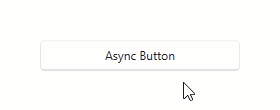
<dx:SimpleButton Content="Async Button"
                 AsyncDisplayMode="WaitCancel"
                 Command="{Binding AsyncCommand}"/>
using DevExpress.Mvvm;
using System.Threading.Tasks;
// ...

public class ViewModel : ViewModelBase {
    public IAsyncCommand AsyncCommand { get; }

    public ViewModel() {
        AsyncCommand = new AsyncCommand(AsyncMethod);
    }

    async Task AsyncMethod() {
        while(!AsyncCommand.IsCancellationRequested) {
            await Task.Delay(100);
        }
    }
}
Refer to the following help topic for more information: Asynchronous Commands.
Customize Appearance
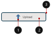
- Glyph, GlyphHeight, GlyphWidth
- Background, Foreground, FontSize
- Height, BorderBrush, BorderThickness, CornerRadius, Width
<Window ...
    xmlns:dx="http://schemas.devexpress.com/winfx/2008/xaml/core">
    <dx:SimpleButton Background="#FFE9EBEC" BorderThickness="2" BorderBrush="#FF0D3A50"
                     CornerRadius="5" Height="30" Width="150" Content="Upload" FontSize="10"
                     Foreground="#ff505050" Glyph="{dx:DXImage SvgImages/Arrows/MoveUp.svg}"
                     GlyphHeight="20" GlyphWidth="20"/>
</Window>
Tip
Refer to the following topic for more information: Appearance Customization.
Related GitHub Examples
The following code snippets (auto-collected from DevExpress Examples) contain references to the SimpleButton class.
Note
The algorithm used to collect these code examples remains a work in progress. Accordingly, the links and snippets below may produce inaccurate results. If you encounter an issue with code examples below, please use the feedback form on this page to report the issue.