Check Nodes
- 4 minutes to read
You can embed check boxes into nodes and allow an end user to check/uncheck them:

To Embed Check Boxes into Nodes
Set the TreeListView.ShowCheckboxes property to true to display check boxes embedded into nodes.
Set values of check boxes. Do one of the following:
- Specify the TreeListView.CheckBoxFieldName property to bind check boxes to a Boolean field in the grid’s data source.
- Check nodes in code.
The code sample below shows how to display check boxes and bind them to the OnVacation field:
<dxg:GridControl Name="gridControl">
    <dxg:GridControl.Columns>
        <dxg:GridColumn FieldName="Name"/>
        <dxg:GridColumn FieldName="Department"/>
        <dxg:GridColumn FieldName="Position"/>
    </dxg:GridControl.Columns>
    <dxg:GridControl.View>
        <dxg:TreeListView KeyFieldName="ID" ParentFieldName="ParentID" AutoExpandAllNodes="True"
            ShowCheckboxes="True" CheckBoxFieldName="OnVacation" />
    </dxg:GridControl.View>
</dxg:GridControl>
public class Employee {
    public int ID { get; set; }
    public int ParentID { get; set; }
    public string Name { get; set; }
    public string Position { get; set; }
    public string Department { get; set; }
    public bool OnVacation { get; set; }
}
Note
The TreeListView does not post the focused row’s check box value until you focus another row. To make the TreeListView post check box values immediately, set the TreeListView.ImmediateUpdateCheckBoxState property to true.
Check Nodes in Code
Use the following members to check/uncheck nodes in code:
| Method | Description |
|---|---|
| TreeListView.CheckAllNodes | Checks all nodes. |
| TreeListView.UncheckAllNodes | Unchecks all nodes. |
| TreeListNode.IsChecked | Checks/unchecks the node. |
When a node’s check state is changed, the TreeListView raises the TreeListView.NodeCheckStateChanged event. Use the TreeListNode.IsChecked property to identify whether a node is checked.
Indeterminate State
Set the TreeListView.AllowIndeterminateCheckState property to true to allow an end user to set the node’s check box to one of three states (checked, unchecked, or indeterminate):

Tip
In this case, a user can specify a check box’s state despite the states of its parents and children. Refer to the Check Nodes Recursively section for information on how to update check states automatically based on child and parent node selection.
The TreeListNode.IsChecked property returns the following values:
- true - if a node is checked
- false - if a node is unchecked
- null - if a node is indeterminated
Check Nodes Recursively
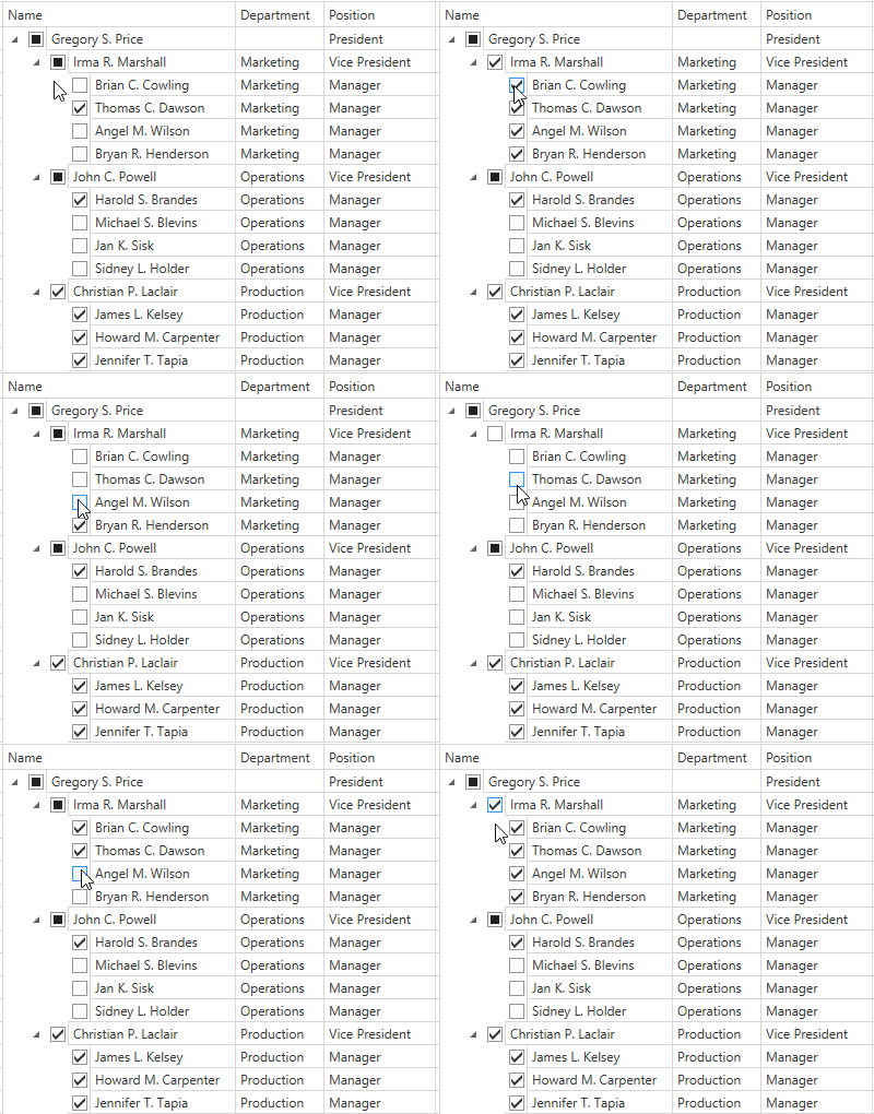
Set the TreeListView.AllowRecursiveNodeChecking property to true if you want the control to update check states automatically based on child and parent node selection:
- When you check/uncheck a parent node, its children become checked/unchecked.
- When you check/uncheck all child nodes, its parent becomes checked/unchecked.
- When you check/uncheck a child node, but not all child nodes are checked/unchecked, its parent goes to the indeterminate check state.

Enabled State
Use the following properties to bind the enabled state of check boxes to a property:
| Property | Description |
|---|---|
| TreeListView.IsCheckBoxEnabledFieldName | Gets or sets the name of a data source’s field whose values determine whether a node’s check box is enabled. |
| TreeListView.IsCheckBoxEnabledBinding | Gets or sets the binding that determines whether a node’s check box is enabled. |
Note
The TreeListView.IsCheckBoxEnabledBinding property takes precedence over the TreeListView.IsCheckBoxEnabledFieldName property.
The code sample below shows how to bind the enabled state of check boxes to the Enabled field:

<dxg:GridControl Name="gridControl">
    <dxg:GridControl.Columns>
        <dxg:GridColumn FieldName="Name"/>
        <dxg:GridColumn FieldName="Department"/>
        <dxg:GridColumn FieldName="Position"/>
    </dxg:GridControl.Columns>
    <dxg:GridControl.View>
        <dxg:TreeListView KeyFieldName="ID" ParentFieldName="ParentID" AutoExpandAllNodes="True"
                          ShowCheckboxes="True" CheckBoxFieldName="OnVacation" IsCheckBoxEnabledFieldName="Enabled" />
    </dxg:GridControl.View>
</dxg:GridControl>