WPF Ribbon, Bars, and Menu: MVVM Support
- 4 minutes to read
This topic demonstrates two ways to use the MVVM pattern in DXBars, DXRibbon, and GalleryControl.
Define UI at View Level
This is the simplest technique that defines a UI at the View level. UI element behavior is implemented by commands defined in a View Model.
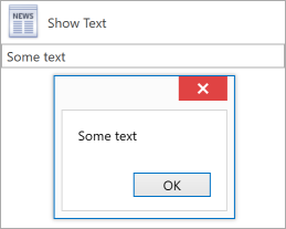
The following code sample creates a simple UI that consists of a MainMenuControl with a BarButtonItem. A click on the button invokes the ShowTextCommand defined in a View Model:
<Window x:Class="WpfApplication25.MainWindow"
        xmlns="http://schemas.microsoft.com/winfx/2006/xaml/presentation"
        xmlns:x="http://schemas.microsoft.com/winfx/2006/xaml"
        xmlns:dxb="http://schemas.devexpress.com/winfx/2008/xaml/bars"
        xmlns:dxe="http://schemas.devexpress.com/winfx/2008/xaml/editors"
        xmlns:dx="http://schemas.devexpress.com/winfx/2008/xaml/core"
        xmlns:dxmvvm="http://schemas.devexpress.com/winfx/2008/xaml/mvvm"
        xmlns:local="clr-namespace:WpfApplication25"
        Title="MainWindow" Height="350" Width="525">
    <Window.DataContext>
        <local:ViewModel/>
    </Window.DataContext>
    <dxmvvm:Interaction.Behaviors>
        <dx:DXMessageBoxService/>
    </dxmvvm:Interaction.Behaviors>
    <Grid>
        <Grid.RowDefinitions>
            <RowDefinition Height="Auto"/>
            <RowDefinition Height="Auto"/>
        </Grid.RowDefinitions>
        <dxb:MainMenuControl BarItemDisplayMode="ContentAndGlyph">
            <dxb:BarButtonItem Content="Show Text"
                               Command="{Binding ShowTextCommand}"
                               Glyph="{dx:DXImage Image=News_16x16.png}"
                               LargeGlyph="{dx:DXImage Image=News_32x32.png}"/>
        </dxb:MainMenuControl>
        <dxe:TextEdit EditValue="{Binding Text, UpdateSourceTrigger=PropertyChanged}"
                      NullText="Type your text here"
                      Grid.Row="1"/>
    </Grid>
</Window>
using DevExpress.Mvvm;
using DevExpress.Mvvm.DataAnnotations;

namespace WpfApplication25 {
    public class ViewModel : ViewModelBase {
        public string Text { get { return GetValue<string>(); } set { SetValue(value); } }
        IMessageBoxService MessageBoxService { get { return GetService<IMessageBoxService>(); } }
        [Command]
        public void ShowText() {
            MessageBoxService.ShowMessage(Text);
        }
    }
}
Refer to the following example for a complex implementation:
Define UI at View Model Level
This is an advanced technique that defines a UI in the View Model. The View Model contains all necessary information required to render or populate visual components with data.
DevExpress WPF controls include the following properties to support this MVVM pattern implementation:
- *Source Property
- This property binds a component/class to a data collection.
- *Style Property
- Allows you to customize styles of visual objects generated through templates.
- *Template Property
- Allows you to specify a template for generated items.
- *TemplateSelector Property
- Allows you to choose templates based on custom logic.
Below is a list of specific DevExpress WPF Menu and Navigation control properties:
Note
When you define a DataTemplate, the template root element must be a ContentControl with the required object (bar, bar item, ribbon page, and so on) as the content.
Implicit Data Templates
You can associate data templates with View Model classes implicitly. These templates are applied to each generated object of the specified type:
- Define a
DataTemplateobject in resources. - Use the
DataTypeproperty to associate the template with a View Model class.
<DataTemplate DataType="{x:Type ViewModels:BarItemViewModel}">
    <ContentControl>
        <dxb:BarButtonItem
            Content="{Binding Caption}"
            Glyph="{Binding Glyph}"
            GlyphAlignment="Top"
            BarItemDisplayMode="ContentAndGlyph"
            Command="{Binding ExecuteActionCommand}"
            CommandParameter="{Binding Caption}"/>
    </ContentControl>
</DataTemplate>
Examples
Generate Bars and Bar Items
This example demonstrates how to generate bars and bar items in the BarManager from a View Model collection:
- Create classes that describe bars and bar items.
- In the View Model class, define a collection that contains objects of the specified classes.
- Bind the BarManager.BarsSource property to the View Model collection.
Specify data templates that generate bars and bar items:
If you have different classes that describe each bar item, you can assign data templates implicitly.
If you have a class that describes multiple bar items, implement a template selector to apply different templates based on a condition. Assign this selector to the BarManager.BarTemplateSelector property.
Refer to the following GitHub example for a complete implementation:
Generate Ribbon Pages, Groups, and Items
The example demonstrates how to generate pages, groups, and items from a collection according to the MVVM pattern. To generate pages in the RibbonPageCategory, bind the RibbonPageCategoryBase.PagesSource property to a collection. Use the RibbonPageCategoryBase.PageTemplate property to specify a template for generated pages.
The RibbonPage and RibbonPageGroup contain similar properties that allow you to generate groups and bar items:
- RibbonPage.GroupsSource, RibbonPage.GroupTemplate
- RibbonPageGroup.ItemLinksSource, RibbonPageGroup.ItemTemplate