ApplicationMenu Class
The Windows Explorer style popup menu.
Namespace: DevExpress.Xpf.Ribbon
Assembly: DevExpress.Xpf.Ribbon.v26.1.dll
Declaration
Remarks
When your application uses the Ribbon Control, you can add one of the following application menus to your application:
- The Application Menu is a pop-up menu based on Windows Explorer.
- The Backstage View is the MS Office style full-screen menu.
Create an Application Menu
Assign a menu to the RibbonControl.ApplicationMenu property to add the menu to the RibbonControl.
The following code sample add the ApplicationMenu to Ribbon:
<dx:ThemedWindow ...
  xmlns:dx="http://schemas.devexpress.com/winfx/2008/xaml/core"
  xmlns:dxr="http://schemas.devexpress.com/winfx/2008/xaml/ribbon" >
  <dxr:RibbonControl RibbonStyle="Office2019">
    <dxr:RibbonControl.ApplicationMenu>
      <dxr:ApplicationMenu RightPaneWidth="280" ShowRightPane="True">
        <dxr:ApplicationMenu.Items>
          <dxb:BarButtonItem x:Name="bNew" Content="New" Glyph="pack://application:,,,/DevExpress.Images.v20.1;component/SvgImages/Actions/New.svg" />
          <dxb:BarButtonItem x:Name="bOpen" Content="Open" Glyph="pack://application:,,,/DevExpress.Images.v20.1;component/SvgImages/Actions/Open.svg" />
          <dxb:BarItemSeparator />
          <dxb:BarSplitButtonItem x:Name="bSaveAs" Content="Save As" Glyph="pack://application:,,,/DevExpress.Images.v20.1;component/SvgImages/Outlook Inspired/Save.svg">
            <dxb:PopupMenu>
              <dxb:BarButtonItem Content="DOC Document" Glyph="pack://application:,,,/DevExpress.Images.v20.1;component/SvgImages/Export/ExportToDOC.svg" />
              <dxb:BarButtonItem Content="HTML Document" Glyph="pack://application:,,,/DevExpress.Images.v20.1;component/SvgImages/Export/ExportToHTML.svg" />
              <dxb:BarButtonItem Content="RTF Document" Glyph="pack://application:,,,/DevExpress.Images.v20.1;component/SvgImages/Export/ExportToRTF.svg" />
            </dxb:PopupMenu>
          </dxb:BarSplitButtonItem>
          <dxb:BarButtonItem x:Name="bPrint" Content="Print" Glyph="pack://application:,,,/DevExpress.Images.v20.1;component/SvgImages/Outlook Inspired/Print.svg" />
          <dxb:BarItemSeparator />
          <dxb:BarButtonItem x:Name="bAbout" Content="About" Glyph="pack://application:,,,/DevExpress.Images.v20.1;component/SvgImages/Outlook Inspired/About.svg" />
        </dxr:ApplicationMenu.Items>
        <dxr:ApplicationMenu.RightPane>
          <DockPanel LastChildFill="True" Margin="2,0,0,0">
            <Label FontWeight="Bold" Content="Recent Documents:" DockPanel.Dock="Top" />
            <ListBox BorderThickness="0,1,0,0">
              <ListBoxItem Content="Document4.rtf" />
              <ListBoxItem Content="Document3.rtf" />
              <ListBoxItem Content="Document2.rtf" />
              <ListBoxItem Content="Document1.rtf" />
            </ListBox>
          </DockPanel>
        </dxr:ApplicationMenu.RightPane>
        <dxr:ApplicationMenu.BottomPane>
          <StackPanel Orientation="Horizontal" Height="22">
            <dx:SimpleButton Content="Options" Glyph="pack://application:,,,/DevExpress.Images.v20.1;component/SvgImages/Icon Builder/Actions_Options.svg" Margin="4,0,0,0" />
            <dx:SimpleButton Content="Exit" Margin="4,0,0,0" />
          </StackPanel>
        </dxr:ApplicationMenu.BottomPane>
      </dxr:ApplicationMenu>
    </dxr:RibbonControl.ApplicationMenu>
  <!-- ... -->
  </dxr:RibbonControl>
  <!-- ... -->
</dx:ThemedWindow>
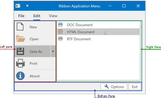
Application Menu Visual Structure
The Application Menu includes the following areas:
| Name | Description |
|---|---|
| Left pane | Contains Application Menu items |
| Right pane | Displays the selected submenu’s content. |
| Bottom pane | Displays the content at the Application Menu’s bottom. |
Left Pane’s Child Objects
Add items to the PopupMenu.Items collection to display the items at the left ApplicationMenu‘s pane. When an end-user hovers over a submenu at the left pane, the right pane is expanded and displayed.
Right Pane’s Child Objects
You can add any control within in the right pane. Assign the control to the ApplicationMenu.RightPane property to display it at the right pane.
Note
The ApplicationMenu.ShowRightPane property should be set to true to display the right pane.
Bottom Pane’s Child Objects
Assign a control to the ApplicationMenu.BottomPane property to display it in the bottom pane.
Customize an Application Menu
| Property | Description |
|---|---|
| PopupMenuBase.ItemsDisplayMode | Gets or sets the appearance of left menu’s items. |
| RightPaneWidth | Gets or sets the right pane’s width. |
Related GitHub Examples
The following code snippets (auto-collected from DevExpress Examples) contain references to the ApplicationMenu class.
Note
The algorithm used to collect these code examples remains a work in progress. Accordingly, the links and snippets below may produce inaccurate results. If you encounter an issue with code examples below, please use the feedback form on this page to report the issue.