BackstageViewControl Class
The MS Office style full-screen menu.
Namespace: DevExpress.Xpf.Ribbon
Assembly: DevExpress.Xpf.Ribbon.v26.1.dll
Declaration
public class BackstageViewControl :
    Control,
    IComplexLayout,
    IHierarchicalMergingSupport<BackstageViewControl>,
    IKeyTipNavigationOwner,
    INavigationOwner,
    IBarsNavigationSupport,
    IMutableNavigationOwner,
    IMutableNavigationSupport,
    IKeyTipNavigationRoot,
    IDisableNavigationTreeControl,
IBarsNavigationCompatibilityRelated API Members
The following members return BackstageViewControl objects:
Remarks
When your application uses Ribbon Control, you can add one of the following application menus to your application:
- The Application Menu is the Windows Explorer style popup menu.
- The Backstage View is the MS Office style full-screen menu.
Create a Backstage View
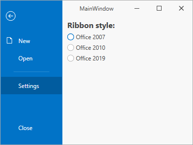
The following code sample adds a Backstage View to a RibbonControl:
<dx:ThemedWindow ...
  xmlns:dx="http://schemas.devexpress.com/winfx/2008/xaml/core"
  xmlns:dxr="http://schemas.devexpress.com/winfx/2008/xaml/ribbon" >
  <dxr:RibbonControl RibbonStyle="Office2019">
    <dxr:RibbonControl.ApplicationMenu>
      <dxr:BackstageViewControl>
        <dxr:BackstageViewControl.Items>
          <dxr:BackstageButtonItem Content="New" Glyph="{dx:SvgImageSource Uri='pack://application:,,,/DevExpress.Images.v26.1;component/SvgImages/Actions/New.svg', Size='16,16'}"/>
          <dxr:BackstageButtonItem Content="Open"/>
          <dxr:BackstageSeparatorItem  />
          <dxr:BackstageTabItem Content="Settings">
            <dxr:BackstageTabItem.ControlPane>
              <StackPanel Margin="10,5,0,0">
                <Label Content="Ribbon style:" FontSize="16" FontWeight="Bold"/>
                <RadioButton Content="Office 2007" />
                <RadioButton Content="Office 2010" />
                <RadioButton Content="Office 2019" />
              </StackPanel>
            </dxr:BackstageTabItem.ControlPane>
          </dxr:BackstageTabItem>
          <dxr:BackstageButtonItem Content="Close" Placement="Bottom"/>
        </dxr:BackstageViewControl.Items>
      </dxr:BackstageViewControl>
    </dxr:RibbonControl.ApplicationMenu>
  <!-- ... -->
  </dxr:RibbonControl>
  <!-- ... -->
</dx:ThemedWindow>
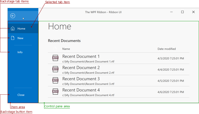
Backstage View Visual Structure
The Backstage View includes two areas:
| Name | Position in the Backstage View | Description |
|---|---|---|
| Item area | At the left | Contains all backstage items. |
| Control pane area | At the right | Displays the selected tab item’s content. |
Item Area’s Child Objects
A BackstageViewControl can contain the following child objects:
Access Child Tabs
You can use the read-only BackstageViewControl.Tabs list to access all the existing BackstageViewControl‘s tab items.
Customize a Backstage View
| Property | Description |
|---|---|
| BackgroundGlyph | Gets or sets the image displayed at the BackstageViewControl‘s right bottom corner. |
| TabPaneMinWidth | Gets or sets the Item area pane‘s minimum width. |
| RibbonStyle | Gets or sets the BackstageViewControl‘s paint style. |
| BackgroundStyle | Gets or sets the BackstageViewControl‘s background style. |
| CloseButtonVisibility | Gets or sets whether the button that closes the control is visible. |
| IsFullScreen | Gets or sets whether the BackstageViewControl occupies the entire client area of the application window. This is a dependency property. |
Tip
The Backstage View supports key tips navigation. Refer to the Key Tips topic for more information.
Inheritance
Object
DispatcherObject
DependencyObject
Visual
UIElement
FrameworkElement
Control
BackstageViewControl
See Also