TcxCustomProgressBarProperties.BarStyle Property
Specifies the progress bar’s paint style.
Declaration
property BarStyle: TcxProgressBarBarStyle read; write; default cxbsSolid;Property Value
| Type | Default |
|---|---|
| TcxProgressBarBarStyle | cxbsSolid |
Remarks
The table below lists available BarStyle property values, and shows their effect for progress bars that don’t use marquee style.
Note that the overload bar and peak values cannot be displayed when the native paint style is applied via the progress bar’s Style.LookAndFeel.NativeStyle property.
| Value | Description | Native Style Disabled | Native Style Enabled |
|---|---|---|---|
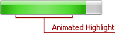
| cxbsAnimation | A Windows® Vista-style progress bar. The bar’s base color is specified by the BeginColor property. To customize settings of the animated highlight that moves across the progress bar, use the AnimationPath, AnimationRestartDelay, and AnimationSpeed properties. |  |
 |
| cxbsAnimationLEDs | A Windows® Vista-style progress bar, painted using a set of rectangles. The base color of rectangles is specified by the BeginColor property. To customize settings of the animated highlight, which moves across the progress bar, use the AnimationPath, AnimationRestartDelay, and AnimationSpeed properties. |  |
 |
| cxbsSolid | The progress bar is represented by a solid rectangle. The bar’s color is set by the BeginColor property. The color of the overload bar (if shown) is specified by the OverloadBeginColor property. |  |
 |
| cxbsLEDs | The progress bar is a set of rectangles. The color of rectangles is set by the BeginColor property. The color of rectangles corresponding to the overload bar (if shown) is set using the OverloadBeginColor property. |  |
 |
| cxbsGradient | The progress bar is represented by a rectangle with gradient filling. The starting and ending colors of the gradient are set using the BeginColor and EndColor properties. The starting and ending colors of the overload bar’s area are specified by the OverloadBeginColor and OverloadEndColor properties. |  |
|
| cxbsGradientLEDs | The progress bar is a set of rectangles filled using a gradient. The starting and ending colors of the gradient are set using the BeginColor and EndColor properties. The starting and ending colors of the overload bar’s area are specified by the OverloadBeginColor and OverloadEndColor properties. |  |
|
| cxbsBitmap | The progress bar is filled with a custom bitmap. The bitmap is specified by the ForegroundImage property. If the specified image is smaller than the control’s client area, it is tiled. |  |
 |
| cxbsBitmapLEDs | The progress bar is filled with a custom bitmap that is broken into a set of rectangles. The bitmap is specified by the ForegroundImage property. If the specified image is smaller than the control’s client area, it is tiled. |  |
 |
Note
The cxbsAnimation and cxbsAnimationLEDs bar styles do not support overload bars and peak values. The animated highlight is painted only if no skin is applied to the progress bar.
Default Value
The BarStyle property’s default value is pbbsSolid.
See Also