TcxCustomLookAndFeelController.SkinPaletteName Property
Specifies the name of the active color palette.
Declaration
property SkinPaletteName: string read; write;Property Value
| Type | Description |
|---|---|
| string | The name of the active color palette. The property value is always sdxDefaultColorPaletteName for a bitmap-based skin. Only vector skins support multiple color schemes. |
Remarks
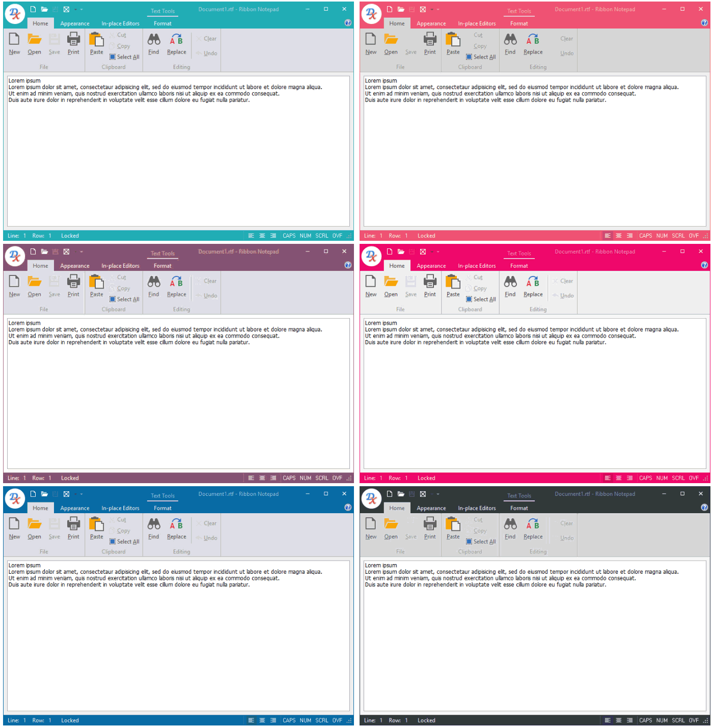
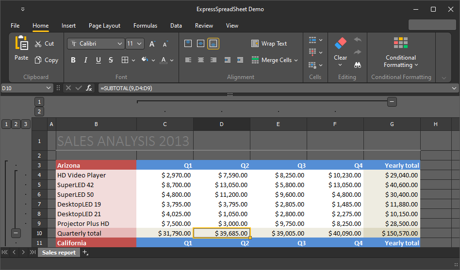
Use the SkinPaletteName property to switch between color schemes (palettes) available for the active vector skin.

Available Skin Palettes
Different vector skins ship with different sets of color palettes. To obtain the list of color palettes available for the active vector skin, you can call the PopulateSkinColorPalettes procedure. Assign a name from the populated name list to the SkinPaletteName property to apply the corresponding color palette to the active skin. If the assigned name is not on the list, the skin controller uses the default color palette.
Tip
You can use the Skin Editor to create custom color palettes for vector skins.
Skin Palette and SVG Glyph Interaction Settings
All SVG icons shipped with the DevExpress Icon Library include the following CSS style names that define corresponding SVG element colors: Red, Green, Blue, Yellow, Black, and White. DevExpress controls can use these CSS style names to apply the active vector skin palette to SVG glyphs to maintain contrast. You can disable or enable palette and glyph interaction application-wide or for individual UI glyphs and image lists.
Global Palette Interaction Settings
The following class properties allow you to disable or enable palette interaction for SVG glyphs application-wide:
- TdxVisualRefinements.UseDisabledSkinPaletteForSVG
- Specifies if UI elements apply the active vector skin palette to disabled state glyphs at the application level.
- TdxVisualRefinements.UseEnabledSkinPaletteForSVG
- Specifies if UI elements apply the active vector skin palette to enabled state glyphs at the application level.
Glyph and Image List Settings
Many UI elements allow you to load individual glyphs or assign glyphs stored in a TcxImageList component. You can use the following properties to explicitly enable or disable palette interaction for individual UI element glyphs or image lists:
- TdxGPImage.UseDisabledSkinPaletteForSVG
- Specifies if the active vector skin palette affects the stored SVG glyph for the disabled UI element state.
- TdxGPImage.UseEnabledSkinPaletteForSVG
- Specifies if the active vector skin palette affects the stored SVG glyph for the enabled UI element state.
- TcxCustomImageList.UseDisabledSkinPaletteForSVG
- Specifies if the active vector skin palette affects stored SVG glyphs for the disabled UI element state.
- TcxCustomImageList.UseEnabledSkinPaletteForSVG
- Specifies if the active vector skin palette affects stored SVG glyphs for the enabled UI element state.
Code Examples: Apply a Skin and its Palette
The following code example applies the WXICompact skin and its Sharpness palette to an application:
  dxSkinController1.BeginUpdate;
  try
    dxSkinController1.UseSkins := True;
    dxSkinController1.NativeStyle := False;
    dxSkinController1.SkinName := 'WXICompact';
    dxSkinController1.SkinPaletteName := 'Sharpness';
  finally
    dxSkinController1.EndUpdate;
  end;

Alternatively, you can call the SetSkin procedure:
  dxSkinController1.BeginUpdate;
  try
    dxSkinController1.NativeStyle := False;
    dxSkinController1.SetSkin('WXICompact', 'Sharpness');
  finally
    dxSkinController1.EndUpdate;
  end;
Default Value
The SkinPaletteName property’s default value is the sdxDefaultColorPaletteName global constant.