Items in Table and Card Views
- 5 minutes to read
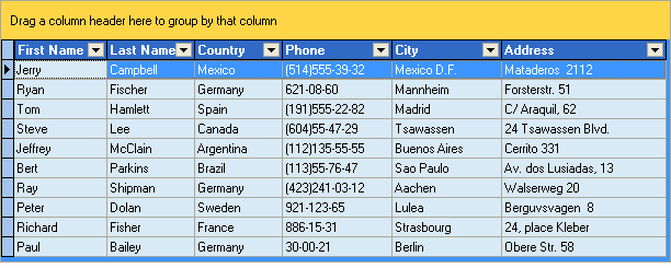
For the ExpressQuantumGrid the term “item” is used to describe a column in a data store. In a Table View, items stand for columns and are displayed across the View.
In a Card View, items are Card View rows and are arranged vertically.
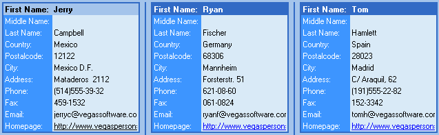
The TcxCustomGridTableItem class is the base class for all table items in Card Views.

All items can be divided into two main groups: data-aware and non data-aware.
Data-aware items (TcxGridDBColumn, TcxGridDBBandedColumn, TcxGridDBCardViewRow, TcxGridDBLayoutViewItem) are used in corresponding data-aware Views (TcxGridDBTableView, TcxGridDBBandedTableView, TcxGridDBCardView, TcxGridDBLayoutView).
Non data-aware items (TcxGridColumn, TcxGridBandedColumn, TcxGridCardViewRow, TcxGridLayoutViewItem) are elements of non data-aware Views (TcxGridTableView, TcxGridBandedTableView, TcxGridCardView, TcxGridLayoutView).
Every View has an Items property that maintains the collection of items created within each View. You can use the CreateItem method (CreateColumn or CreateRow in some Views) to create items manually. In a non data-aware View, you can create items using the Layout and Data Editor at design time. In a data-aware View, you can call the DataController.CreateAllItems method to create columns based on dataset fields. The Component Editor allows you to access all items in a View and create/delete them at design time.
It is possible to get and set a value for an item cell in a focused record via the EditValue member. The data controller gives you the ability to access the item values of all loaded records.
An item has various attributes controlling its behavior. For instance, you can prevent a user from editing, focusing item cells, changing the item’s position within the “group by” or column header panel, applying sorting or filtering by an item, etc.
Every item has a DataBinding property providing data for items from a View’s data controller. DataBinding retrieves data from and posts it back to a data store. Data-aware items redefine DataBinding to work with TDataSet fields.
The ExpressQuantumGrid provides a wide range of in-place editors to edit or display item cells. For instance, the TcxCheckBox editor provides a convenient way to edit Boolean fields. By default, items are assigned default editors as appropriate. In bound mode, the default editor is specified by the field type. For instance, TcxDateEdit is used to edit TDateField fields. See the FieldName topic for details.
In unbound mode, the default editor is determined by an item’s DataBinding.ValueTypeClass property. You must specify an appropriate value type to provide the appropriate behavior when sorting, editing, validating and accessing item values. Refer to the TcxValueType class to learn more about the default editors assigned in unbound mode.
To assign an editor to an item, you can use either the repository (repository and repository items) or the PropertiesClass object. A repository item defines the specific editor settings used for a particular item editor. A single repository item can be assigned to the RepositoryItem property of several items, thus creating items with the same edit behavior. PropertiesClass is another way to set an item editor. It defines the class of editor properties used to create a specific editor. If both RepositoryItem and PropertiesClass are assigned, the item editor is determined by a corresponding repository item. The ExpressQuantumGrid gives you the ability to specify different editors for individual item cells (i.e. on a row by row basis). You can handle the OnGetProperties event and specify the editor based on the record’s position or the data associated with it.
The GroupIndex property of an item allows you to group data within a View by this item. Grouping operations are implemented only in Table Views and are not supported in Card Views. You can group data by multiple items. The grid control provides the “group by” panel to which a user can easily drag a column by its caption to group by this column.
To sort data by an item, you should use the SortOrder property. You can sort by multiple items by setting the SortOrder property of these items to a value other than soNone. Data in a View is sorted in the exact SortOrder sequence. At runtime, a user can sort data by clicking a column’s caption. A small arrow specifies the current sort order. The up-arrow indicates that data is sorted in ascending order, while the down-arrow indicates that sorting is performed in descending order.
Data filtering within a View is implemented via a data controller. It provides a Filter property which specifies the filter conditions set for all the items in a specific View. A filter condition addresses the item, the operator type and the value with which every item cell is compared. When filtering is applied, only the records matching the filter criteria are displayed within the View.
At runtime, a user can press the filter down-arrow button in a Table View to filter by that column.

When a user selects a value from this list, a new EQUAL filter condition (of type “Column = Value”) is added to the existing filter criteria.
Selecting All from the list clears the filter condition set for the column. The Custom item displays a filter dialog that allows an end-user to define filter conditions with other operators (=, <>, <, <=, >, >=, LIKE and NOT LIKE). For more information on filter dialogs, refer to the Runtime Filtering section.
Our grid control gives you the ability to temporarily remove column(s) from a View. At runtime, a user can drag individual columns onto the Customization form thus hiding them in the View.

To display a column within the View again, the user must drag this column from the customization form onto the column header or “group by“ panel.
Dragging a column onto the Customization form results in setting its Visible property to False. It is possible to prevent a column from appearing in this form by setting its VisibleForCustomization property to False. In this case, if your column is dragged to the Customization form, it disappears completely and can only be made visible programmatically.