Customization Form
- 3 minutes to read
Customization forms provide runtime customization of Views. The appearance and capabilities of customization forms depend upon the View type. The following sections summarize the information on customization forms for various Views.
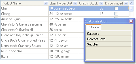
Customization Forms in Tabular and Card Views
In Table Views, Banded Table Views, and Card Views, end-users can hide and show table columns, bands and card rows at runtime using drag and drop. If a View’s customization form is visible and all the options required to allow elements to be hidden are set, end-users can drag a column header, band or row caption and drop it onto the customization form. As a result, the corresponding column, band or all corresponding card rows become hidden and can be made visible again by dragging the appropriate header from the customization form back to the View.
Customization Forms in Chart Views
In Chart Views, the customization form has three tabbed pages.
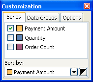
Series
This page allows end-users to select which series to display in the currently active diagram and also designate the plotting order of series values by selecting the series whose values will be used for sorting, and specifying the order in which its values will be sorted.
Data Groups
This page allows end-users to hide and show data groups via drag and drop. A data group appears in the customization form provided that its VisibleForCustomization property is set to True.
Refer to the Creating Data Groups in Chart Views topic to learn how to create data groups.
Options
This page provides a set of options which control various appearance aspects of chart elements such as a chart legend, title, and toolbox. These options are grouped by the corresponding chart elements.
Feature | Related Members |
|---|---|
Visibility | The customization form’s visibility is specified using the desired View’s Controller.Customization property. If you use a Table or Banded Table View whose column header menu is enabled, end-users can invoke the customization form using this menu’s Field Chooser item. If you use a Chart View, you should enable the customization button in a chart toolbox using the View’s Toolbox.CustomizeButton property. If it’s enabled, end-users will be able to invoke the customization form by clicking this button. If you need to respond to such end-user actions, handle the View’s OnCustomization event. |
Content | Customization forms display tabs corresponding to the types of elements they can hold. For instance, a Table View’s customization form displays a single Columns tab, while a Banded Table View’s customization form additionally displays the Bands tab. Pages corresponding to these tabs display lists of elements whose Visible property is set to False. Note that you can prohibit displaying an element within the customization form by setting this element’s Hidden property to True (this relates to bands, table columns and card rows). You can customize the caption of columns or card rows displayed in the dialog via their AlternateCaption property. In Chart Views, you can control the visibility of the Series, Data Groups, and Options tabs in the customization form using the View’s OptionsCustomize.SeriesCustomization, OptionsCustomize.DataGroupMoving, and OptionsCustomize.OptionsCustomization properties, respectively. |
Appearance | You can access the View’s customization form via the Controller.CustomizationForm property. This property returns an object which is a TForm descendant and this enables you to customize the customization form as any other form. Note that you can also use the Controller.CustomizationFormBounds property to specify the form’s position and size before making it visible. |