TcxCustomGridTableItem Class
The base class for all data items in Table, Banded Table, Card, Layout, and WinExplorer grid Views.
Declaration
TcxCustomGridTableItem = class(
    TcxComponent,
    IcxEditRepositoryItemListener,
    IcxStoredObject,
    IdxScaleFactor,
    IdxFilterableComponent,
    IdxFilterImagesProvider,
    IdxExcelFilterableComponent,
    IdxCustomFunctionContainer,
    IdxCustomFunctionFilterableComponent,
    IdxDateTimeHandling,
    IdxFilteringDateTimeHandling,
    IdxGroupingDateTimeHandling,
    IcxDataControllerSpreadSheetExpressionItem,
    IdxAutomationElement,
    IdxAISmartPasteItem,
    IdxFormattedTextOwner
)
Remarks
The TcxCustomGridTableItem class implements core functionality common to data items in all grid Views except for Chart in all supported data access modes. A data item is designed to display data of the same type. In bound and server data access modes, a data item corresponds to an individual dataset field.
Data Item Types
Data items are main visual elements of all grid Views. Depending on the View type, data items describe different View elements:
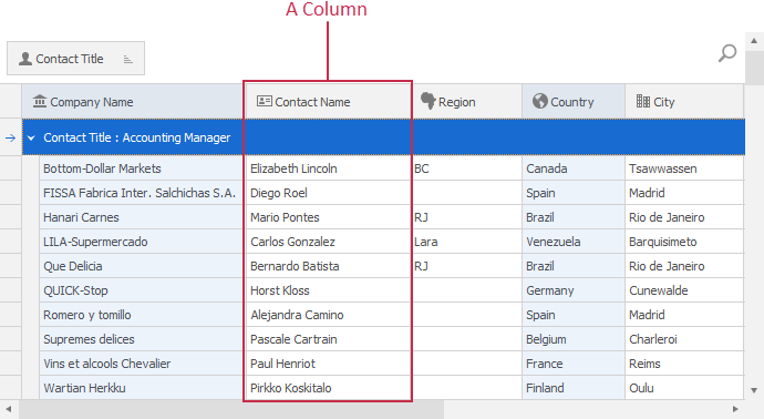
- Column
In a Table or Banded Table View, data items are columns that populate the View from left to right.
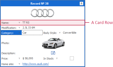
- Card Row
In a Card View, items are card rows arranged vertically.
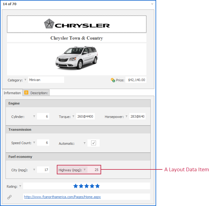
- Layout Data Item
A layout data item is embedded into a layout container.
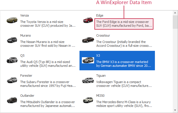
- WinExplorer Data Item
A WinExplorer data item is an image, text, check box, or group associated with a dataset field.
In-Place Editors
A data item can use any editor shipped with the ExpressEditors Library as an in-place editor for cell edit operations. An in-place editor instance exists (and, therefore, has its own WinAPI handle) only when a data item cell is being edited. Otherwise, the data item displays a static editor image for resource usage optimization.

To switch between available in-place editors, you can use the PropertiesClass property. Use the Properties property to configure the in-place editor associated with the data item.
In-Place Editors and Repository Items
Alternatively, you can assign an edit repository item component to the RepositoryItem property, and use the repository item to define the active in-place editor and customize its settings.
Note
If an edit repository item is assigned to the RepositoryItem property, Properties, PropertiesClass, and PropertiesClassName properties have no effect.
Multiple In-Place Editors in One Data Item
You can handle OnGetProperties and OnGetPropertiesForEdit events to dynamically change the assigned in-place editor and its settings based on custom conditions.
Important
Do not change PropertiesClass, PropertiesClassName, and Properties property values directly in OnGetProperties and OnGetPropertiesForEdit event handlers.
To change the active editor and modify its settings safely within these event handlers, use the RepositoryItem property and TcxEditRepositoryItem class descendants.
Main API Members
The list below outlines key members of the TcxCustomGridTableItem class that allow you to configure columns, card rows, as well as layout and WinExplorer items in corresponding grid Views.
Appearance Customization
- ApplyBestFit | BestFitMaxWidth
- Allow you to adjust the column width to display content in full and limit the maximum column width in this mode.
- Caption | AlternateCaption
- Specify main and alternative captions for the column. An alternative column caption can replace the main caption in customization dialogs, filter panels, etc.
- HeaderGlyph | HeaderImageIndex
- Allow you to assign a glyph to the column header.
- OnCustomDrawCell
- Allows you to override or complement column draw routines.
- OnGetDisplayText | OnGetFilterDisplayText
- Allow you to customize display text and column captions displayed in a filter drop-down window.
- OnGetFilterImages | OnGetFilterValues
- Allow you to customize the column’s filter drop-down window.
- Styles
- Allows you to customize the appearance of different data item elements.
In-Place Editor Settings
- AI
- Provides access to AI-powered functionality settings.
- Editing
- Specifies if the assigned in-place cell editor is active.
- OnGetProperties
- Allows you to display different in-place editors for different records or customize editor settings based on custom conditions.
- OnGetPropertiesForEdit
- Allows you to change the assigned in-place editor and customize its settings when a user invokes the editor.
- Properties
- Provides access to the settings of the assigned in-place editor.
- PropertiesClass
- Specifies the active in-place editor class. At design time, you can use the Properties node in the Object Inspector to assign an in-place editor to the column and configure the editor.
- RepositoryItem
Allows you to associate the column with a repository item that defines the required in-place editor and its settings.
Tip
Repository items are particularly useful if you need to share in-place editor settings between multiple grid View items or customize editor settings in OnGetProperties and OnGetPropertiesForEdit event handlers.
Data Management
- DataBinding
- Provides access to data binding settings.
- GroupIndex
- Allows you to group columns in the parent grid View by the current column.
- SortIndex | SortOrder
- Allow you to sort data in the parent grid View against the current column.
Grid View-Related API Members
- Focused
- Specifies if the data item has focus.
- Index
- Defines the data item position in its parent grid View.
- IsFirst | IsLast
- Identify if the data item is the first or last in the parent grid View’s collection of visible data items.
- MakeVisible
- Scrolls the parent grid View to display the current data item.
General-Purpose API Members
- Editable
- Allows you to identify if the data item is editable.
- GridView
- Provides access to the parent grid View.
- Options
- Allows you to configure general data item settings.
- RestoreDefaults
- Restores the default values of data item type-specific settings, such as Caption and Width.
TcxCustomGridTableItemclass descendants override this procedure with data item type-specific implementations. - ShowExpressionEditor
- Displays the Expression Editor dialog.[1]
- Visible
- Specifies if the data item is visible.
Data Item Deletion
To delete a grid data item, release it directly in code (call the Free procedure in Delphi or use the delete keyword in C++Builder):
Terminal TcxCustomGridTableItem Class Descendants
Do not use the TcxCustomGridTableItem class directly. Use the following descendants instead:
Unbound View Items
- TcxGridBandedColumn
- A column in an unbound Banded Table View.
- TcxGridCardViewRow
- An unbound Card View row.
- TcxGridColumn
- A column in an unbound grid Table View.
- TcxGridLayoutViewItem
- A Layout View‘s data item.
- TcxGridWinExplorerViewItem
Data-Aware View Items
- TcxGridDBCardViewRow
- A data-aware Card View row.
- TcxGridDBColumn
- A column in a data-aware grid Table View.
- TcxGridDBBandedColumn
- A column in a data-aware Banded Table grid View.
- TcxGridDBLayoutViewItem
- A data-aware Layout View’s data item.
- TcxGridDBWinExplorerViewItem
Server Mode View Items
- TcxGridServerModeColumn
- A column in a Server Mode grid Table View.
- TcxGridServerModeBandedColumn
- A column of a Banded Table View in Server Mode.
Implements
Inheritance
-
All Server Mode Views do not support calculated field expressions because these Views load data on demand.
A ShowExpressionEditor procedure call has no effect for simple and banded columns in Server Mode grid Views.