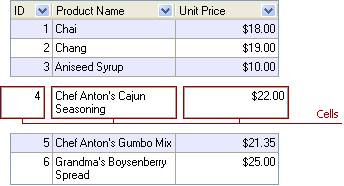
Cell
- 2 minutes to read
Cells display field values from particular records and, thus, stand at the intersection of a column and row (card row and card). In Chart Views, category values and data markers correspond to field values.

Feature | Related Members |
|---|---|
Content | Cells display values from the underlying data source. The format of such values depends on editors that are assigned to cells. Note that you can also provide custom display texts for cells by handling the desired column’s or card row’s OnGetDisplayText or OnGetDataText events. |
Appearance | At a View’s level specified by the Styles.Content, Styles.ContentEven and Styles.ContentOdd properties. You can also specify the style for cells within a particular column or card row using its Styles.Content property. The style specified at a column or card row level overrides other styles applied. Note also, that in Banded Table Views you can specify a style for cells residing within a particular band using the desired band’s Styles.Content property. To specify styles for individual cells, handle the View’s Styles.OnGetContentStyle or a column’s or card row’s Styles.OnGetContentStyle event. The background bitmap for cells can be set via the View’s BackgroundBitmaps.Content property. |
Custom Draw | The View’s OnCustomDrawCell event. To provide custom painting for cells in individual columns or card rows, you can also handle the column’s or card row’s OnCustomDrawCell event. |