TcxGridTableView Class
An unbound Table View in the VCL Data Grid.
Declaration
TcxGridTableView = class(
    TcxCustomGridTableView,
    IdxLayoutContainerOwner
)
Remarks
The TcxGridTableView class implements a simple table designed to display data of the same type in corresponding columns.

In-Place Editors
A column can use any unbound editor shipped with the ExpressEditors Library as an in-place editor for cell edit operations. An in-place editor instance exists (and, therefore, consumes memory and other system resources, such as a WinAPI handle) only when a column cell is being edited. Otherwise, the column displays a static editor image for resource usage optimization.
To switch between available editors, you can use the PropertiesClassName or PropertiesClass property. Use the Properties property to configure the in-place editor associated with the column.
Sort Data
The View allows users to sort data in ascending or descending order.
Users can sort data by the following:
- Column cell values
- Group row values
- Group summary values
You can also sort data at design time and runtime.
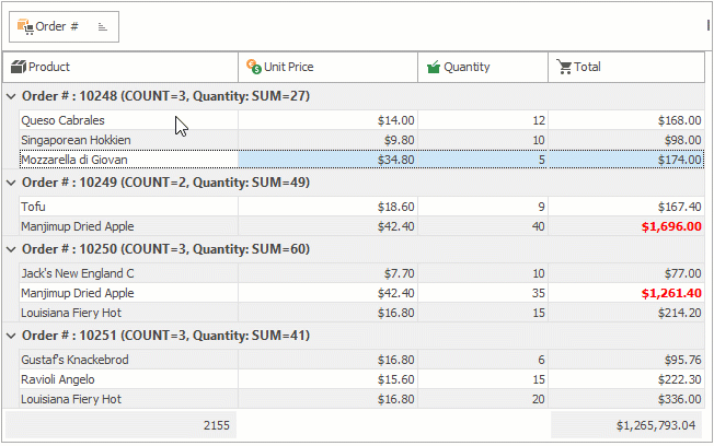
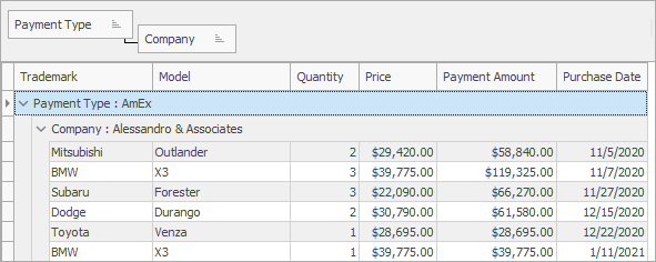
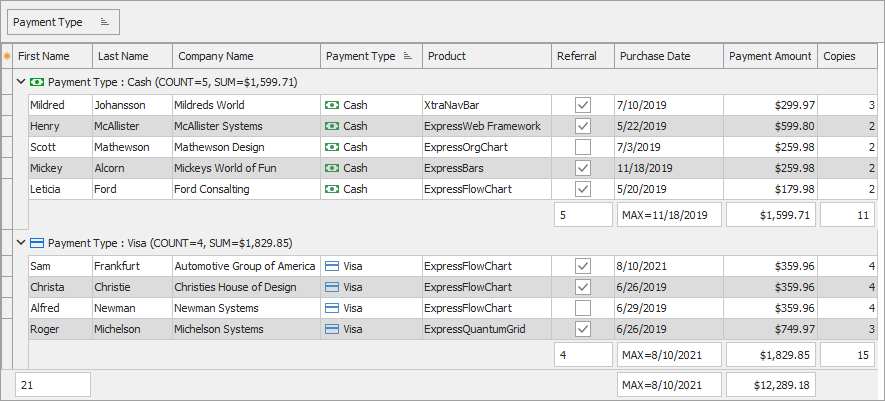
Group Data
The View allows users to drag column headers to the Group By box to group data. You can combine any number of columns in data groups.
Filter
The View uses a data controller to filter data. When a user creates new filter conditions, the data controller retrieves only those data rows that meet these conditions. The View displays active filter criteria in the filter panel.
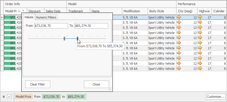
A user can create filter conditions in any of the following ways:
- Enter a condition in a column’s filter row.
- Click a column’s filter button to open the filter dropdown.
- Click the panel’s Customize button to open the Filter Builder dialog.
Search
The View has the Find Panel that allows users to type search requests and highlight results. You can switch the panel between search and data filter processing modes.
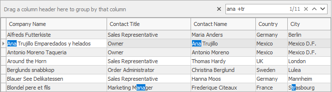
The panel also supports extended syntax that allows a user to input compound requests.
Conditional Formatting
You can create rules to apply custom formatting to data rows whose content meets these rules.
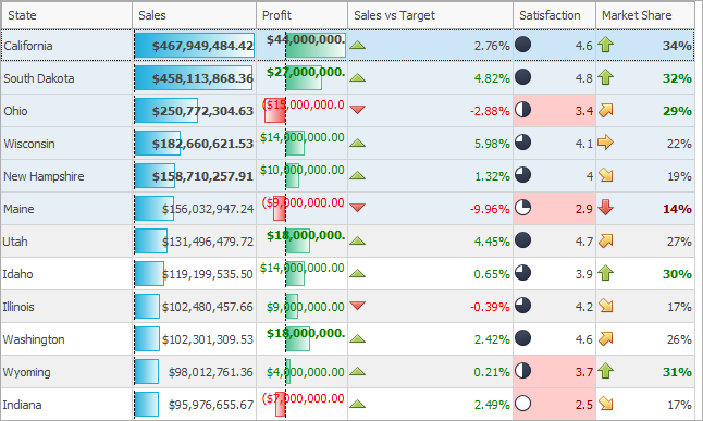
Summaries
Summaries allow a user to calculate totals against all records or a group of records.
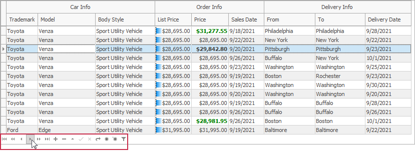
Navigation
The View can display the Data Navigator pane that allows users to navigate through data rows, manage records, and filter data.
Main API Members
The list below outlines key members of the TcxGridTableView class. These members allow you to configure unbound grid Table Views.
General Appearance Settings
- OptionsView
- Provides access to general appearance settings.
- RowLayout
- Provides access to row layout settings.
- Preview
- Allows you to display and configure a preview section in the grid Table View.
- Styles
- Allows you to apply styles to the grid Table View.
General Behavior and User Interaction Settings
- Automation
- Provides access to UI Automation and accessibility-related settings.[1]
- OptionsBehavior
- Provides access to general behavior settings.
- OptionsCustomize
- Allows you to specify table layout customization options available to users.
- OptionsSelection
- Provides access to all selection-related settings.
Column Management
- ColumnCount
- Returns the number of columns accessible through the Columns property.
- Columns
- Provides indexed access to all columns in the grid Table View.
- CreateColumn
- Creates a new unbound column.
- GroupedColumnCount
- Returns the number of columns accessible through the GroupedColumns property.
- GroupedColumns
- Provides indexed access to all grouped columns.
- VisibleColumnCount
- Returns the number of columns accessible through the VisibleColumns property.
- VisibleColumnCountByFixedKind
- Returns the number of fixed columns (by anchor mode).
- VisibleColumns
- Provides indexed access to all visible columns in the grid Table View.
Data Management and Data-Related Options
- DataController
Provides access to the data controller designed to store and manage data displayed in the grid Table View.
Tip
Use DataController.RecordCount and DataController.Values properties to populate the grid Table View in unbound data access mode as demonstrated in the code example below.
Data Shaping APIs
- ConditionalFormatting
- Allows you to apply and manage conditional formatting rules.
- DateTimeHandling
- Provides access to date/time value display and interpretation settings.
- Filtering
- Provides access to data filter settings.
- FilterRow
- Allows you to display and configure a filter row.
- OptionsData
- Provides access to data-related grid Table View behavior settings. You can use these settings to specify data operations available to users (add, insert, delete records, etc.).
- SortedItemCount
- Returns the number of sorted columns accessible through the SortedItems property.
- SortedItems
- Provides indexed access to all sorted columns.
Custom Draw Events
- OnCustomDrawCell
- Allows you to override or complement built-in draw routines for data cells.
- OnCustomDrawColumnHeader
- Allows you to override or complement built-in draw routines for column headers.
- OnCustomDrawFooterCell
- Allows you to override or complement built-in draw routines for footer cells.
- OnCustomDrawGroupCell
- Allows you to override or complement built-in draw routines for group row cells.
- OnCustomDrawGroupSummaryCell
- Allows you to override or complement built-in draw routines for group summary cells.
- OnCustomDrawIndicatorCell
- Allows you to override or complement built-in draw routines for indicator column cells.
- OnCustomDrawPartBackground
- Allows you to override or complement built-in background draw routines.
User Interaction Events
- OnColumnHeaderClick
- Allows you to execute custom code in response to clicks on column headers.
- OnColumnPosChanged | OnColumnSizeChanged
- Allow you to respond to column position and size changes.
- OnGroupRowExpanded | OnGroupRowCollapsed
- Allow you to respond to group row expand and collapse operations.
- OnGroupRowExpanding | OnGroupRowCollapsing
- Allow you to prevent users from expanding or collapsing group rows.
- OnLeftPosChanged
- Allows you to track horizontal scrollbar movement.
General-Purpose API Members
- Controller
- Provides access to the grid Table View controller. You can use this property to execute commands available to users in the UI (search, edit operations, navigation, scrolling, etc.).
- ViewData
- Provides access to all rows currently visible in the grid Table View client area.
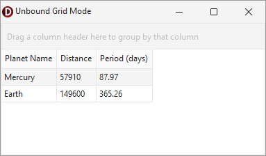
Code Example: Create and Populate Unbound Grid Views
The code example in this section creates an unbound grid Table View (TcxGridTableView) with three columns and populates them. To display data in the TcxGrid control, the code example also creates a root grid level and associates it with the created grid View.
uses
  cxGrid,  // Declares the TcxGrid control
  cxGridLevel,  // Declares the TcxGridLevel class
  cxGridTableView,  // Declares TcxGridTableView and TcxGridColumn classes
  cxTextEdit,  // Declares the TcxTextEditProperties class
  cxSpinEdit;  // Declares the TcxSpinEditProperties class
// ...

var
  AGrid: TcxGrid;
  AGridLevel: TcxGridLevel;
  ATableView: TcxGridTableView;
  AColumn: TcxGridColumn;
begin
  AGrid := TcxGrid.Create(Self); // Creates a TcxGrid control
  AGrid.Parent := Self;  // Associates the TcxGrid control with the application form
  AGrid.Align := alClient;
  AGridLevel := AGrid.Levels.Add;  // Creates a root grid level
  // Create and configure a Table View
  ATableView := AGrid.CreateView(TcxGridTableView) as TcxGridTableView;
  AGridLevel.GridView := ATableView;  // Associates the Table View with the root grid level
  // Configure and populate the created Table View
  ATableView.BeginUpdate;  // Initiates the following batch operation
  try
    AColumn := ATableView.CreateColumn;  // Creates the first column
    AColumn.Caption := 'Planet Name';
    AColumn.PropertiesClass := TcxTextEditProperties;  // Assigns a single-line text editor
    (AColumn.Properties as TcxTextEditProperties).ReadOnly := True;  // Enables read-only mode
    (AColumn.Properties as TcxTextEditProperties).HideSelection := True;  // Disables selection
    AColumn := ATableView.CreateColumn;  // Creates the second column
    AColumn.PropertiesClass := TcxSpinEditProperties;  // Assigns a spin editor
    (AColumn.Properties as TcxSpinEditProperties).Increment := 10;
    AColumn.Caption := 'Distance';
    AColumn := ATableView.CreateColumn;  // Creates the third column
    AColumn.Caption := 'Period (days)';
    ATableView.DataController.RecordCount := 2;  // Creates two empty records in a data controller
    // Populate the first record
    ATableView.DataController.Values[0, 0] := 'Mercury';
    ATableView.DataController.Values[0, 1] := 57910;
    ATableView.DataController.Values[0, 2] :=  87.97;
    // Populate the second record
    ATableView.DataController.Values[1, 0] := 'Earth';
    ATableView.DataController.Values[1, 1] := 149600;
    ATableView.DataController.Values[1, 2] := 365.26;
  finally
    ATableView.EndUpdate;  // Calls EndUpdate regardless of the batch operation's success
    ATableView.ApplyBestFit;  // Adjusts column width to fit captions and content (once data is displayed)
  end;
end;
Other Grid View Classes
Table Views
- TcxGridDBTableView
- A bound Table View in the VCL Data Grid.
- TcxGridServerModeTableView
- The Table View that provides support for server mode.
Banded Table Views
- TcxGridBandedTableView
- A View that groups columns into bands.
- TcxGridDBBandedTableView
- A data-aware Banded Table View.
- TcxGridServerModeBandedTableView
- The Banded Table View that provides support for server mode.
Card Views
- TcxGridCardView
- A Card grid View.
- TcxGridDBCardView
- Represents a data-aware Card View.
Layout Views
- TcxGridLayoutView
- An unbound Layout grid View.
- TcxGridDBLayoutView
- A data-aware Layout View.
WinExplorer Views
- TcxGridWinExplorerView
- An unbound WinExplorer View.
- TcxGridDBWinExplorerView
- A data-aware WinExplorer View.
Implements
Inheritance
-
Each column has its own Automation property.