Get Started
- 12 minutes to read
This topic explains core Ribbon Control concepts.
Base Ribbon UI Settings
Invoke the form smart tag menu to convert your form to a Ribbon Form. This action converts a form and adds the RibbonControl and RibbonStatusBar controls.

The Ribbon Control arranges its buttons into page groups, and page groups merge into pages (tabs). Apart from these main areas, you can also add items to:
- form title bar area;
- page header area;
- Quick Access Toolbar (QAT);
- main application menu.

Every area that can host an item (button, editor, etc.) has a “+” icon that you can click to create a new item and place it in this area. Icons next to page groups and pages allow you to add more of these areas.
Click the “+” icon inside a page group and select “Button (BarButtonItem)” to create a regular push button.

You can invoke a smart tag menu for a selected item to modify its main settings: caption, image, and ribbon style. The “Ribbon style” setting allows you to choose whether or not a button should display its text, and which size its icon should have (16x16 or 32x32 pixels). See this property for more details: BarItem.RibbonStyle.

Note that you can select and invoke smart tag menus for pages and page groups as well. You can do this to quickly rename tabs and page groups.
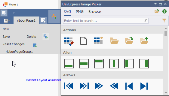
The DevExpress WinForms installation ships with the Image Gallery tool. This Gallery includes hundreds of raster and vector icons drawn by our designers that you can freely use in your apps.
You can also open the Image Picker panel and dock it anywhere inside Visual Studio. This panel reads the currently selected item’s title, and suggests corresponding DevExpress icons. Double-click (or drag-and-drop) an icon to instantly assign it to the selected item.
Both Ribbon and BarManager controls employ the “items - item links” concept. Whenever you create a button, an editor, or any other toolbar command, a corresponding BarItem is created (BarButtonItem, BarEditItem, etc.). However, these items are stored internally and aren’t visible at runtime. Instead, users see copies of these items: item links. This techique allows you to create one item (for instance, the “Open” button) and display links to this item in multiple areas.

To copy a command to a new area (create another bar item link to an existing bar item), drag-and-drop this command with the “Ctrl” key pressed. The “+” sign appears under the mouse pointer to indicate the item is being copied, not moved.
When you press “Del” to remove a command, the Ribbon Control asks whether you want to remove this item link only, or the parent bar item with all of its bar item links.

If you check the “Remember this selection and do not ask me next time” option, the confirmation dialog will no longer appear. If you change your mind and require the confirmation dialog to pop up again, find the
HKEY_CURRENT_USER\Software\Developer Express\Designer\XtraBars\ShowBarElementDeletionConfirmationregistry key and set its value toTrue.Tip
You can delete all Bar Items that do not have links (that is, they are not accessible through the UI) simultaneously. To remove these Bar Items, click “Remove Unassigned Items” in the Ribbon Control’s smart tag menu.
When you add an editor to a Ribbon or Ribbon Status Bar, the control creates a BarEditItem that wraps this editor. You can access the editor through the BarEditItem’s Edit property. The image below illustrates a ProgressBarControl inside a Ribbon Status Bar; the
MinimumandMaximumeditor properties allow you to set up its value range.
Editor width and current value are set with the BarEditItem.EditWidth and BarEditItem.EditValue properties.
Page Categories
All Ribbon Pages that you add are placed into a default category. You can click the “Add Category” button on the Ribbon surface to add custom categories. These categories have a Visible property that allows you to decide whether a category is constantly visible, or shown only under a specific condition. For instance, in the Ribbon Simple Pad Demo, the “Selection” category is shown only when a user selects text.

See this topic for more information about Ribbon page categories: Categories and Contextual Tabs.
Main Menu
Unless the RibbonControl.ShowApplicationButton property is disabled, a Ribbon control displays a button that invokes a main application menu. Depending on the Ribbon Style (see the Ribbon Styles section of this document), this element can be shown as a button in the Ribbon Control’s top left corner, as a tab with a menu icon, or as the “File” tab.

Tip
You can customize the Application Button image and text with the ApplicationButtonImageOptions and ApplicationButtonText properties.
In order for the Application Button to display a main app menu, you need to assign this menu to the RibbonControl.ApplicationButtonDropDownControl property. This property can accept an Object of the following types:
- ApplicationMenu - a panel-like menu that has a limited size. This menu style was used in Microsoft Office 2007 and older versions.

- BackstageViewControl - a menu that occupies an entire form. This menu style can be seen in modern Microsoft Office versions starting with the 2010 release. You can use the RecentItemControl to create BackstageViewControl’s item layout.

Choose the required menu type and drop a corresponding control from the Visual Studio Toolbox directly onto the form surface. Once you assign it to the ApplicationButtonDropDownControl, it is not visible at runtime.
Ribbon Styles
The Ribbon Control includes multiple styles that affect control features and appearance of its elements. For instance, the “Office Universal” style does not support large Ribbon links and arranges all buttons in a single row, and “Office 2019” adds a button that allows users to switch between regular and “Simplified” Ribbon modes. You can read about unique Ribbon features specific to every style in this help article: Ribbon Styles.
To switch a Ribbon Control style, use the control smart tag menu or modify the RibbonStyle property value in the Visual Studio Property Grid.
Context Menus
To create a popup (context) menu, invoke the Ribbon Control smart tag menu, click “Run Designer” and switch to the designer “Sub Menus and Popup Menus” tab. Click “Add New Popup Menu” to create an empty PopupMenu object.

In this designer tab you can drag and drop existing Ribbon items from the middle panel to add them to a selected menu. The “[Add]” link allows you to create new items.

Tip
Add BarHeaderItems to insert captions between regular menu items. This allows you to break down menu items into multiple categories.
To show a menu, call its ShowPopup method inside a required event handler (for instance, MouseDown).
void GridControl_MouseDown(object sender, MouseEventArgs e) {
    GridControl grid = sender as GridControl;
    if (e.Button == MouseButtons.Right)
        popupMenu1.ShowPopup(grid.PointToScreen(e.Location));
}
Tip
When you place a RibbonControl on a form at design time, all controls publish the PopupContextMenu extender property (its caption in the Visual Studio Properties window is “PopupContextMenu on <Ribbon control name>“). If you assign a context menu to this property, this menu will pop up at runtime when users right-click the control. You do not need to manually handle MouseDown or other mouse events.
See also: Radial Menu | DXPopupMenu
Auto-Generated Ribbon Controls
A number of DevExpress WinForms controls can generate a Ribbon control and populate it with commands related to this control. For example, the Chart Control generates a Ribbon that allows users to change a series’ view type, add and remove indicators, draw lines, and so forth.
](/WindowsForms/images/chart-control/ribbon/ribbon.png)
See the following help articles for more information about auto-generated Ribbons:
Ribbon Control in MVVM Apps
DevExpress MVVM Framework allows you to build applications that follow a Model-View-ViewModel concept. This concept implies that data, UI, and application logic are split into independent layers.
Based on this concept, you cannot handle Click events for Ribbon Items because that moves business logic to the UI (View) layer. Instead, you need to declare a Command inside a ViewModel and bind it to a required Ribbon item.
//a View with Ribbon
public partial class RibbonForm1 : DevExpress.XtraBars.Ribbon.RibbonForm {
    public RibbonForm1() {
        InitializeComponent();
        if(!mvvmContext.IsDesignMode)
            InitializeBindings();
    }
    void InitializeBindings() {
        var fluent = mvvmContext1.OfType<RibbonForm1ViewModel>();
        fluent.BindCommand(barButtonItem1, x=>x.OpenDocument;
        fluent.SetBinding(barEditItem1, e => e.EditValue, x => x.Ed);
    }
}

//ViewModel with business logic
[POCOViewModel()]
class RibbonForm1ViewModel {
    public void OpenDocument() {
        //...
    }
}
See the following help article for more information: Commands.
How to Create a Ribbon UI in Code
The code from this section creates a sample Ribbon UI.
Key Takeaways
Ribbon Pages are instances of the RibbonPage class stored in the RibbonControl.Pages collection.
Ribbon Page Groups are instances of the RibbonPageGroup class stored in the RibbonPage.Groups collections of their parent Pages.
Categories are RibbonPageCategory objects stored in the RibbonControl.Categories collection. To add a Page to a custom category, place this Page into the RibbonPageCategory.Pages collection of this category.
To add a bar item link to the required area, place a parent bar item into the related collection:
Area
Link collection
Page Group
Page Header Area
QAT
Form Title Bar
Ribbon Status Bar
- When you create a Bar Item in code, always specify the Ribbon that owns this item. To do this, either use an overload that has the “manager” parameter, or add this item to the RibbonControl.Items collection.
Ribbon Status Bar has two areas that display links: left and right. The parent bar item’s Alignment property value specifies the area where the bar item link is displayed.
There is no API to retrieve images from the DevExpress Image Gallery in code. Instead, create an ImageCollection or SvgImageCollection at design time, populate it with Image Gallery images, and assign this collection to the control’s
Imagesproperty. Then you can useImageIndexproperties to obtain collection images by their indexes, and assign these images to visual elements.
- Wrap large Ribbon customization code in the
BeginInit/EndInitmethod calls to avoid excessive visual updates.
Complete Code
using DevExpress.XtraBars;
using DevExpress.XtraBars.Ribbon;
using DevExpress.XtraEditors.Repository;
using System.Drawing;

namespace DXApplication18 {
    public partial class MainForm : RibbonForm {
        public Form2() {
            InitializeComponent();
            //Create Ribbon UI
            RibbonControl rc = new RibbonControl();
            rc.Images = svgImageCollection1;
            rc.RibbonStyle = RibbonControlStyle.Office2019;
            RibbonStatusBar rsb = new RibbonStatusBar();
            rsb.Ribbon = rc;
            this.Controls.Add(rc);
            this.Controls.Add(rsb);
            rc.BeginInit();
            //Add Ribbon tabs
            rc.Pages.Clear();
            rc.Pages.Add(new RibbonPage("Main Page"));
            rc.Pages.Add(new RibbonPage("Secondary Page"));
            //Add RibbonPageGroups to the first page
            rc.Pages["Main Page"].Groups.Clear();
            rc.Pages["Main Page"].Groups.Add(new RibbonPageGroup("Edit"));
            rc.Pages["Main Page"].Groups.Add(new RibbonPageGroup("Format"));
            //Add buttons to the "Edit" page group
            BarButtonItem bbiOpen = new BarButtonItem(rc.Manager, "Open", 0);
            bbiOpen.RibbonStyle = RibbonItemStyles.Large;
            bbiOpen.Hint = "Load an existing document";
            BarButtonItem bbiClose = new BarButtonItem(rc.Manager, "Close", 1);
            bbiClose.RibbonStyle = RibbonItemStyles.SmallWithText;
            BarButtonItem bbiCopy = new BarButtonItem(rc.Manager, "Copy", 2);
            bbiCopy.RibbonStyle = RibbonItemStyles.SmallWithText;
            rc.Pages[0].Groups[0].ItemLinks.AddRange(new BarItem[] {
                bbiOpen, bbiClose, bbiCopy
            });
            //Add custom categories
            RibbonPageCategory rCat = new RibbonPageCategory("Contextual Category", Color.DeepPink);
            rc.PageCategories.Add(rCat);
            rCat.Pages.Add(new RibbonPage("Selection"));
            rCat.Pages[0].Groups.Add(new RibbonPageGroup("Selection Tools"));
            rCat.Visible = true;
            rCat.AutoStretchPageHeaders = true;
            //Add a links to existing items to Page Header area and QAT
            rc.PageHeaderItemLinks.Add(bbiOpen);
            rc.Toolbar.ItemLinks.Add(bbiOpen);
            //Add a new item to QAT
            BarButtonItem biUndo = new BarButtonItem();
            biUndo.Caption = "Undo";
            biUndo.ImageIndex = 3;
            rc.Items.Add(biUndo);
            rc.Toolbar.ItemLinks.Add(biUndo);
            //Add new item to Form Title Bar area
            rc.CaptionBarItemLinks.Add(new SkinPaletteDropDownButtonItem());
            rc.CaptionBarItemLinks.Add(new SkinDropDownButtonItem());
            //Add Items to Ribbon Status Bar
            BarStaticItem statusLabel = new BarStaticItem() {
                Caption = "Ready", Alignment = BarItemLinkAlignment.Right
            };
            rc.Items.Add(statusLabel);
            rsb.ItemLinks.Add(statusLabel);
            RepositoryItemZoomTrackBar riZoom = new RepositoryItemZoomTrackBar();
            riZoom.Maximum = 200;
            riZoom.Minimum = 0;
            BarEditItem biZoom = new BarEditItem(rc.Manager, riZoom);
            biZoom.EditWidth = 150;
            biZoom.EditValue = 100;
            rsb.ItemLinks.Add(biZoom);
            rc.EndInit();
        }
    }
}