Grid Columns
- 10 minutes to read
Important Notes
We do not recommend binding multiple columns to the same data field because this causes multiple side effects. For example, you cannot access a specific column by field name, an update to a single cell value affects all related columns, and unexpected behavior may occur when records are sorted, filtered, or grouped.
For information on similar functionality in other data-aware controls, refer to the following help topics:
Automatic Column Generation
When you bind a Data Grid to a data source, the grid automatically generates a column for each data source field (if the AutoPopulateColumns property is enabled).
For code-first data sources (for example, Entity Framework models), you can mark a property with the Display attribute and disable its AutoGenerateField parameter to skip column generation for this property.
The following example applies the Display attribute (with AutoGenerateField disabled) to the “AdditionalInfo” data source field. The grid control will not create a column for the “AdditionalInfo” field.
[Display(AutoGenerateField = false, Description = "This column isn't created")]
public string AdditionalInfo { get; set; }
You can also apply attributes to rearrange columns, specify header captions, change default in-place editors, etc. Read the following help topic for more information: Data Annotation Attributes.
When you rebind the Grid control to a different data source, the grid does not automatically update columns. Invoke the Data Grid Designer, switch to the Columns tab, and click the Retrieve Fields button to remove existing columns and create columns for all fields in the data source at design time:

Call the BaseView.PopulateColumns method after a data source change or in the GridControl.DataSourceChanged event handler to regenerate columns at runtime.
Tip
The Grid Control also supports unbound columns that display custom values. Read the following help topic for additional information: Unbound Columns.
Add and Remove Columns
At Design Time
Columns associated with data source fields are bound columns. Follow the steps below to add bound columns at design time:
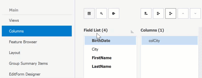
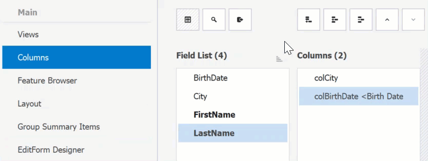
- Invoke the Data Grid designer.
- Switch to the Columns tab and click the Show Field List button.
- Drag a data field to the column list. Data fields not bound to grid columns are highlighted with bold text.
You can also use Add Column and Insert Column buttons on the same designer page. Use the GridColumn.FieldName property to bind a column to a data source field.
To remove a column, use the Remove Column designer button or click a column header at design time and press Delete.
Tip
Read the following tutorial for additional information: Create and Manage Columns at Design Time.
In Code
Use the following API of the View’s Columns collection to manage columns in code. You can access columns by their indexes or field names.
API | Description |
|---|---|
Adds the specified column to the end of the collection. | |
Adds a new column, binding it to the specified field and making this column visible. | |
Removes the specified column from the collection. | |
| Removes the column at the specified index. |
Enable the column’s Visible property to display the column in the View.
The following code snippet creates a column for the “Price” data field and displays the column in the View:
using DevExpress.XtraGrid.Columns;

public Form1() {
GridColumn colPrice = new GridColumn();
colPrice.Name = "colPrice";
colPrice.FieldName = "Price";
colPrice.Visible = true;
gridView.Columns.Add(colPrice);
}
// You can also use the 'AddVisible' method.
// gridView.Columns.AddVisible("Price");
Tip
Read the following tutorial for more code examples: Working with Columns in Code.
Identify and Access Grid Columns
Use the following API to access grid columns:
API | Description |
|---|---|
Stores all columns that belong to the View and allows you to access them by indexes or data field names. | |
Gets or sets the focused column/card field (in CardView and LayoutView Views). | |
Gets a column by its visible index (the GridColumn.VisibleIndex property). |
Tip
Read the following help topic for more information: Modifying Columns Collection.
Column Header
To modify a column header caption and/or add an image at design time, invoke the column’s smart tag menu or use the “Properties” window.
Tip
If the column’s Caption property is not specified, the grid generates the caption based on the name of the bound data field.
Use the following API to customize column headers in code:
API | Description |
|---|---|
Gets or sets whether column headers are visible. | |
Gets or sets the column’s display caption. | |
Gets the appearance settings used to paint column headers and row indicator panel. | |
Gets the appearance settings used to paint the column header. | |
Provides access to settings that allow you to set up raster and vector icons for this GridColumn. | |
Gets or sets whether the column header panel height is automatically adjusted to fit wrapped column captions. | |
Enables you to paint column headers manually. |
Tip
Read the following help topic for more information on column headers: Column Header.
Hide Vertical Column Borders
Disable the GridOptionsView.ShowVerticalLines setting to hide vertical lines:

You can also disable the GridOptionsView.ShowHorizontalLines setting to hide horizontal lines between rows.
Column Width
Default Behavior
The total column width cannot exceed the width of the parent View. The Data Grid truncates column content to fit the client area.
Display a Horizontal Scrollbar
Disable the GridOptionsView.ColumnAutoWidth property to allow grid columns to transcend View bounds. A horizontal scroll bar is displayed automatically if the total column width exceeds the View’s width.

Use the GridControl.CalcBestSize method to obtain the optimal grid size required to fit its content (rows and columns).
Manage Column Width in Code
A column’s actual width may differ from the values that you specify in the following settings if the GridOptionsView.ColumnAutoWidth property is enabled (for example, if the specified value exceeds the View’s width).
API | Description |
|---|---|
Gets or sets the column’s minimum allowed width. | |
Gets or sets the column width. | |
Specifies a new width for the column. |
The following table lists additional settings:
API | Description |
|---|---|
Gets or sets whether the column keeps a constant width when a Grid changes its size or Best Fit operations are called. End users are still allowed to resize this column. | |
Gets the actual column width. This property is useful in column auto-width mode (see GridOptionsView.ColumnAutoWidth). | |
Allows you to identify whether an end user is currently resizing a grid column. | |
Occurs after a column’s width has been changed. |
The following code snippet changes the display format of column values when the column width is too narrow to display the entire value:
private void gridView1_ColumnWidthChanged(object sender, DevExpress.XtraGrid.Views.Base.ColumnEventArgs e) {
  if (e.Column != colUnitPrice) return;
  colUnitPrice.DisplayFormat.FormatString = (colUnitPrice.Width > 50) ? "c2" : "c0";
}
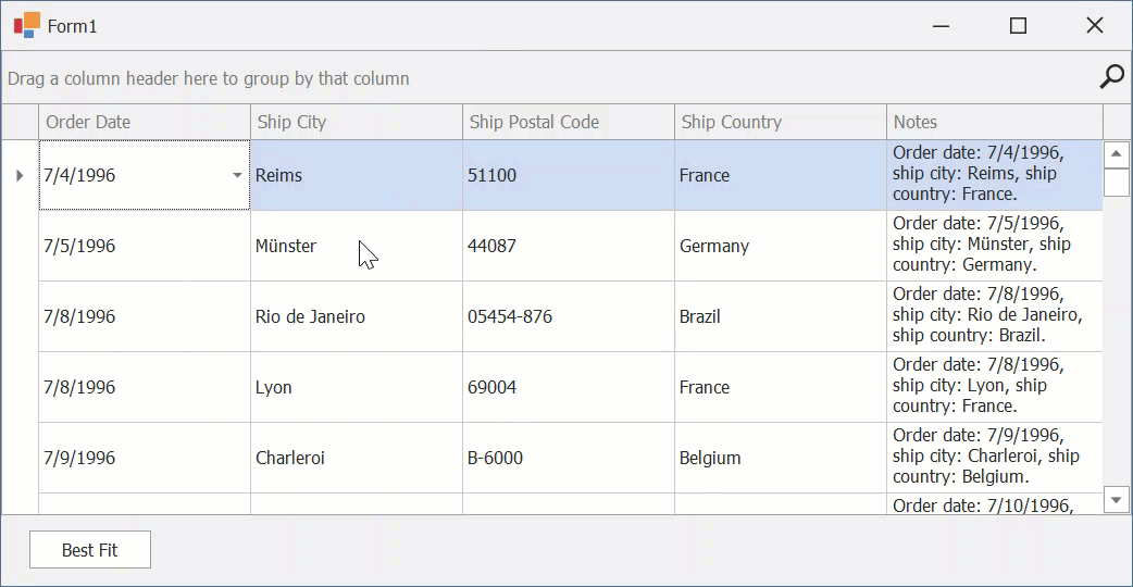
Best Fit
To ensure that a column or all columns have enough width for cells to display their entire content, end users can right-click a column header and choose the Best Fit or Best Fit (all columns) option.
The following API allow you to apply and manage the BestFit feature in code:
API | Description |
|---|---|
Adjusts column widths so that columns fit their content in an optimal way. | |
Resizes the column to the minimum width required to display the column content completely. | |
Gets or sets whether column best-fit resizing operations should prioritize precision or speed. | |
Gets or sets the number of data rows whose content is processed to apply best fit to columns. | |
Gets or sets whether cell error icons are taken into account when calculating the “best width” for columns. |
Auto-Fill Column
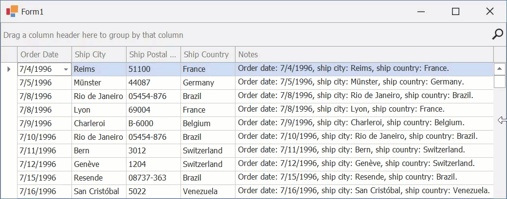
If the GridOptionsView.ColumnAutoWidth property is disabled, a grid column assigned to the GridView.AutoFillColumn property adjusts its width when the View is resized.
In the following animation, the auto-fill column is the Notes column.
Fixed Columns
Set a column’s Fixed property to Left or Right to anchor that column to the corresponding side of the View. Fixed columns remain visible while a user scrolls the View horizontally.
If you set the Fixed property to MiddleLeft, the column is anchored when it reaches the View’s left side.
The following table lists related settings:
API | Description |
|---|---|
Gets or sets whether to render fixed columns with thicker column borders or a different cell background color. | |
Gets or sets the width of frozen panel separators. The value must be in the range from 1 to 12 pixels. | |
Gets the appearance settings used to paint the fixed lines. |
Note
The view ignores FixedColumnHighlightMode and FixedLineWidth properties if any column’s Fixed property is set to MiddleLeft.
If you apply grouping and the view’s OptionsBehavior.AllowPartialGroups property is active, a fixed column is displayed to the right of the grouped column.
The following demo implements custom pop-up menus that allow users to anchor columns at runtime: Fixed Columns.
End-User Capabilities
With default settings, users can do the following:
Drag a right column edge to resize the column.
Related API: OptionsColumn.AllowSize, GridOptionsCustomization.AllowColumnResizing.
Drag and drop column headers to rearrange columns.
Related API: OptionsColumn.AllowMove, GridOptionsCustomization.AllowColumnMoving.
Drag column headers down or right-click headers and select the Hide This Column option to hide columns.
Related API: OptionsColumn.AllowShowHide, GridOptionsCustomization.AllowQuickHideColumns.
Right-click a column header and select the Column Chooser option to invoke a dialog that allows users to drag hidden columns back to the View.
The following help topic lists related API: Customization Form.
Drag a column header to the group area to apply grouping.
Related API: OptionsColumn.AllowGroup, GridOptionsCustomization.AllowGroup.
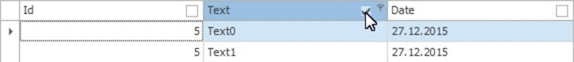
Click a column header to sort data by values of this column. Subsequent clicks change the sort order from ascending to descending and back.
Related API: OptionsColumn.AllowSort, GridOptionsCustomization.AllowSort.
Click the filter button within a column header to filter grid data.
Related API: OptionsColumnFilter.AllowFilter, GridOptionsCustomization.AllowFilter.
Related Examples
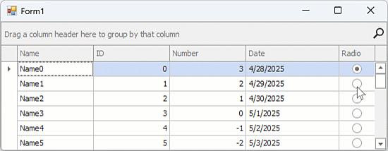
Add a Column that Behaves like a Radio Group
Each data cell has its own in-place editor. Checking a radio item in one cell does not uncheck items in other cells.
This example makes all cells in a column behave like one radio group.
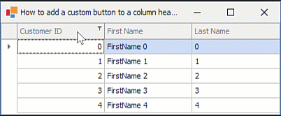
Display a Custom Button within a Column Header
This example creates and displays a custom button within a column header.
The GridView.CustomDrawColumnHeader event is handled to draw a clickable region within the column header.
Display Data Editors within Column Headers
This example draws an editor in a column header and activates the editor on mouse click.
Display a TextEdit within a Column Header to Allow a User to Rename the Column
This example handles a double click on a column header and displays a text editor to allow the user to rename the column.
Highlight the Focused Column Header
This example handles the CustomDrawColumnHeader event to apply a hot-track state for the focused column.
The example also handles FocusedColumnChanged and Layout events to call the InvalidateColumnHeader method and forcibly repaint column headers when the focused column or the GridView’s layout changes.
Display a Check Box within a Column Header
This example creates a GridViewColumnHeaderExtender component that displays check boxes in column headers of a Grid View.
Create a Custom Column
This example creates a GridColumn descendant class and uses the custom column in a GridView.