BarItemMenuHeader.ShowContentHeader Property
Gets or sets whether to display the BarItemMenuHeader‘s caption. This is a dependency property.
Namespace: DevExpress.Xpf.Bars
Assembly: DevExpress.Xpf.Core.v26.1.dll
Declaration
Property Value
| Type | Default | Description |
|---|---|---|
| Boolean | true |
|
Remarks
The BarItemMenuHeader.Content property defines the BarItemMenuHeader‘s caption. Set the ShowContentHeader property to false to hide this caption and display menu items only.
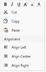
The following code sample creates a context menu that consists of BarItemMenuHeader objects with different captions and orientations:
<Window ...
        xmlns:dxb="http://schemas.devexpress.com/winfx/2008/xaml/bars"
        xmlns:dx="http://schemas.devexpress.com/winfx/2008/xaml/core">
    <dxb:BarManager.DXContextMenu>
        <dxb:PopupMenu>
            <dxb:BarItemMenuHeader Name="fontHeader" ItemsOrientation="Horizontal" ShowContentHeader="False">
                <dxb:BarButtonItem Name="biBold" Glyph="{dx:DXImage 'SvgImages/Format/Bold.svg'}" Content="Bold"/>
                <dxb:BarButtonItem Name="biItalic" Glyph="{dx:DXImage 'SvgImages/Format/Italic.svg'}" Content="Italic"/>
                <dxb:BarButtonItem Name="biUnderline" Glyph="{dx:DXImage 'SvgImages/Format/Underline.svg'}" Content="Underline"/>
                <dxb:BarButtonItem Name="biFontIncrease" Glyph="{dx:DXImage 'SvgImages/Format/FontSizeIncrease.svg'}" Content="Increase Font"/>
                <dxb:BarButtonItem Name="biFontDecrease" Glyph="{dx:DXImage 'SvgImages/Format/FontSizeDecrease.svg'}" Content="Decrease Font"/>
                <dxb:BarButtonItem Name="biFontColor" Glyph="{dx:DXImage 'SvgImages/RichEdit/FontColor.svg'}" Content="Font Color"/>
            </dxb:BarItemMenuHeader>

            <dxb:BarItemMenuHeader Name="mainHeader" ItemsOrientation="Vertical" ShowContentHeader="False">
                <dxb:BarButtonItem Name="biCut" Glyph="{dx:DXImage 'SvgImages/Edit/Cut.svg'}" Content="Cut"/>
                <dxb:BarButtonItem Name="biCopy" Glyph="{dx:DXImage 'SvgImages/Edit/Copy.svg'}" Content="Copy"/>
                <dxb:BarButtonItem Name="biPaste" Glyph="{dx:DXImage 'SvgImages/Edit/Paste.svg'}" Content="Paste"/>
            </dxb:BarItemMenuHeader>

            <dxb:BarItemMenuHeader Name="alignmentHeader" Content="Alignment" ItemsOrientation="Vertical" ShowContentHeader="True">
                <dxb:BarButtonItem Name="biLeft" Glyph="{dx:DXImage 'SvgImages/Format/AlignLeft.svg'}" Content="Align Left"/>
                <dxb:BarButtonItem Name="biCenter" Glyph="{dx:DXImage 'SvgImages/Format/AlignCenter.svg'}" Content="Align Center"/>
                <dxb:BarButtonItem Name="biRight" Glyph="{dx:DXImage 'SvgImages/Format/AlignRight.svg'}" Content="Align Right"/>
            </dxb:BarItemMenuHeader>
        </dxb:PopupMenu>
    </dxb:BarManager.DXContextMenu>
See Also