BarSplitButtonItem Class
Represents a bar button item supporting the drop-down functionality.
Namespace: DevExpress.Xpf.Bars
Assembly: DevExpress.Xpf.Core.v25.2.dll
NuGet Package: DevExpress.Wpf.Core
Declaration
Remarks
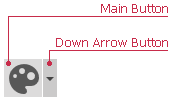
The BarSplitButtonItem supports the drop-down functionality, displaying a drop-down window when clicking the item link. The BarSplitButtonItem contains the main button, displaying the item’s content and glyph, and a Down Arrow button. Clicking the main button invokes the ItemClick events (BarItem.ItemClick and BarManager.ItemClick) and a command (BarItem.Command). Clicking the Down Arrow button invokes the drop-down control, specified by the BarSplitButtonItem.PopupControl property.

You can hide the Down Arrow button via the BarSplitButtonItem.ActAsDropDown property. In this instance, clicking the main button invokes the ItemClick events and the specified command. And in addition, the assigned drop-down control pops up.
BarSplitButtonItem can be used to implement a sub-menu in a RadialContextMenu.
Example
This example creates a BarSplitButtonItem (a button with drop-down). Click the button’s down arrow to display a popup window. To add a custom popup content, use the PopupControlContainer as the PopupControl.
The following image shows the result:

<dxb:BarContainerControl>
    <dxb:ToolBarControl UseWholeRow="True">
        <dxb:BarSplitButtonItem Name="btnFontColor" Content="FontColor" Glyph="{dx:DXImage Image=ChangeFontStyle_16x16.png}" ArrowAlignment="Bottom" ItemClick="btnFontColor_ItemClick">
            <dxb:BarSplitButtonItem.PopupControl>
                <dxb:PopupControlContainer>
                    <UserControl>
                        <dxe:ColorChooser/>
                    </UserControl>
                </dxb:PopupControlContainer>
            </dxb:BarSplitButtonItem.PopupControl>
        </dxb:BarSplitButtonItem>
    </dxb:ToolBarControl>
</dxb:BarContainerControl>
private void btnFontColor_ItemClick(object sender, DevExpress.Xpf.Bars.ItemClickEventArgs e) {
    PopupControlContainer pcc = (e.Item as DevExpress.Xpf.Bars.BarSplitButtonItem).PopupControl as PopupControlContainer;
    Color color = ((pcc.Content as UserControl).Content as ColorChooser).Color;
    MessageBox.Show("Color is applied: " + color.ToString());
}
Related GitHub Examples
The following code snippets (auto-collected from DevExpress Examples) contain references to the BarSplitButtonItem class.
Note
The algorithm used to collect these code examples remains a work in progress. Accordingly, the links and snippets below may produce inaccurate results. If you encounter an issue with code examples below, please use the feedback form on this page to report the issue.