BarCheckItem Class
Represents a check button in bars.
Namespace: DevExpress.Xpf.Bars
Assembly:
DevExpress.Xpf.Core.v26.1.dll
Declaration
public class BarCheckItem :
    BarButtonItem,
    IBarCheckItem
Public Class BarCheckItem
    Inherits BarButtonItem
    Implements IBarCheckItem
By default, this button has two states: checked (pressed) and unchecked (not pressed).

Clicking a check button automatically toggles its state and fires the BarCheckItem.CheckedChanged event. In code, you can change the button’s check state via the BarCheckItem.IsChecked property.
If the BarCheckItem.IsThreeState option is enabled, a check button supports three states. Use the BarCheckItem.IsChecked property to get/set the check state.
Bar check items can be combined into a group via the BarCheckItem.GroupIndex property. Checking one item within a group automatically unchecks the other items.
Example
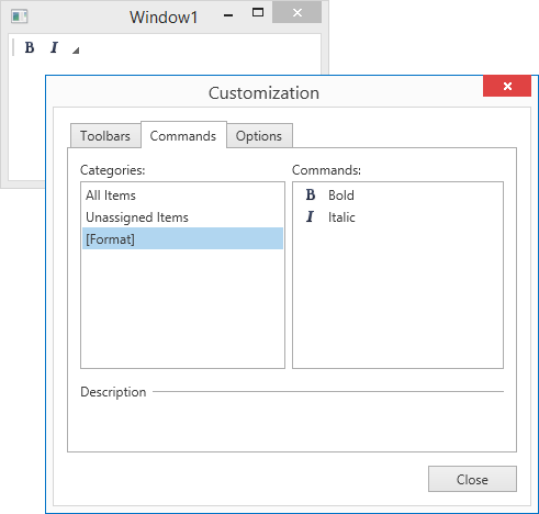
This example shows how to create bar items and associate them with a custom Format category.
The following image shows the result:
Imports System
Imports System.Collections.Generic
Imports System.Configuration
Imports System.Data
Imports System.Linq
Imports System.Windows

Namespace WpfApplication3
    ''' <summary>
    ''' Interaction logic for App.xaml
    ''' </summary>
    Partial Public Class App
        Inherits Application

        Private Sub OnAppStartup_UpdateThemeName(ByVal sender As Object, ByVal e As StartupEventArgs)

            DevExpress.Xpf.Core.ApplicationThemeHelper.UpdateApplicationThemeName()
        End Sub
    End Class
End Namespace
<Window x:Class="WpfApplication3.Window1"
        xmlns="http://schemas.microsoft.com/winfx/2006/xaml/presentation"
        xmlns:x="http://schemas.microsoft.com/winfx/2006/xaml"
        xmlns:dx="http://schemas.devexpress.com/winfx/2008/xaml/core"
        xmlns:dxb="http://schemas.devexpress.com/winfx/2008/xaml/bars"
        Title="Window1" Height="300" Width="300" >
    <Grid>
        <Grid.RowDefinitions>
            <RowDefinition Height="Auto" />
            <RowDefinition Height="*"/>
        </Grid.RowDefinitions>

        <dxb:BarContainerControl Grid.Row="0">
            <dxb:ToolBarControl Caption="Main Toolbar">
                <dxb:BarCheckItem Content="Bold" Glyph="{dx:DXImage Image=Bold_16x16.png}" CategoryName="Format"
                                  CheckedChanged="checkBtnBold_CheckChanged"/>
                <dxb:BarCheckItem Content="Italic" Glyph="{dx:DXImage Image=Italic_16x16.png}" CategoryName="Format"
                                  CheckedChanged="checkBtnItalic_CheckChanged"/>
            </dxb:ToolBarControl>
        </dxb:BarContainerControl>
    </Grid>
</Window>
<Application x:Class="WpfApplication3.App" xmlns="http://schemas.microsoft.com/winfx/2006/xaml/presentation" xmlns:x="http://schemas.microsoft.com/winfx/2006/xaml" StartupUri="Window1.xaml" Startup="OnAppStartup_UpdateThemeName">
    <Application.Resources>

    </Application.Resources>
</Application>
Imports System
Imports System.Collections.Generic
Imports System.Linq
Imports System.Text
Imports System.Windows
Imports System.Windows.Controls
Imports System.Windows.Data
Imports System.Windows.Documents
Imports System.Windows.Input
Imports System.Windows.Media
Imports System.Windows.Media.Imaging
Imports System.Windows.Navigation
Imports System.Windows.Shapes
Imports DevExpress.Xpf.Bars

Namespace WpfApplication3
    ''' <summary>
    ''' Interaction logic for Window1.xaml
    ''' </summary>
    Partial Public Class Window1
        Inherits Window

        Public Sub New()
            InitializeComponent()
        End Sub

        Private Sub checkBtnItalic_CheckChanged(ByVal sender As Object, ByVal e As ItemClickEventArgs)
            '...
        End Sub

        Private Sub checkBtnBold_CheckChanged(ByVal sender As Object, ByVal e As DevExpress.Xpf.Bars.ItemClickEventArgs)
            '...
        End Sub
    End Class
End Namespace
using System;
using System.Collections.Generic;
using System.Linq;
using System.Text;
using System.Windows;
using System.Windows.Controls;
using System.Windows.Data;
using System.Windows.Documents;
using System.Windows.Input;
using System.Windows.Media;
using System.Windows.Media.Imaging;
using System.Windows.Navigation;
using System.Windows.Shapes;
using DevExpress.Xpf.Bars;

namespace WpfApplication3 {
    /// <summary>
    /// Interaction logic for Window1.xaml
    /// </summary>
    public partial class Window1 : Window {
        public Window1() {
            InitializeComponent();
        }

        void checkBtnItalic_CheckChanged(object sender, ItemClickEventArgs e) {
            //...
        }

        void checkBtnBold_CheckChanged(object sender, DevExpress.Xpf.Bars.ItemClickEventArgs e) {
            //...
        }
    }
}
The following code snippets (auto-collected from DevExpress Examples) contain references to the BarCheckItem class.
Note
The algorithm used to collect these code examples remains a work in progress. Accordingly, the links and snippets below may produce inaccurate results. If you encounter an issue with code examples below, please use the feedback form on this page to report the issue.
See Also