BarItemMenuHeader Class
Allows you to group context menu items and specify their alignment, caption, and appearance.
Namespace: DevExpress.Xpf.Bars
Assembly: DevExpress.Xpf.Core.v26.1.dll
Declaration
public class BarItemMenuHeader :
    BarItem,
    ILinksHolder,
    IMultipleElementRegistratorSupport,
    IBarNameScopeSupport,
    IInputElement,
ILogicalChildrenContainerRelated API Members
The following members return BarItemMenuHeader objects:
Remarks
The BarItemMenuHeader is a container object that stores bar items and links and allows you to detach them into multiple sub-groups. Similar to other bar items, you can reference the BarItemMenuHeader by the BarItemLinkMenuHeader class instance.
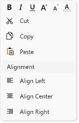
If the BarItemMenuHeader.ItemsOrientation property is set to Horizontal the BarItemMenuHeader displays item glyphs without captions.
The following code sample creates a context menu that consists of BarItemMenuHeader objects with different captions and orientations:
<Window ...
        xmlns:dxb="http://schemas.devexpress.com/winfx/2008/xaml/bars"
        xmlns:dx="http://schemas.devexpress.com/winfx/2008/xaml/core">
    <dxb:BarManager.DXContextMenu>
        <dxb:PopupMenu>
            <dxb:BarItemMenuHeader Name="fontHeader" ItemsOrientation="Horizontal" ShowContentHeader="False">
                <dxb:BarButtonItem Name="biBold" Glyph="{dx:DXImage 'SvgImages/Format/Bold.svg'}" Content="Bold"/>
                <dxb:BarButtonItem Name="biItalic" Glyph="{dx:DXImage 'SvgImages/Format/Italic.svg'}" Content="Italic"/>
                <dxb:BarButtonItem Name="biUnderline" Glyph="{dx:DXImage 'SvgImages/Format/Underline.svg'}" Content="Underline"/>
                <dxb:BarButtonItem Name="biFontIncrease" Glyph="{dx:DXImage 'SvgImages/Format/FontSizeIncrease.svg'}" Content="Increase Font"/>
                <dxb:BarButtonItem Name="biFontDecrease" Glyph="{dx:DXImage 'SvgImages/Format/FontSizeDecrease.svg'}" Content="Decrease Font"/>
                <dxb:BarButtonItem Name="biFontColor" Glyph="{dx:DXImage 'SvgImages/RichEdit/FontColor.svg'}" Content="Font Color"/>
            </dxb:BarItemMenuHeader>

            <dxb:BarItemMenuHeader Name="mainHeader" ItemsOrientation="Vertical" ShowContentHeader="False">
                <dxb:BarButtonItem Name="biCut" Glyph="{dx:DXImage 'SvgImages/Edit/Cut.svg'}" Content="Cut"/>
                <dxb:BarButtonItem Name="biCopy" Glyph="{dx:DXImage 'SvgImages/Edit/Copy.svg'}" Content="Copy"/>
                <dxb:BarButtonItem Name="biPaste" Glyph="{dx:DXImage 'SvgImages/Edit/Paste.svg'}" Content="Paste"/>
            </dxb:BarItemMenuHeader>

            <dxb:BarItemMenuHeader Name="alignmentHeader" Content="Alignment" ItemsOrientation="Vertical" ShowContentHeader="True">
                <dxb:BarButtonItem Name="biLeft" Glyph="{dx:DXImage 'SvgImages/Format/AlignLeft.svg'}" Content="Align Left"/>
                <dxb:BarButtonItem Name="biCenter" Glyph="{dx:DXImage 'SvgImages/Format/AlignCenter.svg'}" Content="Align Center"/>
                <dxb:BarButtonItem Name="biRight" Glyph="{dx:DXImage 'SvgImages/Format/AlignRight.svg'}" Content="Align Right"/>
            </dxb:BarItemMenuHeader>
        </dxb:PopupMenu>
    </dxb:BarManager.DXContextMenu>
Refer to the following help topic for more information: Popup Menu.