BarItemMenuHeader.ItemsOrientation Property
Gets or sets how the BarItemMenuHeader arranges its items. This is a dependency property.
Namespace: DevExpress.Xpf.Bars
Assembly: DevExpress.Xpf.Core.v26.1.dll
Declaration
Property Value
| Type | Description |
|---|---|
| HeaderOrientation | The value that specifies how the BarItemMenuHeader arranges its items. |
Available values:
| Name | Description |
|---|---|
| Default | The orientation of tab headers in the Header Panel is defined by the location of the Panel, specified by the TabControlViewBase.HeaderLocation property. The headers are oriented horizontally if the Header Panel is located at the top or bottom of the tab item. Otherwise, they are oriented vertically. |
| Horizontal | The tab headers in the Header Panel are oriented horizontally. |
| Vertical | The tab headers in the Header Panel are oriented vertically. |
Remarks
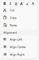
If the ItemsOrientation property is set to Horizontal the BarItemMenuHeader displays item glyphs without captions.
The following code sample creates a context menu that consists of BarItemMenuHeader objects with different captions and orientations:
<Window ...
        xmlns:dxb="http://schemas.devexpress.com/winfx/2008/xaml/bars"
        xmlns:dx="http://schemas.devexpress.com/winfx/2008/xaml/core">
    <dxb:BarManager.DXContextMenu>
        <dxb:PopupMenu>
            <dxb:BarItemMenuHeader Name="fontHeader" ItemsOrientation="Horizontal" ShowContentHeader="False">
                <dxb:BarButtonItem Name="biBold" Glyph="{dx:DXImage 'SvgImages/Format/Bold.svg'}" Content="Bold"/>
                <dxb:BarButtonItem Name="biItalic" Glyph="{dx:DXImage 'SvgImages/Format/Italic.svg'}" Content="Italic"/>
                <dxb:BarButtonItem Name="biUnderline" Glyph="{dx:DXImage 'SvgImages/Format/Underline.svg'}" Content="Underline"/>
                <dxb:BarButtonItem Name="biFontIncrease" Glyph="{dx:DXImage 'SvgImages/Format/FontSizeIncrease.svg'}" Content="Increase Font"/>
                <dxb:BarButtonItem Name="biFontDecrease" Glyph="{dx:DXImage 'SvgImages/Format/FontSizeDecrease.svg'}" Content="Decrease Font"/>
                <dxb:BarButtonItem Name="biFontColor" Glyph="{dx:DXImage 'SvgImages/RichEdit/FontColor.svg'}" Content="Font Color"/>
            </dxb:BarItemMenuHeader>

            <dxb:BarItemMenuHeader Name="mainHeader" ItemsOrientation="Vertical" ShowContentHeader="False">
                <dxb:BarButtonItem Name="biCut" Glyph="{dx:DXImage 'SvgImages/Edit/Cut.svg'}" Content="Cut"/>
                <dxb:BarButtonItem Name="biCopy" Glyph="{dx:DXImage 'SvgImages/Edit/Copy.svg'}" Content="Copy"/>
                <dxb:BarButtonItem Name="biPaste" Glyph="{dx:DXImage 'SvgImages/Edit/Paste.svg'}" Content="Paste"/>
            </dxb:BarItemMenuHeader>

            <dxb:BarItemMenuHeader Name="alignmentHeader" Content="Alignment" ItemsOrientation="Vertical" ShowContentHeader="True">
                <dxb:BarButtonItem Name="biLeft" Glyph="{dx:DXImage 'SvgImages/Format/AlignLeft.svg'}" Content="Align Left"/>
                <dxb:BarButtonItem Name="biCenter" Glyph="{dx:DXImage 'SvgImages/Format/AlignCenter.svg'}" Content="Align Center"/>
                <dxb:BarButtonItem Name="biRight" Glyph="{dx:DXImage 'SvgImages/Format/AlignRight.svg'}" Content="Align Right"/>
            </dxb:BarItemMenuHeader>
        </dxb:PopupMenu>
    </dxb:BarManager.DXContextMenu>