Bands
- 6 minutes to read
The GridControl‘s TableView and TreeListView allow you to organize columns into logical groups called bands. Each band consists of a band header and child columns. The band header is displayed in the bands panel above the band’s child columns.
Create Bands
Bands are GridControlBand objects. The GridControl stores its bands in the GridControl.Bands collection.

At Design Time
You can use the GridControl‘s Quick Actions menu to add bands.

The GridControlBand‘s Quick Actions menu allows you to add child bands and columns and specify the band’s Header property:

In XAML
- Add GridControlBand objects to the GridControl.Bands collection.
- Use the band’s Header property to specify the text displayed in the band.
- Populate the band’s Columns collection with the GridColumn objects.
- Specify column settings.
<dxg:GridControl ItemsSource="{Binding Source}">
    <dxg:GridControl.Bands>
        <dxg:GridControlBand Header="Product">
            <dxg:GridColumn FieldName="ProductName"/>
        </dxg:GridControlBand>

        <dxg:GridControlBand Header="Order Info">
            <dxg:GridColumn FieldName="Country"/>
            <dxg:GridColumn FieldName="City"/>
            <dxg:GridColumn FieldName="OrderDate"/>
        </dxg:GridControlBand>

        <dxg:GridControlBand Header="Pricing">
            <dxg:GridColumn FieldName="UnitPrice"/>
            <dxg:GridColumn FieldName="Quantity"/>
        </dxg:GridControlBand>
    </dxg:GridControl.Bands>
</dxg:GridControl>
In Code
// Create band objects and specify their settings:
var productBand = new GridControlBand();
productBand.Header = "Product";
productBand.Columns.Add(new GridColumn() { FieldName = nameof(Product.ProductName) });

var orderBand = new GridControlBand();
orderBand.Header = "Order Info";
orderBand.Columns.Add(new GridColumn() { FieldName = nameof(Product.Country) });
orderBand.Columns.Add(new GridColumn() { FieldName = nameof(Product.City) });
orderBand.Columns.Add(new GridColumn() { FieldName = nameof(Product.OrderDate) });

var pricingBand = new GridControlBand();
pricingBand.Header = "Pricing";
pricingBand.Columns.Add(new GridColumn() { FieldName = nameof(Product.UnitPrice) });
pricingBand.Columns.Add(new GridColumn() { FieldName = nameof(Product.Quantity) });

// Add bands to the GridControl:
grid.Bands.Add(productBand);
grid.Bands.Add(orderBand);
grid.Bands.Add(pricingBand);
Use Data Annotation Attributes
You can use data annotation attributes to group grid columns in bands:
- Apply the DisplayAttribute to all fields in the data source.
- Use the DisplayAttribute.GroupName property to specify the band’s header.
- Set the DataControlBase.EnableSmartColumnsGeneration property to
trueto generate columns based on data annotation attributes.
<dxg:GridControl ItemsSource="{Binding Source}"
                 AutoGenerateColumns="AddNew"
                 EnableSmartColumnsGeneration="True">
    <!-- ... -->
</dxg:GridControl>
using System.ComponentModel.DataAnnotations;
// ...

public class Product {
    [Display(GroupName = "Product")]
    public string ProductName { get; set; }
    [Display(GroupName = "Order Info")]
    public string Country { get; set; }
    [Display(GroupName = "Order Info")]
    public string City { get; set; }
    [Display(GroupName = "Pricing")]
    public double UnitPrice { get; set; }
    [Display(GroupName = "Pricing")]
    public int Quantity { get; set; }
    [Display(GroupName = "Order Info")]
    public DateTime OrderDate { get; set; }
}
Columns bound to fields without the GroupName property are displayed in the first band.
Create Bands in the View Model
You can define bands in a View Model and display them in the GridControl.
Refer to the following help topic for more information: How to: Bind the Grid to Bands Specified in ViewModel.
Display Nested Bands
Each band has its own GridControlBand.Bands collection. This collection allows you to implement the following multi-band layout:

<dxg:GridControl.Bands>
    <dxg:GridControlBand Header="Personal Info">
        <dxg:GridControlBand.Bands>

            <dxg:GridControlBand Header="Name">
                <dxg:GridColumn FieldName="FirstName"/>
                <dxg:GridColumn FieldName="LastName"/>
            </dxg:GridControlBand>

            <dxg:GridControlBand Header="Birthday">
                <dxg:GridColumn FieldName="BirthDate"/>
            </dxg:GridControlBand>

        </dxg:GridControlBand.Bands>
    </dxg:GridControlBand>
    <!-- ... -->
</dxg:GridControl.Bands>
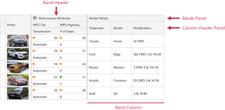
Create Multiple Row Bands
You can arrange columns in a band. Use the BandBase.GridRow attached property to specify the row in which the column is displayed in the band. To specify the column position in the row, use the BaseColumn.VisibleIndex property.

<dxg:GridControl.Bands>
    <dxg:GridControlBand Header="Model Details">
        <dxg:GridColumn FieldName="Trademark"/>
        <dxg:GridColumn FieldName="Model"/>
        <dxg:GridColumn FieldName="Modification"/>
    </dxg:GridControlBand>

    <dxg:GridControlBand Header="Performance Attributes">
        <dxg:GridColumn FieldName="MPGCity"
                dxg:BandBase.GridRow="0"
                VisibleIndex="0"/>
        <dxg:GridColumn FieldName="MPGHighway"
                dxg:BandBase.GridRow="0"
                VisibleIndex="1"/>
        <dxg:GridColumn FieldName="Transmission"
                dxg:BandBase.GridRow="1"
                VisibleIndex="0"/>
        <dxg:GridColumn FieldName="Gears"
                dxg:BandBase.GridRow="1"
                VisibleIndex="1"/>
    </dxg:GridControlBand>
</dxg:GridControl.Bands>
Overlay Band Header by Its Children
Set the BandBase.OverlayHeaderByChildren property to true to hide the band’s header and display headers of child columns and bands instead. This could be helpful if your band contains only one child column or band:

Display Band Separators
Specify the TableView.BandSeparatorWidth / TreeListView.BandSeparatorWidth property to display vertical lines between bands.

Refer to the following help topic for more information: Band Separators.
Customize the Band Header Appearance
The following code sample wraps text in band headers:

<dxg:GridControl.View>
    <dxg:TableView x:Name="view" AutoWidth="True">
        <dxg:TableView.BandHeaderTemplate>
            <DataTemplate>
                <TextBlock Text="{Binding}" TextWrapping="Wrap"/>
            </DataTemplate>
        </dxg:TableView.BandHeaderTemplate>
    </dxg:TableView>
</dxg:GridControl.View>
You can use the following properties to customize bands:
Property | Description |
|---|---|
Gets or sets whether to display the bands panel. | |
Gets or sets whether a view displays column headers. This is a dependency property. | |
Gets or sets the template that defines the appearance of band headers. This is a dependency property. | |
Gets or sets the template that defines the presentation of band header tooltips. This is a dependency property. | |
Gets or sets a style applied to the column’s header. This is a dependency property. | |
Gets or sets the style applied to band headers when the grid is printed. This is a dependency property. | |
Allows you to customize the band header‘s context menu. You can add new menu items or remove existing items. |
Control User Interaction
The following table lists properties that allow you to control whether users can change the band layout at runtime:
Property | Description |
|---|---|
Gets or sets whether users can rearrange bands. This is a dependency property. | |
Gets or sets whether users can drag the band header’s edge to change the band‘s width. | |
Gets or sets whether users can drag columns between bands. This is a dependency property. | |
Gets or sets whether users can drag bands between bands. This is a dependency property. |
Set the TableView.AllowBandMultiRow / TreeListView.AllowBandMultiRow property to false to forbid users to arrange columns in bands vertically.
Additional Notes on Control’s Behavior
- You cannot specify GridControl.Bands and GridControl.Columns collections simultaneously. This also applies to GridControlBand.Bands and GridControlBand.Columns collections.
- You cannot fix the band’s child column. Only the entire band can be fixed.
- The multiple cell selection is not supported.
- You cannot explicitly specify a band’s width. The width of the GridControl‘s bands depends on the width of the band’s columns.
- If the GridControl’s bands contain child bands, the Cell Merging feature does not work when exporting grid data.