RepositoryItemRatingControl.BeforeShowToolTip Event
Occurs when the mouse pointer hovers over a rating scale item and allows you to display a unique hint for that item.
Namespace: DevExpress.XtraEditors.Repository
Assembly: DevExpress.XtraEditors.v26.1.dll
Declaration
Event Data
The BeforeShowToolTip event's data class is RatingToolTipEventArgs. The following properties provide information specific to this event:
| Property | Description |
|---|---|
| HitTest | Gets information about the hit point. |
| Text | Gets or sets tooltip content. |
| Value | Gets the rating value. |
Remarks
The RatingControl supports regular and super tooltips.
Default Behavior
The RatingControl displays a regular tooltip with the rating scale value.

The ShowToolTips option controls whether to show tooltips on hover.
Customize Regular Tooltip Text
Use the following RatingControl API to specify tooltip text and title:
API | Description |
|---|---|
Specifies tooltip text. You can use line breaks in regular tooltips. | |
Specifies whether to parse HTML tags in text. | |
Specifies the tooltip title. | |
Handle this event to customize the tooltip based on the rating value. |
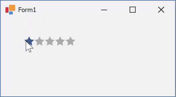
The following code snippet specifies tooltip text and title and changes the text based on the rating value:
public Form1() {
  ratingControl1.ToolTip = "Please leave your feedback";
  ratingControl1.ToolTipTitle = "How was your experience?";
  ratingControl1.BeforeShowToolTip += RatingControl1_BeforeShowToolTip;
}
void RatingControl1_BeforeShowToolTip(object sender, DevExpress.XtraEditors.Repository.RatingToolTipEventArgs e) {
  switch(e.Value) {
  case 1:
    e.Text = "Very bad";
    break;
  case 2:
    e.Text = "Bad";
    break;
  }
}
Assign an Image to Regular Tooltips
Use the RatingControl‘s ToolTipIconType property to specify a predefined icon. The ToolTipController.IconSize property specifies icon size.
Assign a custom image as follows:
- Create a ToolTipController and assign it to the RatingControl.ToolTipController property.
- Create an image collection and assign it to the ToolTipController.ImageList property.
- Handle the ToolTipController.BeforeShow event. Use the e.ImageOptions parameter to assign a raster or vector image to the tooltip.
Note
The ToolTipIconType property has priority over e.ImageOptions. If you assign a custom image, set ToolTipIconType to None.
The following code snippet assigns a custom image to a tooltip:
Note
ratingControl1, toolTipController1, and svgImageCollection1 were created at runtime.
public Form1() {
  ratingControl1.ToolTipController = toolTipController1;
  toolTipController1.ImageList = svgImageCollection1;
  toolTipController1.BeforeShow += ToolTipController1_BeforeShow;
}
void ToolTipController1_BeforeShow(object sender, DevExpress.Utils.ToolTipControllerShowEventArgs e) {
  ToolTipController controller = sender as ToolTipController;
  if (e.SelectedControl == ratingControl1)
  e.ImageOptions.SvgImage = (controller.ImageList as SvgImageCollection)["3stars"];
}
Display a Super Tooltip
Use the control’s SuperTip property to assign a super tooltip. If you wish to use HTML tags in a super tooltip, enable the SuperToolTip.AllowHtmlText property.
Setting the ToolTipController.ToolTipType property to SuperTip converts existing regular tooltips to super tooltips.

Tip
Read the following help topic for information on how to customize super tooltips: Hints and Tooltips.
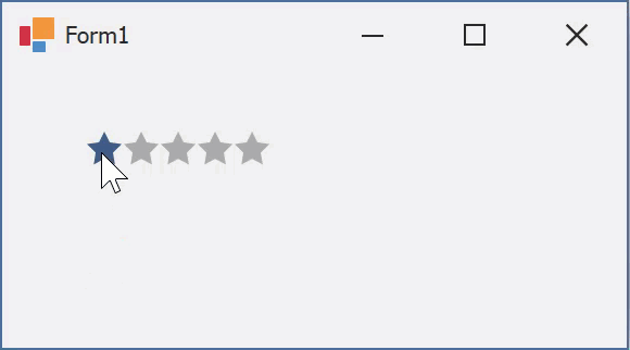
Example
The code below shows how to display a unique tooltip for each rating grade.
ratingControl1.Properties.FillPrecision = DevExpress.XtraEditors.Repository.RatingItemFillPrecision.Full;

private void ratingControl1_BeforeShowToolTip(object sender, DevExpress.XtraEditors.Repository.RatingToolTipEventArgs e) {
    int value = Convert.ToInt32(e.Value);
    switch (value) {
        case 1: e.Text = "Very Bad";
            break;
        case 2: e.Text = "Bad";
            break;
        case 3: e.Text = "Average";
            break;
        case 4: e.Text = "Good";
            break;
        case 5: e.Text = "Excellent";
            break;
    }
}