RepositoryItemProgressBar Class
A repository item that stores settings specific to a ProgressBarControl.
Namespace: DevExpress.XtraEditors.Repository
Assembly: DevExpress.XtraEditors.v26.1.dll
Declaration
Related API Members
The following members return RepositoryItemProgressBar objects:
Remarks
The RepositoryItemProgressBar class contains properties and events related to progress bar controls (ProgressBarControl class objects). In a standalone ProgressBarControl, use the ProgressBarControl.Properties property to access these settings.
The following table lists main settings of the RepositoryItemProgressBar class:
Setting | Description |
|---|---|
Specify maximum and minimum values that can be displayed. | |
PercentView and ShowTitle | Specify the availability and format of the text label that indicates the current progress. |
Specifies the progress bar’s direction. |
Note
You do not need to create repository items manually unless you create inplace editors for container controls like the Data Grid. Refer to the following help topic for more information: Cell Editors.
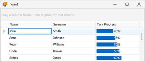
Example
The following code snippet creates a RepositoryItemProgressBar and assigns it to a Grid column:
using DevExpress.XtraEditors;
using DevExpress.XtraEditors.Repository;
using DevExpress.XtraGrid;
using DevExpress.XtraGrid.Views.Grid;

namespace progressBar {
    public partial class Form1 : XtraForm {

        RepositoryItemProgressBar bar;

        public Form1() {
            InitializeComponent();

            bar = new RepositoryItemProgressBar();
            // Add the item to the grid's 'RepositoryItems' collection
            gridControl1.RepositoryItems.Add(bar);
            // Customize the repository item
            bar.Minimum = 0;
            bar.Maximum = 100;
            bar.PercentView = true;
            bar.ShowTitle = true;
            // Assign the repository item to a column
            gridView1.Columns["TaskProgress"].ColumnEdit = bar;
        }
    }
}