BackstageViewItemBase.Appearance Property
Provides access to appearance settings applied to this BackstageViewItemBase descendant in the normal state.
Namespace: DevExpress.XtraBars.Ribbon
Assembly: DevExpress.XtraBars.v25.2.dll
NuGet Package: DevExpress.Win.Navigation
Declaration
Property Value
| Type | Description |
|---|---|
| AppearanceObject | An AppearanceObject that stores appearance settings applied to this BackstageViewItemBase descendant in the normal state. |
Remarks
The Appearance property allows you to customize BackstageViewButtonItem and BackstageViewTabItem objects in their normal visual state. For other visual states use the BackstageViewItemBase.AppearanceHover, BackstageViewItemBase.AppearanceDisabled and BackstageViewTabItem.AppearanceSelected properties.
BackstageView item appearance settings are automatically shared with child BackstageViewControls via the BackstageViewControl.ParentAppearance property. See the example below to learn more.
Example
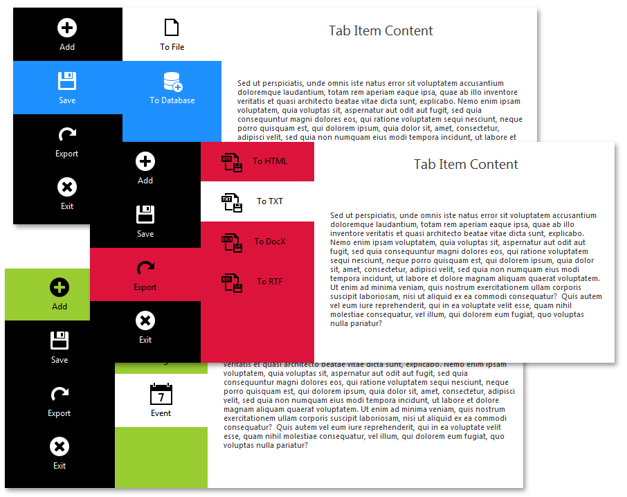
BackstageViewControls can be combined together to create attractive, multi-level control that navigates through its tabs. If combined together, BackstageView controls share their appearance settings, making it possible to apply the same color scheme for the entire object. In this example, you will learn how to create a simple control based on a BackstageView control that contains multiple child BackstageView controls.
As the BackstageView Control topic states, each BackstageView control has two main areas – the left pane containing BackstageViewButtonItem and BackstageViewTabItem objects and the right pane that displays tab item content. It is possible to set another BackstageView control as the tab item content. At design-time, this can be done by dropping the BackstageViewControl component to the parent BackstageView control’s right pane. To do the same in code, use the BackstageViewTabItem.ContentControl property.
You can repeat this step again and again, setting more and more BackstageView controls as tab item content. When you design the required item hierarchy, you can move on to the controls’ appearance. By default, all of the BackstageView controls’ BackstageViewControl.PaintStyle properties are set to Default (equal to the Skinned), which means these controls will be painted according to the currently applied application skin. Set this property to Flat for the parent BackstageView control and access its BackstageViewControl.Appearance section. This section provides access to BackColor, ForeColor, Font and other settings that specify the control’s appearance.
Then, select each BackstageViewTabItem added to the first BackstageView control and modify its BackstageViewItemBase.Appearance, BackstageViewItemBase.AppearanceHover and BackstageViewTabItem.AppearanceSelected properties as required. Since in the previous step you have set black as the tab item back color, pick a warm color to paint selected tabs and change selected tabs’ forecolors to match the chosen background.
backstageViewTabItem1.AppearanceSelected.BackColor = backstageViewTabItem2.AppearanceSelected.BackColor = backstageViewTabItem3.AppearanceSelected.BackColor = Color.DarkOrange;
backstageViewTabItem1.AppearanceSelected.ForeColor = backstageViewTabItem2.AppearanceSelected.ForeColor = backstageViewTabItem3.AppearanceSelected.ForeColor = Color.Black;
backstageViewTabItem1.AppearanceHover.BackColor = backstageViewTabItem2.AppearanceHover.BackColor = backstageViewTabItem3.AppearanceHover.BackColor = backstageViewTabItem3.AppearanceHover.BackColor = Color.DimGray;
Now, as you have customized the first BackstageView control’s left pane, the following BackstageView control will paint its own left pane according to the parent control’s appearance, stored within the BackstageViewControl.ParentAppearance object. This means your child BackstageView control’s left pane will have the same backcolor that selected tab items for the first control have. Following the described pattern, you can now customize AppearanceSelected properties for the second BackstageView control’s tab items and they will be passed to the third BackstageView control as its default backcolor. As the result, with minimum effort you are able to mix multiple BackstageView controls whose appearance settings are shared between each other. This creates a unified paint style as the figure below demonstrates.

using System;
using System.Collections.Generic;
using System.ComponentModel;
using System.Drawing;
using System.Data;
using System.Linq;
using System.Text;
using System.Threading.Tasks;
using System.Windows.Forms;

namespace WindowsFormsApplication12 {
    public partial class UserControl1 : UserControl {
        public UserControl1() {
            InitializeComponent();
        }
    }
}