GalleryDropDown Class
Displays an image gallery and custom commands in a popup window.
Namespace: DevExpress.XtraBars.Ribbon
Assembly: DevExpress.XtraBars.v25.2.dll
NuGet Package: DevExpress.Win.Navigation
Declaration
Related API Members
The following members return GalleryDropDown objects:
Remarks
A GalleryDropDown control is a popup control displaying an image gallery and allowing additional commands (bar item links) to be displayed below the gallery.
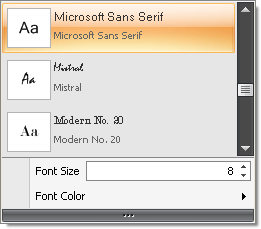
The following image shows a sample GalleryDropDown control which displays a scrollable gallery and custom menu commands (Font Color and Font Size):

The GalleryDropDown control is used to implement an extended version of an In-Ribbon gallery that is displayed when the In-Ribbon gallery’s Dropdown button is clicked. See Dropdown Galleries to learn more.
GalleryDropDown is one of the DevExpress controls that provide the gallery functionality. General information on galleries, items and gallery initialization can be found in the following topics:
The control’s gallery can be accessed with the GalleryDropDown.Gallery property, which is of the InDropDownGallery class (a BaseGallery descendant). To initialize a gallery, first add gallery groups to the BaseGallery.Groups collection. Then, add gallery items to each group using the GalleryItemGroup.Items collection.
Features common to all DevExpress gallery controls are covered in the Gallery Controls topic. Below is a list of additional features supported by the GalleryDropDown.
- Capability to display additional commands (bar item links) below the gallery (see PopupMenuBase.ItemLinks).
- Invoking the GalleryDropDown as a popup window (GalleryDropDown.ShowPopup).